Archive for December 2009
Visualising content and context using issue maps – an example based on a discussion of Cox’s risk matrix theorem
Introduction
Some time ago I wrote a post on a paper by Tony Cox which describes some flaws in risk matrices (as they are commonly used) and proposes an axiomatic approach to address some of the problems. In a recent comment on that post, Tony Waisanen suggested that someone take up the challenge to map the content of the post and the ensuing discussion using issue mapping. Hence my motivation to write the present post.
My main aims in this post are to:
- Create an issue map visualising the content of my post on Cox’s paper.
- Incorporate points raised in the comments into the map, and show how they relate to Cox’s arguments.
A quick word about the notation and software before proceeding. I’ll use the IBIS (Issue-based information system) notation to map the argument. Those unfamiliar with IBIS will find a quick introduction here. The mapping is done using Compendium, an open source issue mapping tool (that can do other things too). I’ll provide a commentary as I build the map, because the detail behind the map cannot be seen in the screenshot
First map: the flaws in risk matrices and how to fix them
Cox ask’s the question: “What’s wrong with risk matrices?” – this is, in fact, the title of the paper in which he describes his theorem. The question is therefore an excellent starting point for our map.
As an answer to the question, Cox lists the following points as problems/flaws in risk matrices:
- Poor resolution: risk matrices use qualitative categories (typically denoted by colour – red, green, yellow). Risks within a category cannot be distiguished.
- Incorrect ranking of risks: In some cases, risks can end up in the wrong qualitative category – i.e. a quantitatively higher risk can be mistakenly categorised as a low risk and vice versa. In the worst case, this can lead to suboptimal resource allocation – i.e. a lower risk being given a higher priority.
- Subjective inputs: Often, the criteria used to rank risks are based on subjective inputs. Such subjective inputs are prone to cognitive bias. This leads to inaccurate and unreliable risk rankings.
See my posts limitations of scoring methods in risk analysis and cognitive biases as project meta-risks for more on the above points.
The map with the root question, problems (ideas or responses, in IBIS terminology) and their consequences is shown in Figure 1. Note that I’ve put numbers (1), (2) etc. against the points so that I can refer to them by number in other nodes.

Figure 1: What's wrong with risk matrices?
The next question suggests itself: we’ve asked “What’s wrong with risk matrices?” so an obvious follow-up question is, “What can be done to fix risk matrices?” There are a few approaches available to address the problems. These are dicussed in my post and the discussion following it. The approaches can be summarised as follows:
- Statistical approach: This involves obtaining the correct statistical distributions for probability of the risk occuring and the impact of the risk. This is generally hard to do because of the lack of data. However, once this is done, it obviates the need for risk matrices. Furthermore, it warns us about situations in which risk matrices may mislead. In Cox’s words, “One (approach) is to consider applications in which there are sufficient data to draw some inferences about the statistical distribution of (Probability, Consequence) pairs. If data are sufficiently plentiful, then statistical and artificial intelligence tools … can potentially be applied to help design risk matrices that give efficient or optimal (according to various criteria) discrete approximations to the quantitative distribution of risks. In such data-rich settings, it might be possible to use risk matrices when they are useful (e.g., if probability and consequence are strongly positively correlated) and to avoid them when they are not (e.g., if probability and consequence are strongly negatively correlated).” This is, in principle, the best approach.
- Qualitative approach: This approach was discussed by Glen Alleman in this comment. It essentially involves characterising impact using qualitative information – i.e. narrative descriptions of impact. To quote from Glen’s comment, “...the numeric value of impacts are replaced by narrative descriptions of the actual operational impacts from the occurrence of the risk. These narratives are developed through analysis of the system…the quantitative risk as a product is abandoned in place of a classification of response to a predefined consequence.” This approach side steps a couple of the issues with risk matrices. Further, many risk aware organisations have used this method with great success (Glen mentions that NASA and the Department of Defense use such an approach to analyse risks on spaceflight/aviation projects)
- Axiomatic approach: This is the approach that Tony Cox discusses in his paper. It has the advantage of being simple – it assumes that the risk function (defined as probability x impact, for example) is continuous whilst also ensuring consistency to the extent possible (i.e. ensuring a correct quantitative ranking of risks). The downside, as Glen emphasises in his comments, is that risk functions are actually discrete, as discussed in (1) above. Cox’s arguments hinge on the continuity of the risk function, so they do not apply to the discrete case.
The map with these approaches added in is depicted in Figure 2. Note that I’ve added Cox’s theorem in as a map node, indicating that a detailed discussion of the theorem is presented in a separate map.

Figure 2: ...and what can be done to fix them.
Note also, that I have added an idea node representing how the issue regarding subjective inputs can be addressed. I will not pursue this point further in the present post as it did not come up in the discussion. That said, I have discussed this point in some detail in an article on cognitive bias in project risk management.
Second map: Cox’s risk matrix theorem
Since the entire discussion is based on Cox’s arguments, it is worth looking into his paper in some detail – in particular, at the axioms and the theorem itself. It is convenient to hive this material off into a separate map, but one connected to the original map (see the map node representing the theorem in Figure 2 above).
The root question of the new map would be, “What is the basis of Cox’s theorem?” Answer: the theorem is based on the axioms and other (tacit) assumptions.
Now, my earlier post on Cox’s theorem contains a very detailed treatment of the axioms, so I’ll offer only a one-line explanation for each here. The axioms are:
- Weak consistency – which states that all risks in the highest category (red) must represent quantitatively higher risks than those in the lowest category (green).
- Consistent colouring – As far as possible, risks with the same quantitative value must have the same colour.
- Between-ness – small changes in probability or impact (i.e. the risk function) should not cause a risk to move from the highest (red) to lowest (green) or vice versa.
The axioms are intuitively appealing – they express a basic consistency that one would expect risk matrices to satisfy. The secondary map, with the three axioms shown is depicted in Figure 3.

Figure 3: Cox's Axioms
Cox’s theorem, which essentially follows from these axioms, can be stated as follows: In a risk matrix that satisfies the three axioms, all cells in the bottom row and left-most column must be green and all cells in the second from bottom row and second from left column must be non-red.
The theorem has two corollaries:
- 2×2 matrices cannot satisfy the theorem.
- 3×3 and 4×4 matrices which satisfy the theorem have a unique colouring scheme.
These are rather surprising conclusions, arrived at from some very intuitive axioms. The secondary map, with the theorem and corollaries added in is shown in Fig. 4.

Figure 4: The theorem, corollaries and axioms
That completes the map of the theorem. However, in this comment Glen Alleman pointed out that the assumption of a continuous function to describe risk (such as risk = probability x impact, where both quantities on the right hand side are continuous functions) is questionable. He also makes the point the probability is specified by a distribution, and numerical values that come out of distributions cannot be combined via arithmetic operations. The reason that folks make the simplifying assumptions (of continutity and ignoring the probabilistic nature of the variables) is that it is intuitive and easy to work with. As I mentioned in one of my responses to the comments, one can choose to define risk this way although it isn’t logically sound. Cox’s theorem essentially specifies consistency conditions that need to be satisfied when such ad-hoc approaches are used. The map with this discussion included is shown in Figure 5 (click anywhere on figure to view a full-sized image)

Figure 5: The theorem in context (Axioms and assumptions made explicit)
That completes the mapping exercise: Figures 2 and 5 represent a fairly complete map of the post and the discussion around it.
Caveats and conclusions
At the risk of belaboring the obvious, the maps represent my interpretation of Cox’s work and my interpretation of others’ comments on my post on Cox’s work. Further, the discussion on which the maps are based is far from comprehensive because it did not cover other limitations of risk matrices. Please see my post on limitations of scoring methods in risk analysis for a detailed discussion of these.
Before closing, it is worth looking at the Figures 2 and 5 from a broader perspective: the figures make clear the context of the discussion in a way that is simply not possible through words. As an example, Figure 2 lays bare the context of Cox’s theorem – it emphasises, for example, that Cox’s approach isn’t the only method to fix what’s wrong with risk matrices. Further, Figure 5 distinguishes between explicitly declared and tacit assumptions. Examples of the former are the three axioms and that of the latter is the assumption of continuity.
In this post I’ve summarised the content and context of Cox’s risk matrix theorem via issue mapping. The maps provide an “at a glance” summary of the theorem alongwith supporting assumptions and axioms. Further, the maps also incorporate key elements of readers’ reaction regarding the post. I hope this example clarifies the content and context of my earlier post on Cox’s risk matrix theorem, whilst also serving as a demonstration of the utility of the IBIS notation in mapping complex arguments.
Acknowledgements:
Thanks go out to Tony Waisanen for suggesting that the post and comments be issue mapped, and to Glen Alleman, Robert Higgins and Prakash Vaidhyanathan for their contributions to the discussion.
When more knowledge means more uncertainty – a task correlation paradox and its resolution
Introduction
Project tasks can have a variety of dependencies. The most commonly encountered ones are task scheduling dependencies such as finish-to-start and start-to-start relationships which are available in many scheduling tools. However, other kinds of dependencies are possible too. For example, it can happen that the durations of two tasks are correlated in such a way that if one task takes longer or shorter than average, then so does the other. [Note: In statistics such a relationship between two quantities is called a positive correlation and an inverse relationship is termed a negative correlation]. In the absence of detailed knowledge of the relationship, one can model such duration dependencies through statistical correlation coefficients. In my previous post, I showed – via Monte Carlo simulations – that the uncertainty in the duration of a project increases if project task durations are positively correlated (the increase in uncertainty being relative to the uncorrelated case). At first sight this is counter-intuitive, even paradoxical. Knowing that tasks are correlated essentially amounts to more knowledge about the tasks as compared to the uncorrelated case. More knowledge should equate to less uncertainty, so one would expect the uncertainty to decrease compared to the uncorrelated case. This post discusses the paradox and its resolution using the example presented in the previous post.
I’ll begin with a brief recapitulation of the main points of the previous post and then discuss the paradox in some detail.
The example and the paradox
The “project” that I simulated consisted of two identical, triangularly distributed tasks performed sequentially. The triangular distribution for each of the tasks had the following parameters: minimum, most likely and maximum durations of 2, 4 and 8 days respectively. Simulations were carried out for two cases:
- No correlation between the two tasks.
- A correlation coefficient of 0.79 between the two tasks.
The simulations yielded probability distributions for overall completion times for the two cases. I then calculated the standard deviation for both distributions. The standard deviation is a measure of the “spread” or uncertainty represented by a distribution. The standard deviation for the correlated case turned out to be more than 30% larger than that for the uncorrelated case (2.33 and 1.77 days respectively), indicating that the probability distribution for the correlated case has a much wider spread than that for the uncorrelated case. The difference in spread can be seen quite clearly in figure 5 of my previous post, which depicts the frequency histograms for the two simulations (the frequency histograms are essentially proportional to the probability distribution). Note that the averages for the two cases are 9.34 and 9.32 days – statistically identical, as we might expect, because the tasks are identically distributed.
Why is the uncertainty (as measured by the standard deviation of the distribution) greater in the correlated case?
Here’s a brief explanation why. In the uncorrelated case, the outcome of the first task has no bearing on the outcome of the second. So if the first task takes longer than the average time (or more precisely, median time), the second one would have an even chance of finishing before the average time of the distribution. There is, therefore, a good chance in the uncorrelated case that overruns (underruns) in the first task will be cancelled out by underruns (overruns) in the second. This is essentially why the combined distribution for the uncorrelated case is more symmetric than that of the correlated case (see figure 5 of the previous post). In the correlated case, however, if the first task takes longer than the median time, chances are that the second task will take longer than the median too (with a similar argument holding for shorter-than-median times). The second task thus has an effect of amplifying the outcome of the first task. This effect becomes more pronounced as we move towards the extremes of the distribution, thus making extreme outcomes more likely than in the uncorrelated case. This has the effect of broadening the combined probability distribution – and hence the larger standard deviation.
Now, although the above explanation is technically correct, the sense that something’s not quite right remains: how can it be that knowing more about the tasks that make up a project results in increased overall uncertainty?
Resolving the paradox
The key to resolving the paradox lies in looking at the situation after task A has completed but B is yet to start. Let’s look at this in some detail.
Consider the uncorrelated case first. The two tasks are independent, so after A completes, we still know nothing more about the possible duration of B other than that it is triangularly distributed with min, max and most likely times of 2, 4 and 8 days. In the correlated case, however, the duration of B tracks the duration of A – that is, if A takes a long (or short) time then so will B. So, after A has completed, we have a pretty good idea of how long B will take. Our knowledge of the correlation works to reduce the uncertainty in B – but only after A is done.
One can also frame the argument in terms of conditional probability.
In the uncorrelated case, the probability distribution of B – let’s call it p(B) – is independent of A. So the conditional probability of B given that A has already finished (often denoted as P(B|A)) is identical to P(B). That is, there is no change in our knowledge of B after A has completed. Remember that we know p(B) – it is a triangular distribution with min, max and most likely completion times of 2, 4 and 8 days respectively. In the correlated case, however, P(B|A) is not the same as P(B) – the knowledge that A has completed has a huge bearing on the distribution of B. Even if one does not know the conditional distribution of B, one can say with some certainty that outcomes close to the duration of A are very likely, and outcomes substantially different from A are highly unlikely. The degree of “unlikeliness” – and the consequent shape of the distribution – depends on the value of the correlation coefficient.
Endnote
So we see that, on the one hand, positive correlations between tasks increase uncertainty in the overall duration of the two tasks. This happens because a wider range of outcomes are possible when the tasks are correlated. On the other hand knowledge of the correlation can also reduce uncertainty – but only after one of the correlated tasks is done. There is no paradox here, its all a question of where we are on the project timeline.
Of course, one can argue that the paradox is an artefact of the assumption that the two tasks remain triangularly distributed in the correlated case. It is far from obvious that this assumption is correct, and it is hard to validate in the real world. That said, I should add that most commercially available simulation tools treat correlations in much the same way as I have done in my previous post – see this article from the @Risk knowledge base, for example.
In the end, though, even if the paradox is only an artefact of modelling and has no real world application, it is still a good pedagogic example of how probability distributions can combine to give counter-intuitive results.
Acknowledgement:
Thanks to Vlado Bokan for several interesting conversations relating to this paradox.
The effect of task duration correlations on project schedules – a study using Monte Carlo simulation
Introduction
Some time ago, I wrote a couple of posts on Monte Carlo simulation of project tasks: the the first post presented a fairly detailed introduction to the technique and the second illustrated its use via three simple examples. The examples in the latter demonstrated the effect of various dependencies on overall completion times. The dependencies discussed were: two tasks in series (finish-to-start dependency), two tasks in series with a time delay (finish-to-start dependency with a lag) and two tasks in parallel (start-to-start dependency). All of these are dependencies in timing: i.e. they dictate when a successor task can start in relation to its predecessor. However, there are several practical situations in which task durations are correlated – that is, the duration of one task depends on the duration of another. As an example, a project manager working for an enterprise software company might notice that the longer it takes to elicit requirements the longer it takes to customise the software. When tasks are correlated thus, it is of interest to find out the effect of the correlation on the overall (project) completion time. In this post I explore the effect of correlations on project schedules via Monte Carlo simulation of a simple “project” consisting of two tasks in series.
A bit about what’s coming before we dive into it. I begin with a brief discusssion on how correlations are quantified. I then describe the simulation procedure, following which I present results for the example mentioned earlier, with and without correlations. I then present a detailed comparison of the results for the uncorrelated and correlated cases. It turns out that correlations increase uncertainty. This seemed counter-intuitive to me at first, but the simulations helped me see why it is so.
Note that I’ve attempted to keep the discussion intuitive and (largely) non-mathematical by relying on graphs and tables rather than formulae. There are a few formulae but most of these can be skipped quite safely.
Correlated project tasks
Imagine that there are two project tasks, A and B, which need to be performed sequentially. To keep things simple, I’ll assume that the durations of A and B are described by a triangular distribution with minimum, most likely and maximum completion times of 2, 4 and 8 days respectively (see my introductory Monte Carlo article for a detailed discussion of this distribution – note that I used hours as the unit of time in that post). In the absence of any other information, it is reasonable to assume that the durations of A and B are independent or uncorrelated – i.e. the time it takes to complete task A does not have any effect on the duration of task B. This assumption can be tested if we have historical data. So let’s assume we have the following historical data gathered from 10 projects:
| Duration A (days)) | duration B (days) |
| 2.5 | 3 |
| 3 | 3 |
| 7 | 7.5 |
| 6 | 4.5 |
| 5.5 | 3.5 |
| 4.5 | 4.5 |
| 5 | 5.5 |
| 4 | 4.5 |
| 6 | 5 |
| 3 | 3.5 |
Figure 1 shows a plot of the duration of A vs. the duration of B. The plot suggests that there is a relationship between the two tasks – the longer A takes, the chances are that B will take longer too.

Figure 1: Duration of A vs. Duration of B
In technical terms we would say that A and B are positively correlated (if one decreased as the other increased, the correlation would be negative).
There are several measures of correlation, the most common one being Pearson’s coefficient of correlation 
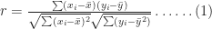
In this case 


The Pearson coefficient, can vary between -1 and 1: the former being a perfect negative correlation and the latter a perfect positive one [Note: The Pearson coefficient is sometimes referred to as the product-moment correlation coefficient]. On calculating
If A and B are correlated as discussed above, simulations which assume the tasks to be independent will not be correct. In the remainder of this article I’ll discuss how correlations affect overall task durations via a Monte Carlo simulation of the aforementioned example.
Simulating correlated project tasks
There are two considerations when simulating correlated tasks. The first is to characterize the correlation accurately. For the purposes of the present discussion I’ll assume that the correlation is described adequately by a single coefficient as discussed in the previous section. The second issue is to generate correlated completion times that satisfy the individual task duration distributions (Remember that the two tasks A and B have completion times that are described by a triangular distribution with minimum, maximum and most likely times of 2, 4 and 8 days). What we are asking for, in effect, is a way to generate a series of two correlated random numbers, each of which satisfy the triangular distribution.
The best known algorithm to generate correlated sets of random numbers in a way that preserves the individual (input) distributions is due to Iman and Conover. The beauty of the Iman-Conover algorithm is that it takes the uncorrelated data for tasks A and B (simulated separately) as input and induces the desired correlation by simply re-ordering the uncorrelated data. Since the original data is not changed, the distributions for A and B are preserved. Although the idea behind the method is simple, it is technically quite complex. The details of the technique aren’t important – but I offer a partial “hand-waving” explanation in the appendix at the end of this post. Fortunately I didn’t have to implement the Iman-Conover algorithm because someone else has done the hard work: Steve Roxburgh has written a graphical tool to generate sets of correlated random variables using the technique (follow this link to download the software and this one to view a brief tutorial) . I used Roxburgh’s utility to generate sets of random variables for my simulations.
I looked at two cases: the first with no correlation between A and B and the second with a correlation of 0.79 between A and B. Each simulation consisted of 10,000 trials – basically I generated two sets of 10,000 triangularly-distributed random numbers, the first with a correlation coefficient close to zero and the second with a correlation coefficient of 0.79. Figures 2 and 3 depict scatter plots of the durations of A vs. the durations of B (for the same trial) for the uncorrelated and correlated cases. The correlation is pretty clear to see in Figure 3.

Figure 2: Scatter plot of duration of A vs. duration of B (uncorrelated)

Figure 3: Scatter plot of duration of A vs. duration of B (correlated)
To check that the generated trials for A and B do indeed satisfy the triangular distribution, I divided the difference between the minimum and maximum times (for the individual tasks) into 0.5 day intervals and plotted the number of trials that fall into each interval. The resulting histograms are shown in Figure 4. Note that the blue and red bars are frequency plots for the case where A and B are uncorrelated and the green and pink (purple?) bars are for the case where they are correlated.

Figure 4: Frequency histograms for A and B (correlated and uncorrelated)
The histograms for all four cases are very similar, demonstrating that they all follow the specified triangular distribution. Figures 2 through 4 give confidence (but do not prove!) that Roxburgh’s utility works as advertised: i.e. that it generates sets of correlated random numbers in a way that preserves the desired distribution.
Now, to simulate A and B in sequence I simply added the durations of the individual tasks for each trial. I did this twice – once each for the correlated and uncorrelated data sets – which yielded two sets of completion times, varying between 4 days (the theoretical minimum) and 16 days (the theoretical maximum). As before, I plotted a frequency histogram for the uncorrelated and correlated case (see Figure 5). Note that the difference in the heights of the bars has no significance – it is an artefact of having the same number of trials (10,000) in both cases. What is significant is the difference in the spread of the two plots – the correlated case has a greater spread signifying an increased probability of very low and very high completion times compared to the uncorrelated case.

Figure 5: Frequency histograms for overall duration (blue=uncorrelated, red=correlated)
Note that the uncorrelated case resembles a Normal distribution – it is more symmetric than the original triangular distribution. This is a consequence of the Central Limit Theorem which states that the sum of identically distributed, independent (i.e. uncorrelated) random numbers is Normally distributed, regardless of the form of original distribution. The correlated distribution, on the other hand, has retained the shape of the original triangular distribution. This is no surprise: the relatively high correlation coefficient ensures that A and B will behave in a similar fashion and, hence, so will their sum.
Figure 6 is a plot of the cumulative distribution function (CDF) for the uncorrelated and correlated cases. The value of the CDFat any time 

Figure 6: Cumulative probability distribution for uncorrelated (blue) and correlated (red) cases
The cumulative distribution clearly shows the greater spread in the correlated case: for small values of 
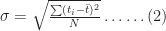
wher 

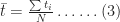
In both (2) and (3) 
The averages,
So, the simulations tell us that correlations increase uncertainty. Let’s try to understand why this happens. Basically, if tasks are correlated positively, they “track” each other: that is, if one takes a long time so will the other (with the same holding for short durations). The upshot of this is that the overall completion time tends to get “stretched” if the first task takes longer than average whereas it gets “compressed” if the first task finishes earlier than average. Since the net effect of stretching and compressing would balance out, we would expect the mean completion time (or any other measure of central tendency – such as the mode or median) to be relatively unaffected. However, because extremes are amplified, we would expect the spread of the distribution to increase.
Wrap-up
In this post I have highlighted the effect of task correlations on project schedules by comparing the results of simulations for two sequential tasks with and without correlations. The example shows that correlations can increase uncertainty. The mechanism is easy to understand: correlations tend to amplify extreme outcomes, thus increasing the spread in the resulting distribution. The effect of the correlation (compared to the uncorrelated case) can be quantified by comparing the standard deviations of the two cases.
Of course, quantifying correlations using a single number is simplistic – real life correlations have all kinds of complex dependencies. Nevertheless, it is a useful first step because it helps one develop an intuition for what might happen in more complicated cases: in hindsight it is easy to see that (positive) correlations will amplify extremes, but the simple model helped me really see it.
— —
Appendix – more on the Iman-Conover algorithm
Below I offer a hand-waving, half- explanation of how the technique works; those interested in a proper, technical explanation should see this paper by Simon Midenhall.
Before I launch off into my explanation, I’ll need to take a bit of a detour on coefficients of correlation. The title of Iman and Conover’s paper talks about rank correlation which is different from product-moment (or Pearson) correlation discussed in this post. A popular measure of rank correlation is the Spearman coefficient, 

where 
| duration A (days) | duration B (days) | rank A | rank B | rank difference squared |
| 2.5 | 3 | 1 | 1 | 0 |
| 3 | 3 | 2 | 1 | 1 |
| 7 | 7.5 | 10 | 10 | 0 |
| 6 | 4.5 | 8 | 5 | 9 |
| 5.5 | 3.5 | 7 | 3 | 16 |
| 4.5 | 4.5 | 5 | 5 | 0 |
| 5 | 5.5 | 6 | 9 | 9 |
| 4 | 4.5 | 4 | 5 | 1 |
| 6 | 5 | 8 | 8 | 0 |
| 3 | 3.5 | 2 | 3 | 1 |
Note that ties cause the subsequent number to be skipped.
The last column lists the rank differences, 
With that background about the rank correlation, we can now move on to a brief discussion of the Iman-Conover algorithm.
In essence, the Iman-Conover method relies on reordering the set of to-be-correlated variables to have the same rank order as a reference distribution which has the desired correlation. To paraphrase from Midenhall’s paper (my two cents in italics):
Given two samples of n values from known distributions X and Y (the triangular distributions for A and B in this case) and a desired correlation between them (of 0.78), first determine a sample from a reference distribution that has exactly the desired linear correlation (of 0.78). Then re-order the samples from X and Y to have the same rank order as the reference distribution. The output will be a sample with the correct (individual, triangular) distributions and with rank correlation coefficient equal to that of the reference distribution…. Since linear (Pearson) correlation and rank correlation are typically close, the output has approximately the desired correlation structure…
The idea is beautifully simple, but a problem remains. How does one calculate the required reference distribution? Unfortunately, this is a fairly technical affair for which I could not find a simple explanation – those interested in a proper, technical discussion of the technique should see Chapter 4 of Midenhall’s paper or the original paper by Iman and Conover.
For completeness I should note that some folks have criticised the use of the Iman-Conover algorithm on the grounds that it generates rank correlated random variables instead of Pearson correlated ones. This is a minor technicality which does not impact the main conclusion of this post: i.e. that correlations increase uncertainty.


