Archive for the ‘Data Analytics’ Category
A gentle introduction to data visualisation using R
Data science students often focus on machine learning algorithms, overlooking some of the more routine but important skills of the profession. I’ve lost count of the number of times I have advised students working on projects for industry clients to curb their keenness to code and work on understanding the data first. This is important because, as people (ought to) know, data doesn’t speak for itself, it has to be given a voice; and as data-scarred professionals know from hard-earned experience, one of the best ways to do this is through visualisation.
Data visualisation is sometimes (often?) approached as a bag of tricks to be learnt individually, with no little or no reference to any underlying principles. Reading Hadley Wickham’s paper on the grammar of graphics was an epiphany; it showed me how different types of graphics can be constructed in a consistent way using common elements. Among other things, the grammar makes visualisation a logical affair rather than a set of tricks. This post is a brief – and hopefully logical – introduction to visualisation using ggplot2, Wickham’s implementation of a grammar of graphics.
In keeping with the practical bent of this series we’ll focus on worked examples, illustrating elements of the grammar as we go along. We’ll first briefly describe the elements of the grammar and then show how these are used to build different types of visualisations.
A grammar of graphics
Most visualisations are constructed from common elements that are pieced together in prescribed ways. The elements can be grouped into the following categories:
- Data – this is obvious, without data there is no story to tell and definitely no plot!
- Mappings – these are correspondences between data and display elements such as spatial location, shape or colour. Mappings are referred to as aesthetics in Wickham’s grammar.
- Scales – these are transformations (conversions) of data values to numbers that can be displayed on-screen. There should be one scale per mapping. ggplot typically does the scaling transparently, without users having to worry about it. One situation in which you might need to mess with default scales is when you want to zoom in on a particular range of values. We’ll see an example or two of this later in this article.
- Geometric objects – these specify the geometry of the visualisation. For example, in ggplot2 a scatter plot is specified via a point geometry whereas a fitting curve is represented by a smooth geometry. ggplot2 has a range of geometries available of which we will illustrate just a few.
- Coordinate system – this specifies the system used to position data points on the graphic. Examples of coordinate systems are Cartesian and polar. We’ll deal with Cartesian systems in this tutorial. See this post for a nice illustration of how one can use polar plots creatively.
- Facets – a facet specifies how data can be split over multiple plots to improve clarity. We’ll look at this briefly towards the end of this article.
The basic idea of a layered grammar of graphics is that each of these elements can be combined – literally added layer by layer – to achieve a desired visual result. Exactly how this is done will become clear as we work through some examples. So without further ado, let’s get to it.
Hatching (gg)plots
In what follows we’ll use the NSW Government Schools dataset, made available via the state government’s open data initiative. The data is in csv format. If you cannot access the original dataset from the aforementioned link, you can download an Excel file with the data here (remember to save it as a csv before running the code!).
The first task – assuming that you have a working R/RStudio environment – is to load the data into R. To keep things simple we’ll delete a number of columns (as shown in the code) and keep only rows that are complete, i.e. those that have no missing values. Here’s the code:
A note regarding the last line of code above, a couple of schools have “np” entered for the student_number variable. These are coerced to NA in the numeric conversion. The last line removes these two schools from the dataset.
Apart from student numbers and location data, we have retained level of schooling (primary, secondary etc.) and ICSEA ranking. The location information includes attributes such as suburb, postcode, region, remoteness as well as latitude and longitude. We’ll use only remoteness in this post.
The first thing that caught my eye in the data was was the ICSEA ranking. Before going any further, I should mention that the Australian Curriculum Assessment and Reporting Authority (the organisation responsible for developing the ICSEA system) emphasises that the score is not a school ranking, but a measure of socio-educational advantage of the student population in a school. Among other things, this is related to family background and geographic location. The average ICSEA score is set at an average of 1000, which can be used as a reference level.
I thought a natural first step would be to see how ICSEA varies as a function of the other variables in the dataset such as student numbers and location (remoteness, for example). To begin with, let’s plot ICSEA rank as a function of student number. As it is our first plot, let’s take it step by step to understand how the layered grammar works. Here we go:
This displays a blank plot because we have not specified a mapping and geometry to go with the data. To get a plot we need to specify both. Let’s start with a scatterplot, which is specified via a point geometry. Within the geometry function, variables are mapped to visual properties of the using aesthetic mappings. Here’s the code:
The resulting plot is shown in Figure 1.
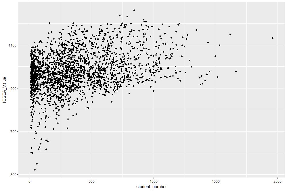
Figure 1: Scatterplot of ICSEA score versus student numbers
At first sight there are two points that stand out: 1) there are fewer number of large schools, which we’ll look into in more detail later and 2) larger schools seem to have a higher ICSEA score on average. To dig a little deeper into the latter, let’s add a linear trend line. We do that by adding another layer (geometry) to the scatterplot like so:
The result is shown in Figure 2.
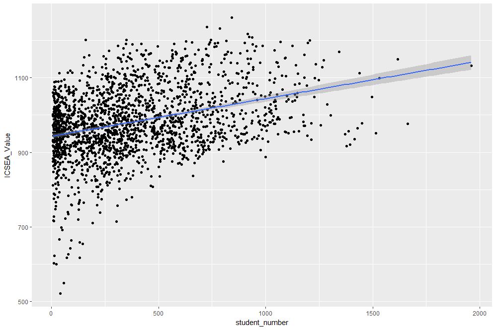
Figure 2: scatterplot of ICSEA vs student number with linear trendline
The lm method does a linear regression on the data. The shaded area around the line is the 95% confidence level of the regression line (i.e that it is 95% certain that the true regression line lies in the shaded region). Note that geom_smooth provides a range of smoothing functions including generalised linear and local regression (loess) models.
You may have noted that we’ve specified the aesthetic mappings in both geom_point and geom_smooth. To avoid this duplication, we can simply specify the mapping, once in the top level ggplot call (the first layer) like so:
geom_point()+
geom_smooth(method=”lm”)
From Figure 2, one can see a clear positive correlation between student numbers and ICSEA scores, let’s zoom in around the average value (1000) to see this more clearly…
The coord_cartesian function is used to zoom the plot to without changing any other settings. The result is shown in Figure 3.

Figure 3: Zoomed view of Figure 2 for 900 < ICSEA <1100
To make things clearer, let’s add a reference line at the average:
The result, shown in Figure 4, indicates quite clearly that larger schools tend to have higher ICSEA scores. That said, there is a twist in the tale which we’ll come to a bit later.
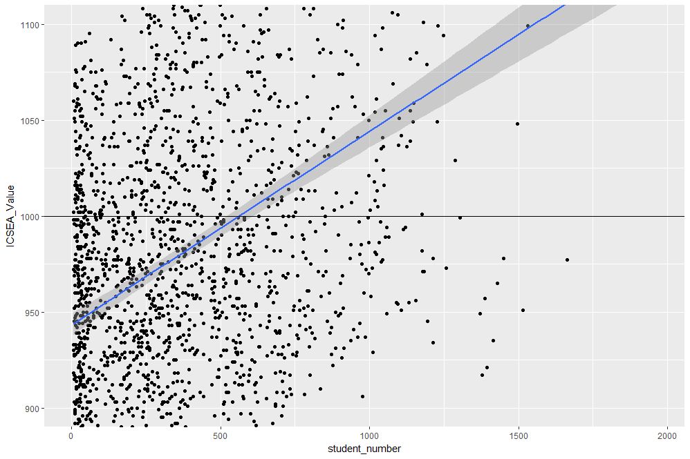
Figure 4: Zoomed view with reference line at average value of ICSEA
As a side note, you would use geom_vline to zoom in on a specific range of x values and geom_abline to add a reference line with a specified slope and intercept. See this article on ggplot reference lines for more.
OK, now that we have seen how ICSEA scores vary with student numbers let’s switch tack and incorporate another variable in the mix. An obvious one is remoteness. Let’s do a scatterplot as in Figure 1, but now colouring each point according to its remoteness value. This is done using the colour aesthetic as shown below:
geom_point()
The resulting plot is shown in Figure 5.

Figure 5: ICSEA score as a function of student number and remoteness category
Aha, a couple of things become apparent. First up, large schools tend to be in metro areas, which makes good sense. Secondly, it appears that metro area schools have a distinct socio-educational advantage over regional and remote area schools. Let’s add trendlines by remoteness category as well to confirm that this is indeed so:
The plot, which is shown in Figure 6, indicates clearly that ICSEA scores decrease on the average as we move away from metro areas.
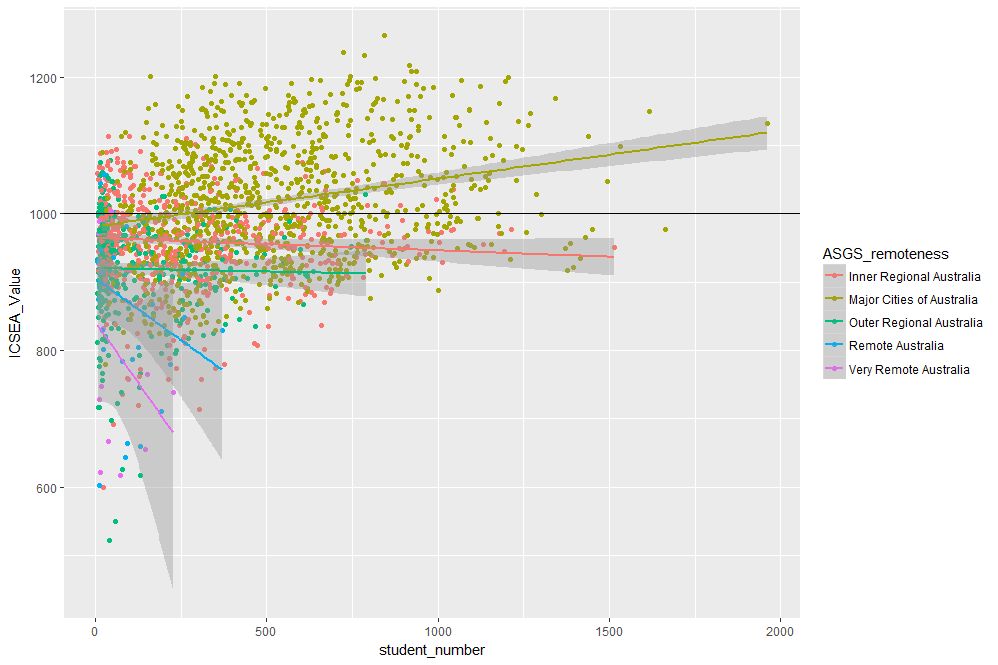
Figure 6: ICSEA scores vs student numbers and remoteness, with trendlines for each remoteness category
Moreover, larger schools metropolitan areas tend to have higher than average scores (above 1000), regional areas tend to have lower than average scores overall, with remote areas being markedly more disadvantaged than both metro and regional areas. This is no surprise, but the visualisations show just how stark the differences are.
It is also interesting that, in contrast to metro and (to some extent) regional areas, there negative correlation between student numbers and scores for remote schools. One can also use local regression to get a better picture of how ICSEA varies with student numbers and remoteness. To do this, we simply use the loess method instead of lm:
geom_point() + geom_hline(yintercept=1000) + geom_smooth(method=”loess”)
The result, shown in Figure 7, has a number of interesting features that would have been worth pursuing further were we analysing this dataset in a real life project. For example, why do small schools tend to have lower than benchmark scores?

Figure 7: ICSEA scores vs student numbers and remoteness with loess regression curves.
From even a casual look at figures 6 and 7, it is clear that the confidence intervals for remote areas are huge. This suggests that the number of datapoints for these regions are a) small and b) very scattered. Let’s quantify the number by getting counts using the table function (I know, we could plot this too…and we will do so a little later). We’ll also transpose the results using data.frame to make them more readable:
The number of datapoints for remote regions is much less than those for metro and regional areas. Let’s repeat the loess plot with only the two remote regions. Here’s the code:
geom_point() + geom_hline(yintercept=1000) + geom_smooth(method=”loess”)
The plot, shown in Figure 8, shows that there is indeed a huge variation in the (small number) of datapoints, and the confidence intervals reflect that. An interesting feature is that some small remote schools have above average scores. If we were doing a project on this data, this would be a feature worth pursuing further as it would likely be of interest to education policymakers.

Figure 8: Loess plots as in Figure 7 for remote region schools
Note that there is a difference in the x axis scale between Figures 7 and 8 – the former goes from 0 to 2000 whereas the latter goes up to 400 only. So for a fair comparison, between remote and other areas, you may want to re-plot Figure 7, zooming in on student numbers between 0 and 400 (or even less). This will also enable you to see the complicated dependence of scores on student numbers more clearly across all regions.
We’ll leave the scores vs student numbers story there and move on to another geometry – the well-loved bar chart. The first one is a visualisation of the remoteness category count that we did earlier. The relevant geometry function is geom_bar, and the code is as easy as:
The plot is shown in Figure 9.
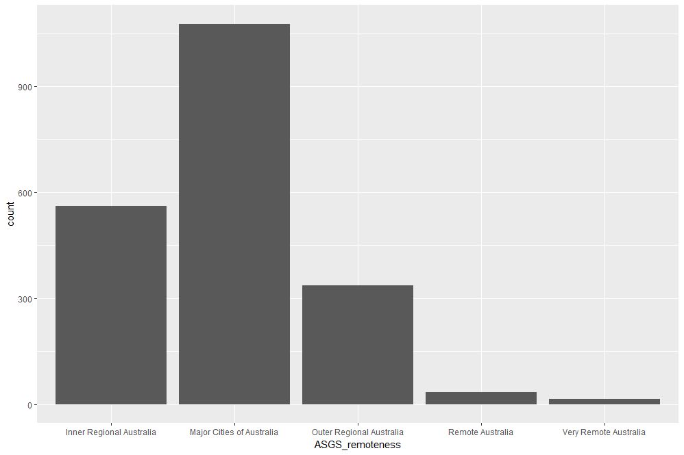
Figure 9: School count by remoteness categories
The category labels on the x axis are too long and look messy. This can be fixed by tilting them to a 45 degree angle so that they don’t run into each other as they most likely did when you ran the code on your computer. This is done by modifying the axis.text element of the plot theme. Additionally, it would be nice to get counts on top of each category bar. The way to do that is using another geometry function, geom_text. Here’s the code incorporating the two modifications:
theme(axis.text.x=element_text(angle=45, hjust=1))
The result is shown in Figure 10.

Figure 10: Bar plot of remoteness with counts and angled x labels
Some things to note: : stat=count tells ggplot to compute counts by category and the aesthetic label = ..count.. tells ggplot to access the internal variable that stores those counts. The the vertical justification setting, vjust=-1, tells ggplot to display the counts on top of the bars. Play around with different values of vjust to see how it works. The code to adjust label angles is self explanatory.
It would be nice to reorder the bars by frequency. This is easily done via fct_infreq function in the forcats package like so:
geom_bar(mapping = aes(x=fct_infreq(ASGS_remoteness)))+
theme(axis.text.x=element_text(angle=45, hjust=1))
The result is shown in Figure 11.

Figure 11: Barplot of Figure 10 sorted by descending count
To reverse the order, invoke fct_rev, which reverses the sort order:
geom_bar(mapping = aes(x=fct_rev(fct_infreq(ASGS_remoteness))))+
theme(axis.text.x=element_text(angle=45, hjust=1))
The resulting plot is shown in Figure 12.
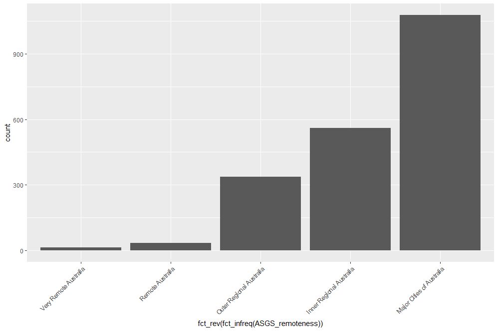
Figure 12: Bar plot of Figure 10 sorted by ascending count
If this is all too grey for us, we can always add some colour. This is done using the fill aesthetic as follows:
geom_bar(mapping = aes(x=ASGS_remoteness, fill=ASGS_remoteness))+
theme(axis.text.x=element_text(angle=45, hjust=1))
The resulting plot is shown in Figure 13.

Figure 13: Coloured bar plot of school count by remoteness
Note that, in the above, that we have mapped fill and x to the same variable, remoteness which makes the legend superfluous. I will leave it to you to figure out how to suppress the legend – Google is your friend.
We could also map fill to another variable, which effectively adds another dimension to the plot. Here’s how:
geom_bar(mapping = aes(x=ASGS_remoteness, fill=level_of_schooling))+
theme(axis.text.x=element_text(angle=45, hjust=1))
The plot is shown in Figure 14. The new variable, level of schooling, is displayed via proportionate coloured segments stacked up in each bar. The default stacking is one on top of the other.

Figure 14: Bar plot of school counts as a function of remoteness and school level
Alternately, one can stack them up side by side by setting the position argument to dodge as follows:
geom_bar(mapping = aes(x=ASGS_remoteness,fill=level_of_schooling),position =”dodge”)+
theme(axis.text.x=element_text(angle=45, hjust=1))
The plot is shown in Figure 15.

Figure 15: Same data as in Figure 14 stacked side-by-side
Finally, setting the position argument to fill normalises the bar heights and gives us the proportions of level of schooling for each remoteness category. That sentence will make more sense when you see Figure 16 below. Here’s the code, followed by the figure:
geom_bar(mapping = aes(x=ASGS_remoteness,fill=level_of_schooling),position = “fill”)+
theme(axis.text.x=element_text(angle=45, hjust=1))
Obviously, we lose frequency information since the bar heights are normalised.
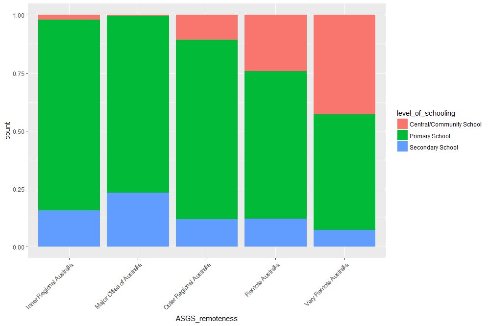
Figure 16: Proportions of school levels for remoteness categories
An interesting feature here is that the proportion of central and community schools increases with remoteness. Unlike primary and secondary schools, central / community schools provide education from Kindergarten through Year 12. As remote areas have smaller numbers of students, it makes sense to consolidate educational resources in institutions that provide schooling at all levels .
Finally, to close the loop so to speak, let’s revisit our very first plot in Figure 1 and try to simplify it in another way. We’ll use faceting to split it out into separate plots, one per remoteness category. First, we’ll organise the subplots horizontally using facet_grid:
facet_grid(~ASGS_remoteness)
The plot is shown in Figure 17 in which the different remoteness categories are presented in separate plots (facets) against a common y axis. It shows, the sharp differences between student numbers between remote and other regions.
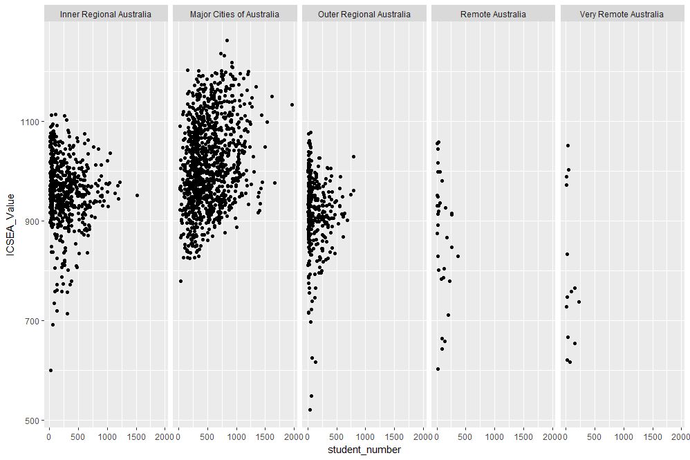
Figure 17: Horizontally laid out facet plots of ICSEA scores for different remoteness categories
To get a vertically laid out plot, switch the faceted variable to other side of the formula (left as an exercise for you).
If one has too many categories to fit into a single row, one can wrap the facets using facet_wrap like so:
geom_point(mapping = aes(x=student_number,y=ICSEA_Value))+
facet_wrap(~ASGS_remoteness, ncol= 2)
The resulting plot is shown in Figure 18.

Figure 18: Same data as in Figure 17, with facets wrapped in a 2 column format
One can specify the number of rows instead of columns. I won’t illustrate that as the change in syntax is quite obvious.
…and I think that’s a good place to stop.
Wrapping up
Data visualisation has a reputation of being a dark art, masterable only by the visually gifted. This may have been partially true some years ago, but in this day and age it definitely isn’t. Versatile packages such as ggplot, that use a consistent syntax have made the art much more accessible to visually ungifted folks like myself. In this post I have attempted to provide a brief and (hopefully) logical introduction to ggplot. In closing I note that although some of the illustrative examples violate the principles of good data visualisation, I hope this article will serve its primary purpose which is pedagogic rather than artistic.
Further reading:
Where to go for more? Two of the best known references are Hadley Wickham’s books:
I highly recommend his R for Data Science , available online here. Apart from providing a good overview of ggplot, it is an excellent introduction to R for data scientists. If you haven’t read it, do yourself a favour and buy it now.
People tell me his ggplot book is an excellent book for those wanting to learn the ins and outs of ggplot . I have not read it myself, but if his other book is anything to go by, it should be pretty damn good.
A gentle introduction to logistic regression and lasso regularisation using R
In this day and age of artificial intelligence and deep learning, it is easy to forget that simple algorithms can work well for a surprisingly large range of practical business problems. And the simplest place to start is with the granddaddy of data science algorithms: linear regression and its close cousin, logistic regression. Indeed, in his acclaimed MOOC and accompanying textbook, Yaser Abu-Mostafa spends a good portion of his time talking about linear methods, and with good reason too: linear methods are not only a good way to learn the key principles of machine learning, they can also be remarkably helpful in zeroing in on the most important predictors.
My main aim in this post is to provide a beginner level introduction to logistic regression using R and also introduce LASSO (Least Absolute Shrinkage and Selection Operator), a powerful feature selection technique that is very useful for regression problems. Lasso is essentially a regularization method. If you’re unfamiliar with the term, think of it as a way to reduce overfitting using less complicated functions (and if that means nothing to you, check out my prelude to machine learning). One way to do this is to toss out less important variables, after checking that they aren’t important. As we’ll discuss later, this can be done manually by examining p-values of coefficients and discarding those variables whose coefficients are not significant. However, this can become tedious for classification problems with many independent variables. In such situations, lasso offers a neat way to model the dependent variable while automagically selecting significant variables by shrinking the coefficients of unimportant predictors to zero. All this without having to mess around with p-values or obscure information criteria. How good is that?
Why not linear regression?
In linear regression one attempts to model a dependent variable (i.e. the one being predicted) using the best straight line fit to a set of predictor variables. The best fit is usually taken to be one that minimises the root mean square error, which is the sum of square of the differences between the actual and predicted values of the dependent variable. One can think of logistic regression as the equivalent of linear regression for a classification problem. In what follows we’ll look at binary classification – i.e. a situation where the dependent variable takes on one of two possible values (Yes/No, True/False, 0/1 etc.).
First up, you might be wondering why one can’t use linear regression for such problems. The main reason is that classification problems are about determining class membership rather than predicting variable values, and linear regression is more naturally suited to the latter than the former. One could, in principle, use linear regression for situations where there is a natural ordering of categories like High, Medium and Low for example. However, one then has to map sub-ranges of the predicted values to categories. Moreover, since predicted values are potentially unbounded (in data as yet unseen) there remains a degree of arbitrariness associated with such a mapping.
Logistic regression sidesteps the aforementioned issues by modelling class probabilities instead. Any input to the model yields a number lying between 0 and 1, representing the probability of class membership. One is still left with the problem of determining the threshold probability, i.e. the probability at which the category flips from one to the other. By default this is set to p=0.5, but in reality it should be settled based on how the model will be used. For example, for a marketing model that identifies potentially responsive customers, the threshold for a positive event might be set low (much less than 0.5) because the client does not really care about mailouts going to a non-responsive customer (the negative event). Indeed they may be more than OK with it as there’s always a chance – however small – that a non-responsive customer will actually respond. As an opposing example, the cost of a false positive would be high in a machine learning application that grants access to sensitive information. In this case, one might want to set the threshold probability to a value closer to 1, say 0.9 or even higher. The point is, the setting an appropriate threshold probability is a business issue, not a technical one.
Logistic regression in brief
So how does logistic regression work?
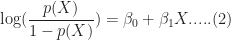
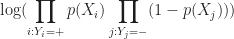
For the discussion let’s assume that the outcome (predicted variable) and predictors are denoted by Y and X respectively and the two classes of interest are denoted by + and – respectively. We wish to model the conditional probability that the outcome Y is +, given that the input variables (predictors) are X. The conditional probability is denoted by p(Y=+|X) which we’ll abbreviate as p(X) since we know we are referring to the positive outcome Y=+.
As mentioned earlier, we are after the probability of class membership so we must ensure that the hypothesis function (a fancy word for the model) always lies between 0 and 1. The function assumed in logistic regression is:

You can verify that 


Figure 1: Logistic function
As an aside, you might be wondering where the name logistic comes from. An equivalent way of expressing the above equation is:
The quantity on the left is the logarithm of the odds. So, the model is a linear regression of the log-odds, sometimes called logit, and hence the name logistic.
The problem is to find the values of 

Where 
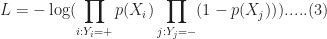
It should be noted that in practice one works with the log likelihood because it is easier to work with mathematically. Moreover, one minimises the negative log likelihood which, of course, is the same as maximising the log likelihood. The quantity one minimises is thus:
However, these are technical details that I mention only for completeness. As you will see next, they have little bearing on the practical use of logistic regression.
Logistic regression in R – an example
In this example, we’ll use the logistic regression option implemented within the glm function that comes with the base R installation. This function fits a class of models collectively known as generalized linear models. We’ll apply the function to the Pima Indian Diabetes dataset that comes with the mlbench package. The code is quite straightforward – particularly if you’ve read earlier articles in my “gentle introduction” series – so I’ll just list the code below noting that the logistic regression option is invoked by setting family=”binomial” in the glm function call.
Here we go:
Although this seems pretty good, we aren’t quite done because there is an issue that is lurking under the hood. To see this, let’s examine the information output from the model summary, in particular the coefficient estimates (i.e. estimates for 
- Column 2 in the table lists coefficient estimates.
- Column 3 list s the standard error of the estimates (the larger the standard error, the less confident we are about the estimate)
- Column 4 the z statistic (which is the coefficient estimate (column 2) divided by the standard error of the estimate (column 3)) and
- The last column (Pr(>|z|) lists the p-value, which is the probability of getting the listed estimate assuming the predictor has no effect. In essence, the smaller the p-value, the more significant the estimate is likely to be.
From the table we can conclude that only 4 predictors are significant – pregnant, glucose, mass and pedigree (and possibly a fifth – pressure). The other variables have little predictive power and worse, may contribute to overfitting. They should, therefore, be eliminated and we’ll do that in a minute. However, there’s an important point to note before we do so…
In this case we have only 9 variables, so are able to identify the significant ones by a manual inspection of p-values. As you can well imagine, such a process will quickly become tedious as the number of predictors increases. Wouldn’t it be be nice if there were an algorithm that could somehow automatically shrink the coefficients of these variables or (better!) set them to zero altogether? It turns out that this is precisely what lasso and its close cousin, ridge regression, do.
Ridge and Lasso
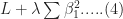
Recall that the values of the logistic regression coefficients 


and

Where 
In the case of ridge regression, the effect of the penalty term is to shrink the coefficients that contribute most to the error. Put another way, it reduces the magnitude of the coefficients that contribute to increasing 
Let’s illustrate this through an example. We’ll use the glmnet package which implements a combined version of ridge and lasso (called elastic net). Instead of minimising (4) or (5) above, glmnet minimises:
![L +\lambda[ (1-\alpha)\sum [\beta_1^2 + \alpha\sum|\beta_1|]....(6)](https://s0.wp.com/latex.php?latex=L+%2B%5Clambda%5B+%281-%5Calpha%29%5Csum+%5B%5Cbeta_1%5E2+%2B+%5Calpha%5Csum%7C%5Cbeta_1%7C%5D....%286%29&bg=ffffff&fg=1c1c1c&s=0&c=20201002)
where 


Lasso regularisation using glmnet
Let’s reanalyse the Pima Indian Diabetes dataset using glmnet with
- does not have a formula interface, so one has to input the predictors as a matrix and the class labels as a vector.
- does not accept categorical predictors, so one has to convert these to numeric values before passing them to glmnet.
The glmnet function model.matrix creates the matrix and also converts categorical predictors to appropriate dummy variables.
Another important point to note is that we’ll use the function cv.glmnet, which automatically performs a grid search to find the optimal value of
OK, enough said, here we go:
The plot is shown in Figure 2 below:
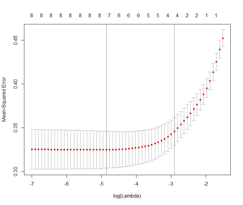
Figure 2: Error as a function of lambda (select lambda that minimises error)
The plot shows that the log of the optimal value of lambda (i.e. the one that minimises the root mean square error) is approximately -5. The exact value can be viewed by examining the variable lambda_min in the code below. In general though, the objective of regularisation is to balance accuracy and simplicity. In the present context, this means a model with the smallest number of coefficients that also gives a good accuracy. To this end, the cv.glmnet function finds the value of lambda that gives the simplest model but also lies within one standard error of the optimal value of lambda. This value of lambda (lambda.1se) is what we’ll use in the rest of the computation. Interested readers should have a look at this article for more on lambda.1se vs lambda.min.
The output shows that only those variables that we had determined to be significant on the basis of p-values have non-zero coefficients. The coefficients of all other variables have been set to zero by the algorithm! Lasso has reduced the complexity of the fitting function massively…and you are no doubt wondering what effect this has on accuracy. Let’s see by running the model against our test data:
Which is a bit less than what we got with the more complex model. So, we get a similar out-of-sample accuracy as we did before, and we do so using a way simpler function (4 non-zero coefficients) than the original one (9 nonzero coefficients). What this means is that the simpler function does at least as good a job fitting the signal in the data as the more complicated one. The bias-variance tradeoff tells us that the simpler function should be preferred because it is less likely to overfit the training data.
Paraphrasing William of Ockham: all other things being equal, a simple hypothesis should be preferred over a complex one.
Wrapping up
In this post I have tried to provide a detailed introduction to logistic regression, one of the simplest (and oldest) classification techniques in the machine learning practitioners arsenal. Despite it’s simplicity (or I should say, because of it!) logistic regression works well for many business applications which often have a simple decision boundary. Moreover, because of its simplicity it is less prone to overfitting than flexible methods such as decision trees. Further, as we have shown, variables that contribute to overfitting can be eliminated using lasso (or ridge) regularisation, without compromising out-of-sample accuracy. Given these advantages and its inherent simplicity, it isn’t surprising that logistic regression remains a workhorse for data scientists.
A prelude to machine learning
What is machine learning?
The term machine learning gets a lot of airtime in the popular and trade press these days. As I started writing this article, I did a quick search for recent news headlines that contained this term. Here are the top three results with datelines within three days of the search:
The truth about hype usually tends to be quite prosaic and so it is in this case. Machine learning, as Professor Yaser Abu-Mostafa puts it, is simply about “learning from data.” And although the professor is referring to computers, this is so for humans too – we learn through patterns discerned from sensory data. As he states in the first few lines of his wonderful (but mathematically demanding!) book entitled, Learning From Data:
If you show a picture to a three-year-old and ask if there’s a tree in it, you will likely get a correct answer. If you ask a thirty year old what the definition of a tree is, you will likely get an inconclusive answer. We didn’t learn what a tree is by studying a [model] of what trees [are]. We learned by looking at trees. In other words, we learned from data.
In other words, the three year old forms a model of what constitutes a tree through a process of discerning a common pattern between all objects that grown-ups around her label “trees.” (the data). She can then “predict” that something is (or is not) a tree by applying this model to new instances presented to her.
This is exactly what happens in machine learning: the computer (or more correctly, the algorithm) builds a predictive model of a variable (like “treeness”) based on patterns it discerns in data. The model can then be applied to predict the value of the variable (e.g. is it a tree or not) in new instances.
With that said for an introduction, it is worth contrasting this machine-driven process of model building with the traditional approach of building mathematical models to predict phenomena as in, say, physics and engineering.
What are models good for?
Physicists and engineers model phenomena using physical laws and mathematics. The aim of such modelling is both to understand and predict natural phenomena. For example, a physical law such as Newton’s Law of Gravitation is itself a model – it helps us understand how gravity works and make predictions about (say) where Mars is going to be six months from now. Indeed, all theories and laws of physics are but models that have wide applicability.
(Aside: Models are typically expressed via differential equations. Most differential equations are hard to solve analytically (or exactly), so scientists use computers to solve them numerically. It is important to note that in this case computers are used as calculation tools, they play no role in model-building.)
As mentioned earlier, the role of models in the sciences is twofold – understanding and prediction. In contrast, in machine learning the focus is usually on prediction rather than understanding. The predictive successes of machine learning have led certain commentators to claim that scientific theory building is obsolete and science can advance by crunching data alone. Such claims are overblown, not to mention, hubristic, for although a data scientist may be able to predict with accuracy, he or she may not be able to tell you why a particular prediction is obtained. This lack of understanding can mislead and can even have harmful consequences, a point that’s worth unpacking in some detail…
Assumptions, assumptions
A model of a real world process or phenomenon is necessarily a simplification. This is essentially because it is impossible to isolate a process or phenomenon from the rest of the world. As a consequence it is impossible to know for certain that the model one has built has incorporated all the interactions that influence the process / phenomenon of interest. It is quite possible that potentially important variables have been overlooked.
The selection of variables that go into a model is based on assumptions. In the case of model building in physics, these assumptions are made upfront and are thus clear to anybody who takes the trouble to read the underlying theory. In machine learning, however, the assumptions are harder to see because they are implicit in the data and the algorithm. This can be a problem when data is biased or an algorithm opaque.
Problem of bias and opacity become more acute as datasets increase in size and algorithms become more complex, especially when applied to social issues that have serious human consequences. I won’t go into this here, but for examples the interested reader may want to have a look at Cathy O’Neil’s book, Weapons of Math Destruction, or my article on the dark side of data science.
As an aside, I should point out that although assumptions are usually obvious in traditional modelling, they are often overlooked out of sheer laziness or, more charitably, lack of awareness. This can have disastrous consequences. The global financial crisis of 2008 can – to some extent – be blamed on the failure of trading professionals to understand assumptions behind the model that was used to calculate the value of collateralised debt obligations.
It all starts with a straight line….
Now that we’ve taken a tour of some of the key differences between model building in the old and new worlds, we are all set to start talking about machine learning proper.
I should begin by admitting that I overstated the point about opacity: there are some machine learning algorithms that are transparent as can possibly be. Indeed, chances are you know the algorithm I’m going to discuss next, either from an introductory statistics course in university or from plotting relationships between two variables in your favourite spreadsheet. Yea, you may have guessed that I’m referring to linear regression.
In its simplest avatar, linear regression attempts to fit a straight line to a set of data points in two dimensions. The two dimensions correspond to a dependent variable (traditionally denoted by 


Figure 1: Linear Regression
Figure 1 also serves to illustrate that linear models are going to be inappropriate in most real world situations (the straight line does not fit the data well). But it is not so hard to devise methods to fit more complicated functions.
The important point here is that since machine learning is about finding functions that accurately predict dependent variables for as yet unknown values of the independent variables, most algorithms make explicit or implicit choices about the form of these functions.
Complexity versus simplicity
At first sight it seems a no-brainer that complicated functions will work better than simple ones. After all, if we choose a nonlinear function with lots of parameters, we should be able to fit a complex data set better than a linear function can (See Figure 2 – the complicated function fits the datapoints better than the straight line). But there’s catch: although the ability to fit a dataset increases with the flexibility of the fitting function, increasing complexity beyond a point will invariably reduce predictive power. Put another way, a complex enough function may fit the known data points perfectly but, as a consequence, will inevitably perform poorly on unknown data. This is an important point so let’s look at it in greater detail.

Figure 2: Simple and complex fitting function (courtesy: Wikimedia)
Recall that the aim of machine learning is to predict values of the dependent variable for as yet unknown values of the independent variable(s). Given a finite (and usually, very limited) dataset, how do we build a model that we can have some confidence in? The usual strategy is to partition the dataset into two subsets, one containing 60 to 80% of the data (called the training set) and the other containing the remainder (called the test set). The model is then built – i.e. an appropriate function fitted – using the training data and verified against the test data. The verification process consists of comparing the predicted values of the dependent variable with the known values for the test set.
Now, it should be intuitively clear that the more complicated the function, the better it will fit the training data.
Question: Why?
Answer: Because complicated functions have more free parameters – for example, linear functions of a single (dependent) variable have two parameters (slope and intercept), quadratics have three, cubics four and so on. The mathematician, John von Neumann is believed to have said, “With four parameters I can fit an elephant, and with five I can make him wiggle his trunk.” See this post for a nice demonstration of the literal truth of his words.
Put another way, complex functions are wrigglier than simple ones, and – by suitable adjustment of parameters – their “wriggliness” can be adjusted to fit the training data better than functions that are less wriggly. Figure 2 illustrates this point well.
This may sound like you can have your cake and eat it too: choose a complicated enough function and you can fit both the training and test data well. Not so! Keep in mind that the resulting model (fitted function) is built using the training set alone, so a good fit to the test data is not guaranteed. In fact, it is intuitively clear that a function that fits the training data perfectly (as in Figure 2) is likely to do a terrible job on the test data.
Question: Why?
Answer: Remember, as far as the model is concerned, the test data is unknown. Hence, the greater the wriggliness in the trained model, the less likely it is to fit the test data well. Remember, once the model is fitted to the training data, you have no freedom to tweak parameters any further.
This tension between simplicity and complexity of models is one of the key principles of machine learning and is called the bias-variance tradeoff. Bias here refers to lack of flexibility and variance, the reducible error. In general simpler functions have greater bias and lower variance and complex functions, the opposite. Much of the subtlety of machine learning lies in developing an understanding of how to arrive at the right level of complexity for the problem at hand – that is, how to tweak parameters so that the resulting function fits the training data just well enough so as to generalise well to unknown data.
Note: those who are curious to learn more about the bias-variance tradeoff may want to have a look at this piece. For details on how to achieve an optimal tradeoff, search for articles on regularization in machine learning.
Unlocking unstructured data
The discussion thus far has focused primarily on quantitative or enumerable data (numbers and categories) that’s stored in a structured format – i.e. as columns and rows in a spreadsheet or database table). This is fine as it goes, but the fact is that much of the data in organisations is unstructured, the most common examples being text documents and audio-visual media. This data is virtually impossible to analyse computationally using relational database technologies (such as SQL) that are commonly used by organisations.
The situation has changed dramatically in the last decade or so. Text analysis techniques that once required expensive software and high-end computers have now been implemented in open source languages such as Python and R, and can be run on personal computers. For problems that require computing power and memory beyond that, cloud technologies make it possible to do so cheaply. In my opinion, the ability to analyse textual data is the most important advance in data technologies in the last decade or so. It unlocks a world of possibilities for the curious data analyst. Just think, all those comment fields in your survey data can now be analysed in a way that was never possible in the relational world!
There is a general impression that text analysis is hard. Although some of the advanced techniques can take a little time to wrap one’s head around, the basics are simple enough. Yea, I really mean that – for proof, check out my tutorial on the topic.
Wrapping up
I could go on for a while. Indeed, I was planning to delve into a few algorithms of increasing complexity (from regression to trees and forests to neural nets) and then close with a brief peek at some of the more recent headline-grabbing developments like deep learning. However, I realised that such an exploration would be too long and (perhaps more importantly) defeat the main intent of this piece which is to give starting students an idea of what machine learning is about, and how it differs from preexisting techniques of data analysis. I hope I have succeeded, at least partially, in achieving that aim.
For those who are interested in learning more about machine learning algorithms, I can suggest having a look at my “Gentle Introduction to Data Science using R” series of articles. Start with the one on text analysis (link in last line of previous section) and then move on to clustering, topic modelling, naive Bayes, decision trees, random forests and support vector machines. I’m slowly adding to the list as I find the time, so please do check back again from time to time.
Note: This post is written as an introduction to the Data, Algorithms and Meaning subject that is part of the core curriculum of the Master of Data Science and Innovation program at UTS. I’m co-teaching the subject in Autumn 2018 with Alex Scriven and Rory Angus.


