Archive for the ‘R’ Category
A gentle introduction to logistic regression and lasso regularisation using R
In this day and age of artificial intelligence and deep learning, it is easy to forget that simple algorithms can work well for a surprisingly large range of practical business problems. And the simplest place to start is with the granddaddy of data science algorithms: linear regression and its close cousin, logistic regression. Indeed, in his acclaimed MOOC and accompanying textbook, Yaser Abu-Mostafa spends a good portion of his time talking about linear methods, and with good reason too: linear methods are not only a good way to learn the key principles of machine learning, they can also be remarkably helpful in zeroing in on the most important predictors.
My main aim in this post is to provide a beginner level introduction to logistic regression using R and also introduce LASSO (Least Absolute Shrinkage and Selection Operator), a powerful feature selection technique that is very useful for regression problems. Lasso is essentially a regularization method. If you’re unfamiliar with the term, think of it as a way to reduce overfitting using less complicated functions (and if that means nothing to you, check out my prelude to machine learning). One way to do this is to toss out less important variables, after checking that they aren’t important. As we’ll discuss later, this can be done manually by examining p-values of coefficients and discarding those variables whose coefficients are not significant. However, this can become tedious for classification problems with many independent variables. In such situations, lasso offers a neat way to model the dependent variable while automagically selecting significant variables by shrinking the coefficients of unimportant predictors to zero. All this without having to mess around with p-values or obscure information criteria. How good is that?
Why not linear regression?
In linear regression one attempts to model a dependent variable (i.e. the one being predicted) using the best straight line fit to a set of predictor variables. The best fit is usually taken to be one that minimises the root mean square error, which is the sum of square of the differences between the actual and predicted values of the dependent variable. One can think of logistic regression as the equivalent of linear regression for a classification problem. In what follows we’ll look at binary classification – i.e. a situation where the dependent variable takes on one of two possible values (Yes/No, True/False, 0/1 etc.).
First up, you might be wondering why one can’t use linear regression for such problems. The main reason is that classification problems are about determining class membership rather than predicting variable values, and linear regression is more naturally suited to the latter than the former. One could, in principle, use linear regression for situations where there is a natural ordering of categories like High, Medium and Low for example. However, one then has to map sub-ranges of the predicted values to categories. Moreover, since predicted values are potentially unbounded (in data as yet unseen) there remains a degree of arbitrariness associated with such a mapping.
Logistic regression sidesteps the aforementioned issues by modelling class probabilities instead. Any input to the model yields a number lying between 0 and 1, representing the probability of class membership. One is still left with the problem of determining the threshold probability, i.e. the probability at which the category flips from one to the other. By default this is set to p=0.5, but in reality it should be settled based on how the model will be used. For example, for a marketing model that identifies potentially responsive customers, the threshold for a positive event might be set low (much less than 0.5) because the client does not really care about mailouts going to a non-responsive customer (the negative event). Indeed they may be more than OK with it as there’s always a chance – however small – that a non-responsive customer will actually respond. As an opposing example, the cost of a false positive would be high in a machine learning application that grants access to sensitive information. In this case, one might want to set the threshold probability to a value closer to 1, say 0.9 or even higher. The point is, the setting an appropriate threshold probability is a business issue, not a technical one.
Logistic regression in brief
So how does logistic regression work?
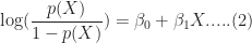
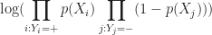
For the discussion let’s assume that the outcome (predicted variable) and predictors are denoted by Y and X respectively and the two classes of interest are denoted by + and – respectively. We wish to model the conditional probability that the outcome Y is +, given that the input variables (predictors) are X. The conditional probability is denoted by p(Y=+|X) which we’ll abbreviate as p(X) since we know we are referring to the positive outcome Y=+.
As mentioned earlier, we are after the probability of class membership so we must ensure that the hypothesis function (a fancy word for the model) always lies between 0 and 1. The function assumed in logistic regression is:

You can verify that 


Figure 1: Logistic function
As an aside, you might be wondering where the name logistic comes from. An equivalent way of expressing the above equation is:
The quantity on the left is the logarithm of the odds. So, the model is a linear regression of the log-odds, sometimes called logit, and hence the name logistic.
The problem is to find the values of 

Where 
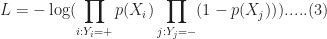
It should be noted that in practice one works with the log likelihood because it is easier to work with mathematically. Moreover, one minimises the negative log likelihood which, of course, is the same as maximising the log likelihood. The quantity one minimises is thus:
However, these are technical details that I mention only for completeness. As you will see next, they have little bearing on the practical use of logistic regression.
Logistic regression in R – an example
In this example, we’ll use the logistic regression option implemented within the glm function that comes with the base R installation. This function fits a class of models collectively known as generalized linear models. We’ll apply the function to the Pima Indian Diabetes dataset that comes with the mlbench package. The code is quite straightforward – particularly if you’ve read earlier articles in my “gentle introduction” series – so I’ll just list the code below noting that the logistic regression option is invoked by setting family=”binomial” in the glm function call.
Here we go:
Although this seems pretty good, we aren’t quite done because there is an issue that is lurking under the hood. To see this, let’s examine the information output from the model summary, in particular the coefficient estimates (i.e. estimates for 
- Column 2 in the table lists coefficient estimates.
- Column 3 list s the standard error of the estimates (the larger the standard error, the less confident we are about the estimate)
- Column 4 the z statistic (which is the coefficient estimate (column 2) divided by the standard error of the estimate (column 3)) and
- The last column (Pr(>|z|) lists the p-value, which is the probability of getting the listed estimate assuming the predictor has no effect. In essence, the smaller the p-value, the more significant the estimate is likely to be.
From the table we can conclude that only 4 predictors are significant – pregnant, glucose, mass and pedigree (and possibly a fifth – pressure). The other variables have little predictive power and worse, may contribute to overfitting. They should, therefore, be eliminated and we’ll do that in a minute. However, there’s an important point to note before we do so…
In this case we have only 9 variables, so are able to identify the significant ones by a manual inspection of p-values. As you can well imagine, such a process will quickly become tedious as the number of predictors increases. Wouldn’t it be be nice if there were an algorithm that could somehow automatically shrink the coefficients of these variables or (better!) set them to zero altogether? It turns out that this is precisely what lasso and its close cousin, ridge regression, do.
Ridge and Lasso
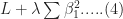
Recall that the values of the logistic regression coefficients 


and

Where 
In the case of ridge regression, the effect of the penalty term is to shrink the coefficients that contribute most to the error. Put another way, it reduces the magnitude of the coefficients that contribute to increasing 
Let’s illustrate this through an example. We’ll use the glmnet package which implements a combined version of ridge and lasso (called elastic net). Instead of minimising (4) or (5) above, glmnet minimises:
![L +\lambda[ (1-\alpha)\sum [\beta_1^2 + \alpha\sum|\beta_1|]....(6)](https://s0.wp.com/latex.php?latex=L+%2B%5Clambda%5B+%281-%5Calpha%29%5Csum+%5B%5Cbeta_1%5E2+%2B+%5Calpha%5Csum%7C%5Cbeta_1%7C%5D....%286%29&bg=ffffff&fg=1c1c1c&s=0&c=20201002)
where 


Lasso regularisation using glmnet
Let’s reanalyse the Pima Indian Diabetes dataset using glmnet with
- does not have a formula interface, so one has to input the predictors as a matrix and the class labels as a vector.
- does not accept categorical predictors, so one has to convert these to numeric values before passing them to glmnet.
The glmnet function model.matrix creates the matrix and also converts categorical predictors to appropriate dummy variables.
Another important point to note is that we’ll use the function cv.glmnet, which automatically performs a grid search to find the optimal value of
OK, enough said, here we go:
The plot is shown in Figure 2 below:
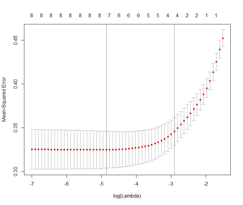
Figure 2: Error as a function of lambda (select lambda that minimises error)
The plot shows that the log of the optimal value of lambda (i.e. the one that minimises the root mean square error) is approximately -5. The exact value can be viewed by examining the variable lambda_min in the code below. In general though, the objective of regularisation is to balance accuracy and simplicity. In the present context, this means a model with the smallest number of coefficients that also gives a good accuracy. To this end, the cv.glmnet function finds the value of lambda that gives the simplest model but also lies within one standard error of the optimal value of lambda. This value of lambda (lambda.1se) is what we’ll use in the rest of the computation. Interested readers should have a look at this article for more on lambda.1se vs lambda.min.
The output shows that only those variables that we had determined to be significant on the basis of p-values have non-zero coefficients. The coefficients of all other variables have been set to zero by the algorithm! Lasso has reduced the complexity of the fitting function massively…and you are no doubt wondering what effect this has on accuracy. Let’s see by running the model against our test data:
Which is a bit less than what we got with the more complex model. So, we get a similar out-of-sample accuracy as we did before, and we do so using a way simpler function (4 non-zero coefficients) than the original one (9 nonzero coefficients). What this means is that the simpler function does at least as good a job fitting the signal in the data as the more complicated one. The bias-variance tradeoff tells us that the simpler function should be preferred because it is less likely to overfit the training data.
Paraphrasing William of Ockham: all other things being equal, a simple hypothesis should be preferred over a complex one.
Wrapping up
In this post I have tried to provide a detailed introduction to logistic regression, one of the simplest (and oldest) classification techniques in the machine learning practitioners arsenal. Despite it’s simplicity (or I should say, because of it!) logistic regression works well for many business applications which often have a simple decision boundary. Moreover, because of its simplicity it is less prone to overfitting than flexible methods such as decision trees. Further, as we have shown, variables that contribute to overfitting can be eliminated using lasso (or ridge) regularisation, without compromising out-of-sample accuracy. Given these advantages and its inherent simplicity, it isn’t surprising that logistic regression remains a workhorse for data scientists.
A gentle introduction to support vector machines using R
Introduction
Most machine learning algorithms involve minimising an error measure of some kind (this measure is often called an objective function or loss function). For example, the error measure in linear regression problems is the famous mean squared error – i.e. the averaged sum of the squared differences between the predicted and actual values. Like the mean squared error, most objective functions depend on all points in the training dataset. In this post, I describe the support vector machine (SVM) approach which focuses instead on finding the optimal separation boundary between datapoints that have different classifications. I’ll elaborate on what this means in the next section.
Here’s the plan in brief. I’ll begin with the rationale behind SVMs using a simple case of a binary (two class) dataset with a simple separation boundary (I’ll clarify what “simple” means in a minute). Following that, I’ll describe how this can be generalised to datasets with more complex boundaries. Finally, I’ll work through a couple of examples in R, illustrating the principles behind SVMs. In line with the general philosophy of my “Gentle Introduction to Data Science Using R” series, the focus is on developing an intuitive understanding of the algorithm along with a practical demonstration of its use through a toy example.
The rationale
The basic idea behind SVMs is best illustrated by considering a simple case: a set of data points that belong to one of two classes, red and blue, as illustrated in figure 1 below. To make things simpler still, I have assumed that the boundary separating the two classes is a straight line, represented by the solid green line in the diagram. In the technical literature, such datasets are called linearly separable.

Figure 1: Linearly separable data
In the linearly separable case, there is usually a fair amount of freedom in the way a separating line can be drawn. Figure 2 illustrates this point: the two broken green lines are also valid separation boundaries. Indeed, because there is a non-zero distance between the two closest points between categories, there are an infinite number of possible separation lines. This, quite naturally, raises the question as to whether it is possible to choose a separation boundary that is optimal.

Figure 2: Illustrating multiple separation boundaries
The short answer is, yes there is. One way to do this is to select a boundary line that maximises the margin, i.e. the distance between the separation boundary and the points that are closest to it. Such an optimal boundary is illustrated by the black brace in Figure 3. The really cool thing about this criterion is that the location of the separation boundary depends only on the points that are closest to it. This means, unlike other classification methods, the classifier does not depend on any other points in dataset. The directed lines between the boundary and the closest points on either side are called support vectors (these are the solid black lines in figure 3). A direct implication of this is that the fewer the support vectors, the better the generalizability of the boundary.

Figure 3: Optimal separation boundary in linearly separable case
Although the above sounds great, it is of limited practical value because real data sets are seldom (if ever) linearly separable.
So, what can we do when dealing with real (i.e. non linearly separable) data sets?
A simple approach to tackle small deviations from linear separability is to allow a small number of points (those that are close to the boundary) to be misclassified. The number of possible misclassifications is governed by a free parameter C, which is called the cost. The cost is essentially the penalty associated with making an error: the higher the value of C, the less likely it is that the algorithm will misclassify a point.
This approach – which is called soft margin classification – is illustrated in Figure 4. Note the points on the wrong side of the separation boundary. We will demonstrate soft margin SVMs in the next section. (Note: At the risk of belabouring the obvious, the purely linearly separable case discussed in the previous para is simply is a special case of the soft margin classifier.)

Figure 4: Soft margin classifier (linearly separable data)
Real life situations are much more complex and cannot be dealt with using soft margin classifiers. For example, as shown in Figure 5, one could have widely separated clusters of points that belong to the same classes. Such situations, which require the use of multiple (and nonlinear) boundaries, can sometimes be dealt with using a clever approach called the kernel trick.

Figure 5: Non-linearly separable data
The kernel trick
Recall that in the linearly separable (or soft margin) case, the SVM algorithm works by finding a separation boundary that maximises the margin, which is the distance between the boundary and the points closest to it. The distance here is the usual straight line distance between the boundary and the closest point(s). This is called the Euclidean distance in honour of the great geometer of antiquity. The point to note is that this process results in a separation boundary that is a straight line, which as Figure 5 illustrates, does not always work. In fact in most cases it won’t.
So what can we do? To answer this question, we have to take a bit of a detour…
What if we were able to generalize the notion of distance in a way that generates nonlinear separation boundaries? It turns out that this is possible. To see how, one has to first understand how the notion of distance can be generalized.
The key properties that any measure of distance must satisfy are:
- Non-negativity – a distance cannot be negative, a point that needs no further explanation I reckon 🙂
- Symmetry – that is, the distance between point A and point B is the same as the distance between point B and point A.
- Identity– the distance between a point and itself is zero.
- Triangle inequality – that is the sum of distances between point A and B and points B and C must be less than or equal to the distance between A and C (equality holds only if all three points lie along the same line).
Any mathematical object that displays the above properties is akin to a distance. Such generalized distances are called metrics and the mathematical space in which they live is called a metric space. Metrics are defined using special mathematical functions designed to satisfy the above conditions. These functions are known as kernels.
The essence of the kernel trick lies in mapping the classification problem to a metric space in which the problem is rendered separable via a separation boundary that is simple in the new space, but complex – as it has to be – in the original one. Generally, the transformed space has a higher dimensionality, with each of the dimensions being (possibly complex) combinations of the original problem variables. However, this is not necessarily a problem because in practice one doesn’t actually mess around with transformations, one just tries different kernels (the transformation being implicit in the kernel) and sees which one does the job. The check is simple: we simply test the predictions resulting from using different kernels against a held out subset of the data (as one would for any machine learning algorithm).
It turns out that a particular function – called the radial basis function kernel (RBF kernel) – is very effective in many cases. The RBF kernel is essentially a Gaussian (or Normal) function with the Euclidean distance between pairs of points as the variable (see equation 1 below). The basic rationale behind the RBF kernel is that it creates separation boundaries that it tends to classify points close together (in the Euclidean sense) in the original space in the same way. This is reflected in the fact that the kernel decays (i.e. drops off to zero) as the Euclidean distance between points increases.
The rate at which a kernel decays is governed by the parameter 
Finally, though it is probably obvious, it is worth mentioning that the separation boundaries for arbitrary kernels are also defined through support vectors as in Figure 3. To reiterate a point made earlier, this means that a solution that has fewer support vectors is likely to be more robust than one with many. Why? Because the data points defining support vectors are ones that are most sensitive to noise- therefore the fewer, the better.
There are many other types of kernels, each with their own pros and cons. However, I’ll leave these for adventurous readers to explore by themselves. Finally, for a much more detailed….and dare I say, better… explanation of the kernel trick, I highly recommend this article by Eric Kim.
Support vector machines in R
In this demo we’ll use the svm interface that is implemented in the e1071 R package. This interface provides R programmers access to the comprehensive libsvm library written by Chang and Lin. I’ll use two toy datasets: the famous iris dataset available with the base R package and the sonar dataset from the mlbench package. I won’t describe details of the datasets as they are discussed at length in the documentation that I have linked to. However, it is worth mentioning the reasons why I chose these datasets:
- As mentioned earlier, no real life dataset is linearly separable, but the iris dataset is almost so. Consequently, it is a good illustration of using linear SVMs. Although one almost never uses these in practice, I have illustrated their use primarily for pedagogical reasons.
- The sonar dataset is a good illustration of the benefits of using RBF kernels in cases where the dataset is hard to visualise (60 variables in this case!). In general, one would almost always use RBF (or other nonlinear) kernels in practice.
With that said, let’s get right to it. I assume you have R and RStudio installed. For instructions on how to do this, have a look at the first article in this series. The processing preliminaries – loading libraries, data and creating training and test datasets are much the same as in my previous articles so I won’t dwell on these here. For completeness, however, I’ll list all the code so you can run it directly in R or R studio (a complete listing of the code can be found here):
The output from the SVM model show that there are 24 support vectors. If desired, these can be examined using the SV variable in the model – i.e via svm_model$SV.
The test prediction accuracy indicates that the linear performs quite well on this dataset, confirming that it is indeed near linearly separable. To check performance by class, one can create a confusion matrix as described in my post on random forests. I’ll leave this as an exercise for you. Another point is that we have used a soft-margin classification scheme with a cost C=1. You can experiment with this by explicitly changing the value of C. Again, I’ll leave this for you an exercise.
Before proceeding to the RBF kernel, I should mention a point that an alert reader may have noticed. The predicted variable, Species, can take on 3 values (setosa, versicolor and virginica). However, our discussion above dealt with a binary (2 valued) classification problem. This brings up the question as to how the algorithm deals multiclass classification problems – i.e those involving datasets with more than two classes. The libsvm algorithm (which svm uses) does this using a one-against-one classification strategy. Here’s how it works:
- Divide the dataset (assumed to have N classes) into N(N-1)/2 datasets that have two classes each.
- Solve the binary classification problem for each of these subsets
- Use a simple voting mechanism to assign a class to each data point.
Basically, each data point is assigned the most frequent classification it receives from all the binary classification problems it figures in.
With that said for the unrealistic linear classifier, let’s move to the real world. In the code below, I build SVM models using three different kernels
- Linear kernel (this is for comparison with the following 2 kernels).
- RBF kernel with default values for the parameters
and
- RBF kernel with optimal values for
OK, lets go:
I’ll leave you to examine the contents of the model. The important point to note here is that the performance of the model with the test set is quite dismal compared to the previous case. This simply indicates that the linear kernel is not appropriate here. Let’s take a look at what happens if we use the RBF kernel with default values for the parameters:
That’s a pretty decent improvement from the linear kernel. Let’s see if we can do better by doing some parameter tuning. To do this we first invoke tune.svm and use the parameters it gives us in the call to svm:
Which is fairly decent improvement on the un-optimised case.
Wrapping up
This bring us to the end of this introductory exploration of SVMs in R. To recap, the distinguishing feature of SVMs in contrast to most other techniques is that they attempt to construct optimal separation boundaries between different categories.
SVMs are quite versatile and have been applied to a wide variety of domains ranging from chemistry to pattern recognition. They are best used in binary classification scenarios. This brings up a question as to where SVMs are to be preferred to other binary classification techniques such as logistic regression. The honest response is, “it depends” – but here are some points to keep in mind when choosing between the two. A general point to keep in mind is that SVM algorithms tend to be expensive both in terms of memory and computation, issues that can start to hurt as the size of the dataset increases.
Given all the above caveats and considerations, the best way to figure out whether an SVM approach will work for your problem may be to do what most machine learning practitioners do: try it out!
A gentle introduction to random forests using R
Introduction
In a previous post, I described how decision tree algorithms work and demonstrated their use via the rpart library in R. Decision trees work by splitting a dataset recursively. That is, subsets arising from a split are further split until a predetermined termination criterion is reached. At each step, a split is made based on the independent variable that results in the largest possible reduction in heterogeneity of the dependent variable.
(Note: readers unfamiliar with decision trees may want to read that post before proceeding)
The main drawback of decision trees is that they are prone to overfitting. The reason for this is that trees, if grown deep, are able to fit all kinds of variations in the data, including noise. Although it is possible to address this partially by pruning, the result often remains less than satisfactory. This is because the algorithm makes a locally optimal choice at each split without any regard to whether the choice made is the best one overall. A poor split made in the initial stages can thus doom the model, a problem that cannot be fixed by post-hoc pruning.
In this post I describe random forests, a tree-based algorithm that addresses the above shortcoming of decision trees. I’ll first describe the intuition behind the algorithm via an analogy and then do a demo using the R randomForest library.
Motivating random forests
One of the reasons for the popularity of decision trees is that they reflect the way humans make decisions: by weighing up options at each stage and choosing the best one available. The analogy is particularly useful because it also suggests how decision trees can be improved.
One of the lifelines in the game show, Who Wants to be A Millionaire, is “Ask The Audience” wherein a contestant can ask the audience to vote on the answer to a question. The rationale here is that the majority response from a large number of independent decision makers is more likely to yield a correct answer than one from a randomly chosen person. There are two factors at play here:
- People have different experiences and will therefore draw upon different “data” to answer the question.
- People have different knowledge bases and preferences and will therefore draw upon different “variables” to make their choices at each stage in their decision process.
Taking a cue from the above, it seems reasonable to build many decision trees using:
- Different sets of training data.
- Randomly selected subsets of variables at each split of every decision tree.
Predictions can then made by taking the majority vote over all trees (for classification problems) or averaging results over all trees (for regression problems). This is essentially how the random forest algorithm works.
The net effect of the two strategies is to reduce overfitting by a) averaging over trees created from different samples of the dataset and b) decreasing the likelihood of a small set of strong predictors dominating the splits. The price paid is reduced interpretability as well as increased computational complexity. But then, there is no such thing as a free lunch.
The mechanics of the algorithm
Although we will not delve into the mathematical details of the algorithm, it is important to understand how two points made above are implemented in the algorithm.
Bootstrap aggregating… and a (rather cool) error estimate
A key feature of the algorithm is the use of multiple datasets for training individual decision trees. This is done via a neat statistical trick called bootstrap aggregating (also called bagging).
Here’s how bagging works:
Assume you have a dataset of size N. From this you create a sample (i.e. a subset) of size n (n less than or equal to N) by choosing n data points randomly with replacement. “Randomly” means every point in the dataset is equally likely to be chosen and “with replacement” means that a specific data point can appear more than once in the subset. Do this M times to create M equally-sized samples of size n each. It can be shown that this procedure, which statisticians call bootstrapping, is legit when samples are created from large datasets – that is, when N is large.
Because a bagged sample is created by selection with replacement, there will generally be some points that are not selected. In fact, it can be shown that, on the average, each sample will use about two-thirds of the available data points. This gives us a clever way to estimate the error as part of the process of model building.
Here’s how:
For every data point, obtain predictions for trees in which the point was out of bag. From the result mentioned above, this will yield approximately M/3 predictions per data point (because a third of the data points are out of bag). Take the majority vote of these M/3 predictions as the predicted value for the data point. One can do this for the entire dataset. From these out of bag predictions for the whole dataset, we can estimate the overall error by computing a classification error (Count of correct predictions divided by N) for classification problems or the root mean squared error for regression problems. This means there is no need to have a separate test data set, which is kind of cool. However, if you have enough data, it is worth holding out some data for use as an independent test set. This is what we’ll do in the demo later.
Using subsets of predictor variables
Although bagging reduces overfitting somewhat, it does not address the issue completely. The reason is that in most datasets a small number of predictors tend to dominate the others. These predictors tend to be selected in early splits and thus influence the shapes and sizes of a significant fraction of trees in the forest. That is, strong predictors enhance correlations between trees which tends to come in the way of variance reduction.
A simple way to get around this problem is to use a random subset of variables at each split. This avoids over-representation of dominant variables and thus creates a more diverse forest. This is precisely what the random forest algorithm does.
Random forests in R
In what follows, I use the famous Glass dataset from the mlbench library. The dataset has 214 data points of six types of glass with varying metal oxide content and refractive indexes. I’ll first build a decision tree model based on the data using the rpart library (recursive partitioning) that I covered in an earlier article and then use then show how one can build a random forest model using the randomForest library. The rationale behind this is to compare the two models – single decision tree vs random forest. In the interests of space, I won’t explain details of the rpart here as I’ve covered it at length in the previous article. However, for completeness, I’ll list the demo code for it before getting into random forests.
Decision trees using rpart
Here’s the code listing for building a decision tree using rpart on the Glass dataset (please see my previous article for a full explanation of each step). Note that I have not used pruning as there is little benefit to be gained from it (Exercise for the reader: try this for yourself!).
Now, we know that decision tree algorithms tend to display high variance so the hit rate from any one tree is likely to be misleading. To address this we’ll generate a bunch of trees using different training sets (via random sampling) and calculate an average hit rate and spread (or standard deviation).
The decision tree algorithm gets it right about 69% of the time with a variation of about 5%. The variation isn’t too bad here, but the accuracy has hardly improved at all (Exercise for the reader: why?). Let’s see if we can do better using random forests.
Random forests
As discussed earlier, a random forest algorithm works by averaging over multiple trees using bootstrapped samples. Also, it reduces the correlation between trees by splitting on a random subset of predictors at each node in tree construction. The key parameters for randomForest algorithm are the number of trees (ntree) and the number of variables to be considered for splitting (mtry). The algorithm sets a default of 500 for ntree and sets mtry to the square root of the the number of predictors for classification problems or one-third the total number of predictors for regression. These defaults can be overridden by explicitly providing values for these variables.
The preliminary stuff – the creation of training and test datasets etc. – is much the same as for decision trees but I’ll list the code for completeness.
randomForest(formula = Type ~ ., data = trainGlass, importance = TRUE, xtest = testGlass[, -typeColNum], ntree = 1001)
| 1 | 2 | 3 | 5 | 6 | 7 | class.error | |
| 1 | 40 | 7 | 2 | 0 | 0 | 0 | 0.1836735 |
| 2 | 8 | 49 | 1 | 2 | 2 | 1 | 0.2222222 |
| 3 | 6 | 3 | 6 | 0 | 0 | 0 | 0.6000000 |
| 5 | 0 | 1 | 0 | 11 | 0 | 1 | 0.1538462 |
| 6 | 1 | 2 | 0 | 1 | 6 | 0 | 0.5000000 |
| 7 | 1 | 2 | 0 | 1 | 0 | 21 | 0.1600000 |
The first thing to note is the out of bag error estimate is ~ 24%. Equivalently the hit rate is 76%, which is better than the 69% for decision trees. Secondly, you’ll note that the algorithm does a terrible job identifying type 3 and 6 glasses correctly. This could possibly be improved by a technique called boosting, which works by iteratively improving poor predictions made in earlier stages. I plan to look at boosting in a future post, but if you’re curious, check out the gbm package in R.
Finally, for completeness, let’s see how the test set does:
| 1 | 2 | 3 | 5 | 6 | 7 | |
| 1 | 19 | 2 | 0 | 0 | 0 | 0 |
| 2 | 1 | 9 | 1 | 0 | 0 | 0 |
| 3 | 1 | 1 | 1 | 0 | 0 | 0 |
| 5 | 0 | 1 | 0 | 0 | 0 | 0 |
| 6 | 0 | 0 | 0 | 0 | 3 | 0 |
| 7 | 0 | 0 | 0 | 0 | 0 | 4 |
The test accuracy is better than the out of bag accuracy and there are some differences in the class errors as well. However, overall the two compare quite well and are significantly better than the results of the decision tree algorithm.
Variable importance
Random forest algorithms also give measures of variable importance. Computation of these is enabled by setting importance, a boolean parameter, to TRUE. The algorithm computes two measures of variable importance: mean decrease in Gini and mean decrease in accuracy. Brief explanations of these follow.
Mean decrease in Gini
When determining splits in individual trees, the algorithm looks for the largest class (in terms of population) and attempts to isolate it first. If this is not possible, it tries to do the best it can, always focusing on isolating the largest remaining class in every split.This is called the Gini splitting rule (see this article for a good explanation of the rule).
The “goodness of split” is measured by the Gini Impurity, 

where 


Mean decrease in accuracy
The mean decrease in accuracy is calculated using the out of bag data points for each tree. The procedure goes as follows: when a particular tree is grown, the out of bag points are passed down the tree and the prediction accuracy (based on all out of bag points) recorded . The predictors are then randomly permuted and the out of bag prediction accuracy recalculated. The decrease in accuracy for a given predictor is the difference between the accuracy of the original (unpermuted) tree and the those obtained from the permuted trees in which the predictor was excluded. As in the previous case, the decrease in accuracy for each predictor can be computed and tracked as the algorithm progresses. These can then be averaged by predictor to yield a mean decrease in accuracy.
Variable importance plot
From the above, it would seem that the mean decrease in accuracy is a more global measure as it uses fully constructed trees in contrast to the Gini measure which is based on individual splits. In practice, however, there could be other reasons for choosing one over the other…but that is neither here nor there, if you set importance to TRUE, you’ll get both. The numerical measures of importance are returned in the randomForest object (Glass.rf in our case), but I won’t list them here. Instead, I’ll just print out the variable importance plots for the two measures as these give a good visual overview of the relative importance of variables. The code is a simple one-liner:
The plot is shown in Figure 1 below.

Figure 1: Variable importance plots
In this case the two measures are pretty consistent so it doesn’t really matter which one you choose.
Wrapping up
Random forests are an example of a general class of techniques called ensemble methods. These techniques are based on the principle that averaging over a large number of not-so-good models yields a more reliable prediction than a single model. This is true only if models in the group are independent of each other, which is precisely what bootstrap aggregation and predictor subsetting are intended to achieve.
Although considerably more complex than decision trees, the logic behind random forests is not hard to understand. Indeed, the intuitiveness of the algorithm together with its ease of use and accuracy have made it very popular in the machine learning community.


