Archive for the ‘R’ Category
A gentle introduction to decision trees using R
Introduction
Most techniques of predictive analytics have their origins in probability or statistical theory (see my post on Naïve Bayes, for example). In this post I’ll look at one that has more a commonplace origin: the way in which humans make decisions. When making decisions, we typically identify the options available and then evaluate them based on criteria that are important to us. The intuitive appeal of such a procedure is in no small measure due to the fact that it can be easily explained through a visual. Consider the following graphic, for example:

Figure 1: Example of a simple decision tree (Courtesy: Duncan Hull)
(Original image: https://www.flickr.com/photos/dullhunk/7214525854, Credit: Duncan Hull)
The tree structure depicted here provides a neat, easy-to-follow description of the issue under consideration and its resolution. The decision procedure is based on asking a series of questions, each of which serve to further reduce the domain of possibilities. The predictive technique I discuss in this post,classification and regression trees (CART), works in much the same fashion. It was invented by Leo Breiman and his colleagues in the 1970s.
In what follows, I will use the open source software, R. If you are new to R, you may want to follow this link for more on the basics of setting up and installing it. Note that the R implementation of the CART algorithm is called RPART (Recursive Partitioning And Regression Trees). This is essentially because Breiman and Co. trademarked the term CART. As some others have pointed out, it is somewhat ironical that the algorithm is now commonly referred to as RPART rather than by the term coined by its inventors.
A bit about the algorithm
The rpart algorithm works by splitting the dataset recursively, which means that the subsets that arise from a split are further split until a predetermined termination criterion is reached. At each step, the split is made based on the independent variable that results in the largest possible reduction in heterogeneity of the dependent (predicted) variable.
Splitting rules can be constructed in many different ways, all of which are based on the notion of impurity- a measure of the degree of heterogeneity of the leaf nodes. Put another way, a leaf node that contains a single class is homogeneous and has impurity=0. There are three popular impurity quantification methods: Entropy (aka information gain), Gini Index and Classification Error. Check out this article for a simple explanation of the three methods.
The rpart algorithm offers the entropy and Gini index methods as choices. There is a fair amount of fact and opinion on the Web about which method is better. Here are some of the better articles I’ve come across:
https://www.garysieling.com/blog/sklearn-gini-vs-entropy-criteria
http://www.salford-systems.com/resources/whitepapers/114-do-splitting-rules-really-matter
The answer as to which method is the best is: it depends. Given this, it may be prudent to try out a couple of methods and pick the one that works best for your problem.
Regardless of the method chosen, the splitting rules partition the decision space (a fancy word for the entire dataset) into rectangular regions each of which correspond to a split. Consider the following simple example with two predictors x1 and x2. The first split is at x1=1 (which splits the decision space into two regions x11), the second at x2=2, which splits the (x1>1) region into 2 sub-regions, and finally x1=1.5 which splits the (x1>1,x2>2) sub-region further.
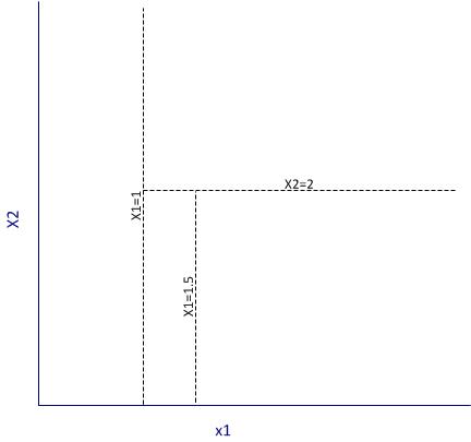
Figure 2: Example of partitioning
It is important to note that the algorithm works by making the best possible choice at each particular stage, without any consideration of whether those choices remain optimal in future stages. That is, the algorithm makes a locally optimal decision at each stage. It is thus quite possible that such a choice at one stage turns out to be sub-optimal in the overall scheme of things. In other words, the algorithm does not find a globally optimal tree.
Another important point relates to well-known bias-variance tradeoff in machine learning, which in simple terms is a tradeoff between the degree to which a model fits the training data and its predictive accuracy. This refers to the general rule that beyond a point, it is counterproductive to improve the fit of a model to the training data as this increases the likelihood of overfitting. It is easy to see that deep trees are more likely to overfit the data than shallow ones. One obvious way to control such overfitting is to construct shallower trees by stopping the algorithm at an appropriate point based on whether a split significantly improves the fit. Another is to grow a tree unrestricted and then prune it back using an appropriate criterion. The rpart algorithm takes the latter approach.
Here is how it works in brief:
Essentially one minimises the cost, 


First, we note that when 

An implication of their tendency to overfit data is that decision trees tend to be sensitive to relatively minor changes in the training datasets. Indeed, small differences can lead to radically different looking trees. Pruning addresses this to an extent, but does not resolve it completely. A better resolution is offered by the so-called ensemble methods that average over many differently constructed trees. I’ll discuss one such method at length in a future post.
Finally, I should also mention that decision trees can be used for both classification and regression problems (i.e. those in which the predicted variable is discrete and continuous respectively). I’ll demonstrate both types of problems in the next two sections.
Classification trees using rpart
To demonstrate classification trees, we’ll use the Ionosphere dataset available in the mlbench package in R. I have chosen this dataset because it nicely illustrates the points I wish to make in this post. In general, you will almost always find that algorithms that work fine on classroom datasets do not work so well in the real world…but of course, you know that already!
We begin by setting the working directory, loading the required packages (rpart and mlbench) and then loading the Ionosphere dataset.
Next we separate the data into training and test sets. We’ll use the former to build the model and the latter to test it. To do this, I use a simple scheme wherein I randomly select 80% of the data for the training set and assign the remainder to the test data set. This is easily done in a single R statement that invokes the uniform distribution (runif) and the vectorised function, ifelse. Before invoking runif, I set a seed integer to my favourite integer in order to ensure reproducibility of results.
In the above, I have also removed the training flag from the training and test datasets.
Next we invoke rpart. I strongly recommend you take some time to go through the documentation and understand the parameters and their defaults values. Note that we need to remove the predicted variable from the dataset before passing the latter on to the algorithm, which is why we need to find the column index of the predicted variable (first line below). Also note that we set the method parameter to “class“, which simply tells the algorithm that the predicted variable is discrete. Finally, rpart uses Gini rule for splitting by default, and we’ll stick with this option.
The resulting plot is shown in Figure 3 below. It is quite self-explanatory so I won’t dwell on it here.
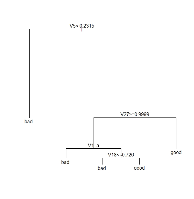
Figure 3: A classification tree for Ionosphere dataset
Next we see how good the model is by seeing how it fares against the test data.
| pred true | bad | good |
| bad | 17 | 2 |
| good | 9 | 43 |
Note that we need to verify the above results by doing multiple runs, each using different training and test sets. I will do this later, after discussing pruning.
Next, we prune the tree using the cost complexity criterion. Basically, the intent is to see if a shallower subtree can give us comparable results. If so, we’d be better of choosing the shallower tree because it reduces the likelihood of overfitting.
As described earlier, we choose the appropriate pruning parameter (aka cost-complexity parameter)
| CP | nsplit | rel error | xerror | xstd | |
| 1 | 0.57 | 0 | 1.00 | 1.00 | 0.080178 |
| 2 | 0.20 | 1 | 0.43 | 0.46 | 0.062002 |
| 3 | 0.02 | 2 | 0.23 | 0.26 | 0.048565 |
| 4 | 0.01 | 4 | 0.19 | 0.35 |
It is clear from the above, that the lowest cross-validation error (xerror in the table) occurs for 
Next, we prune the tree based on this value of CP:
Note that rpart will use a default CP value of 0.01 if you don’t specify one in prune.
The pruned tree is shown in Figure 4 below.

Figure 4: A pruned classification tree for Ionosphere dataset
Let’s see how this tree stacks up against the fully grown one shown in Fig 3.
This seems like an improvement over the unpruned tree, but one swallow does not a summer make. We need to check that this holds up for different training and test sets. This is easily done by creating multiple random partitions of the dataset and checking the efficacy of pruning for each. To do this efficiently, I’ll create a function that takes the training fraction, number of runs (partitions) and the name of the dataset as inputs and outputs the proportion of correct predictions for each run. It also optionally prunes the tree. Here’s the code:
Note that in the above, I have set the default value of the prune_tree to FALSE, so the function will execute the first branch of the if statement unless the default is overridden.
OK, so let’s do 50 runs with and without pruning, and check the mean and variance of the results for both sets of runs.
So we see that there is an improvement of about 3% with pruning. Also, if you were to plot the trees as we did earlier, you would see that this improvement is achieved with shallower trees. Again, I point out that this is not always the case. In fact, it often happens that pruning results in worse predictions, albeit with better reliability – a classic illustration of the bias-variance tradeoff.
Regression trees using rpart
In the previous section we saw how one can build decision trees for situations in which the predicted variable is discrete. Let’s now look at the case in which the predicted variable is continuous. We’ll use the Boston Housing dataset from the mlbench package. Much of the discussion of the earlier section applies here, so I’ll just display the code, explaining only the differences.
Next we invoke rpart, noting that the predicted variable is medv (median value of owner-occupied homes in $1000 units) and that we need to set the method parameter to “anova“. The latter tells rpart that the predicted variable is continuous (i.e that this is a regression problem).
The plot of the tree is shown in Figure 5 below.
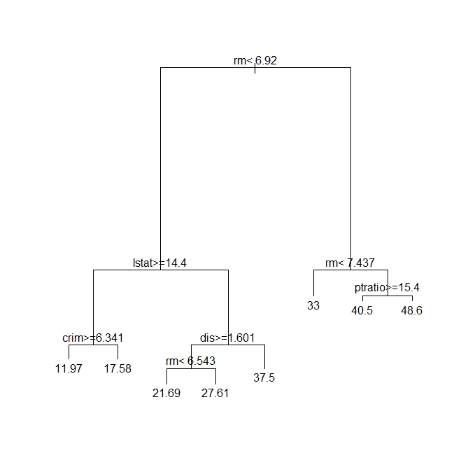
Figure 5: A regression tree for Boston Housing dataset
Next, we need to see how good the predictions are. Since the dependent variable is continuous, we cannot compare the predictions directly against the test set. Instead, we calculate the root mean square (RMS) error. To do this, we request rpart to output the predictions as a vector – one prediction per record in the test dataset. The RMS error can then easily be calculated by comparing this vector with the medv column in the test dataset.
Here is the relevant code:
Again, we need to do multiple runs to check on the reliability of the predictions. However, you already know how to do that so I will leave it to you.
Moving on, we prune the tree using the cost complexity criterion as before. The code is exactly the same as in the classification problem.
The tree is unchanged so I won’t show it here. This means, as far as the cost complexity pruning is concerned, the optimal subtree is the same as the original tree. To confirm this, we’d need to do multiple runs as before – something that I’ve already left as as an exercise for you :). Basically, you’ll need to write a function analogous to the one above, that computes the root mean square error instead of the proportion of correct predictions.
Wrapping up
This brings us to the end of my introduction to classification and regression trees using R. Unlike some articles on the topic I have attempted to describe each of the steps in detail and provide at least some kind of a rationale for them. I hope you’ve found the description and code snippets useful.
I’ll end by reiterating a couple points I made early in this piece. The nice thing about decision trees is that they are easy to explain to the users of our predictions. This is primarily because they reflect the way we think about how decisions are made in real life – via a set of binary choices based on appropriate criteria. That said, in many practical situations decision trees turn out to be unstable: small changes in the dataset can lead to wildly different trees. It turns out that this limitation can be addressed by building a variety of trees using different starting points and then averaging over them. This is the domain of the so-called random forest algorithm.We’ll make the journey from decision trees to random forests in a future post.
Postscript, 20th September 2016: I finally got around to finishing my article on random forests.
A gentle introduction to network graphs using R and Gephi
Introduction
Graph theory is the an area of mathematics that analyses relationships between pairs of objects. Typically graphs consist of nodes (points representing objects) and edges (lines depicting relationships between objects). As one might imagine, graphs are extremely useful in visualizing relationships between objects. In this post, I provide a detailed introduction to network graphs using R, the premier open source tool statistics package for calculations and the excellent Gephi software for visualization.
The article is organised as follows: I begin by defining the problem and then spend some time developing the concepts used in constructing the graph Following this, I do the data preparation in R and then finally build the network graph using Gephi.
The problem
In an introductory article on cluster analysis, I provided an in-depth introduction to a couple of algorithms that can be used to categorise documents automatically. Although these techniques are useful, they do not provide a feel for the relationships between different documents in the collection of interest. In the present piece I show network graphs can be used to to visualise similarity-based relationships within a corpus.
Document similarity
There are many ways to quantify similarity between documents. A popular method is to use the notion of distance between documents. The basic idea is simple: documents that have many words in common are “closer” to each other than those that share fewer words. The problem with distance, however, is that it can be skewed by word count: documents that have an unusually high word count will show up as outliers even though they may be similar (in terms of words used) to other documents in the corpus. For this reason, we will use another related measure of similarity that does not suffer from this problem – more about this in a minute.
Representing documents mathematically
As I explained in my article on cluster analysis, a document can be represented as a point in a conceptual space that has dimensionality equal to the number of distinct words in the collection of documents. I revisit and build on that explanation below.
Say one has a simple document consisting of the words “five plus six”, one can represent it mathematically in a 3 dimensional space in which the individual words are represented by the three axis (See Figure 1). Here each word is a coordinate axis (or dimension). Now, if one connects the point representing the document (point A in the figure) to the origin of the word-space, one has a vector, which in this case is a directed line connecting the point in question to the origin. Specifically, the point A can be represented by the coordinates 

Figure 1
As another example consider document, B, which consists of only two words: “five plus” (see Fig 2). Clearly this document shares some similarity with document but it is not identical. Indeed, this becomes evident when we note that document (or point) B is simply the point $latex(1, 1, 0)$ in this space, which tells us that it has two coordinates (words/frequencies) in common with document (or point) A.

Figure 2
To be sure, in a realistic collection of documents we would have a large number of distinct words, so we’d have to work in a very high dimensional space. Nevertheless, the same principle holds: every document in the corpus can be represented as a vector consisting of a directed line from the origin to the point to which the document corresponds.
Cosine similarity
Now it is easy to see that two documents are identical if they correspond to the same point. In other words, if their vectors coincide. On the other hand, if they are completely dissimilar (no words in common), their vectors will be at right angles to each other. What we need, therefore, is a quantity that varies from 0 to 1 depending on whether two documents (vectors) are dissimilar(at right angles to each other) or similar (coincide, or are parallel to each other).
Now here’s the ultra-cool thing, from your high school maths class, you know there is a trigonometric ratio which has exactly this property – the cosine!
What’s even cooler is that the cosine of the angle between two vectors is simply the dot product of the two vectors, which is sum of the products of the individual elements of the vector, divided by the product of the lengths of the two vectors. In three dimensions this can be expressed mathematically as:

where the two vectors are 


The upshot of the above is that the cosine of the angle between the vector representation of two documents is a reasonable measure of similarity between them. This quantity, sometimes referred to as cosine similarity, is what we’ll take as our similarity measure in the rest of this article.
The adjacency matrix
If we have a collection of 

Since every document is identical to itself, the diagonal elements of the matrix will all be 1. These similarities are trivial (we know that every document is identical to itself!) so we’ll set the diagonal elements to zero.
Another important practical point is that visualizing every relationship is going to make a very messy graph. There would be 
Building the adjacency matrix using R
We now have enough background to get down to the main point of this article – visualizing relationships between documents.
The first step is to build the adjacency matrix. In order to do this, we have to build the document term matrix (DTM) for the collection of documents, a process which I have dealt with at length in my introductory pieces on text mining and topic modeling. In fact, the steps are actually identical to those detailed in the second piece. I will therefore avoid lengthy explanations here. However, I’ve listed all the code below with brief comments (for those who are interested in trying this out, the document corpus can be downloaded here and a pdf listing of the R code can be obtained here.)
OK, so here’s the code listing:
docs <- tm_map(docs, toSpace, “-“)
docs <- tm_map(docs, toSpace, “’”)
docs <- tm_map(docs, toSpace, “‘”)
docs <- tm_map(docs, toSpace, “•”)
docs <- tm_map(docs, toSpace, “””)
docs <- tm_map(docs, toSpace, ““”)
pattern = “organiz”, replacement = “organ”)
docs <- tm_map(docs, content_transformer(gsub),
pattern = “organis”, replacement = “organ”)
docs <- tm_map(docs, content_transformer(gsub),
pattern = “andgovern”, replacement = “govern”)
docs <- tm_map(docs, content_transformer(gsub),
pattern = “inenterpris”, replacement = “enterpris”)
docs <- tm_map(docs, content_transformer(gsub),
pattern = “team-“, replacement = “team”)
“also”,”howev”,”tell”,”will”,
“much”,”need”,”take”,”tend”,”even”,
“like”,”particular”,”rather”,”said”,
“get”,”well”,”make”,”ask”,”come”,”end”,
“first”,”two”,”help”,”often”,”may”,
“might”,”see”,”someth”,”thing”,”point”,
“post”,”look”,”right”,”now”,”think”,”‘ve “,
“‘re “,”anoth”,”put”,”set”,”new”,”good”,
“want”,”sure”,”kind”,”larg”,”yes,”,”day”,”etc”,
“quit”,”sinc”,”attempt”,”lack”,”seen”,”awar”,
“littl”,”ever”,”moreov”,”though”,”found”,”abl”,
“enough”,”far”,”earli”,”away”,”achiev”,”draw”,
“last”,”never”,”brief”,”bit”,”entir”,”brief”,
“great”,”lot”)
The rows of a DTM are document vectors akin to the vector representations of documents A and B discussed earlier. The DTM therefore contains all the information we need to calculate the cosine similarity between every pair of documents in the corpus (via equation 1). The R code below implements this, after taking care of a few preliminaries.
A few lines need a brief explanation:
First up, although the DTM is a matrix, it is internally stored in a special form suitable for sparse matrices. We therefore have to explicitly convert it into a proper matrix before using it to calculate similarity.
Second, the names I have given the documents are way too long to use as labels in the network diagram. I have therefore mapped the document names to the row numbers which we’ll use in our network graph later. The mapping back to the original document names is stored in filekey.csv. For future reference, the mapping is shown in Table 1 below.
| File number | Name |
| 1 | BeyondEntitiesAndRelationships.txt |
| 2 | bigdata.txt |
| 3 | ConditionsOverCauses.txt |
| 4 | EmergentDesignInEnterpriseIT.txt |
| 5 | FromInformationToKnowledge.txt |
| 6 | FromTheCoalface.txt |
| 7 | HeraclitusAndParmenides.txt |
| 8 | IroniesOfEnterpriseIT.txt |
| 9 | MakingSenseOfOrganizationalChange.txt |
| 10 | MakingSenseOfSensemaking.txt |
| 11 | ObjectivityAndTheEthicalDimensionOfDecisionMaking.txt |
| 12 | OnTheInherentAmbiguitiesOfManagingProjects.txt |
| 13 | OrganisationalSurprise.txt |
| 14 | ProfessionalsOrPoliticians.txt |
| 15 | RitualsInInformationSystemDesign.txt |
| 16 | RoutinesAndReality.txt |
| 17 | ScapegoatsAndSystems.txt |
| 18 | SherlockHolmesFailedProjects.txt |
| 19 | sherlockHolmesMgmtFetis.txt |
| 20 | SixHeresiesForBI.txt |
| 21 | SixHeresiesForEnterpriseArchitecture.txt |
| 22 | TheArchitectAndTheApparition.txt |
| 23 | TheCloudAndTheGrass.txt |
| 24 | TheConsultantsDilemma.txt |
| 25 | TheDangerWithin.txt |
| 26 | TheDilemmasOfEnterpriseIT.txt |
| 27 | TheEssenceOfEntrepreneurship.txt |
| 28 | ThreeTypesOfUncertainty.txt |
| 29 | TOGAFOrNotTOGAF.txt |
| 30 | UnderstandingFlexibility.txt |
Table 1: File mappings
Finally, the distance function (as.dist) in the cosine similarity function sets the diagonal elements to zero because the distance between a document and itself is zero…which is just a complicated way of saying that a document is identical to itself 🙂
The last three lines of code above simply implement the cutoff that I mentioned in the previous section. The comments explain the details so I need say no more about it.
…which finally brings us to Gephi.
Visualizing document similarity using Gephi
Gephi is an open source, Java based network analysis and visualisation tool. Before going any further, you may want to download and install it. While you’re at it you may also want to download this excellent quick start tutorial.
Go on, I’ll wait for you…
To begin with, there’s a little formatting quirk that we need to deal with. Gephi expects separators in csv files to be semicolons (;) . So, your first step is to open up the adjacency matrix that you created in the previous section (AdjacencyMatrix.csv) in a text editor and replace commas with semicolons.
Once you’ve done that, fire up Gephi, go to File > Open, navigate to where your Adjacency matrix is stored and load the file. If it loads successfully, you should see a feedback panel as shown in Figure 3. By default Gephi creates a directed graph (i.e one in which the edges have arrows pointing from one node to another). Change this to undirected and click OK.

Figure 3: Gephi import feedback
Once that is done, click on overview (top left of the screen). You should end up with something like Figure 4.
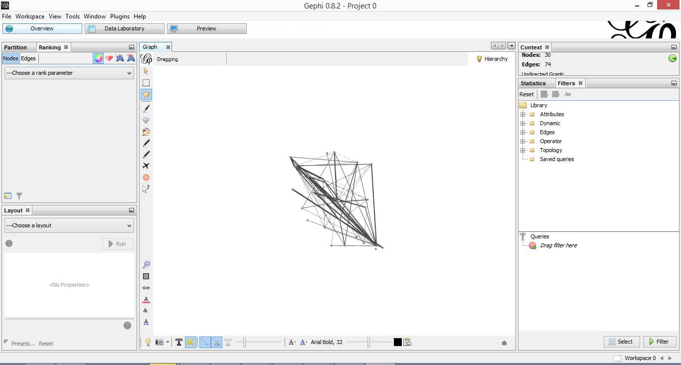
Figure 4: Initial overview after loading adjacency matrix
Gephi has sketched out an initial network diagram which depicts the relationships between documents…but it needs a bit of work to make it look nicer and more informative. The quickstart tutorial mentioned earlier describes various features that can be used to manipulate and prettify the graph. In the remainder of this section, I list some that I found useful. Gephi offers many more. Do explore, there’s much more than I can cover in an introductory post.
First some basics. You can:
- Zoom and pan using mouse wheel and right button.
- Adjust edge thicknesses using the slider next to text formatting options on bottom left of main panel.
- Re-center graph via the magnifying glass icon on left of display panel (just above size adjuster).
- Toggle node labels on/off by clicking on grey T symbol on bottom left panel.
Figure 5 shows the state of the diagram after labels have been added and edge thickness adjusted (note that your graph may vary in appearance).

Figure 5: graph with node labels and adjusted edge thicknesses
The default layout of the graph is ugly and hard to interpret. Let’s work on fixing it up. To do this, go over to the layout panel on the left. Experiment with different layouts to see what they do. After some messing around, I found the Fruchtermann-Reingold and Force Atlas options to be good for this graph. In the end I used Force Atlas with a Repulsion Strength of 2000 (up from the default of 200) and an Attraction Strength of 1 (down from the default of 10). I also adjusted the figure size and node label font size from the graph panel in the center. The result is shown in Figure 6.

Figure 6: Graph after using Force Atlas layout
This is much better. For example, it is now evident that document 9 is the most connected one (which table 9 tells us is a transcript of a conversation with Neil Preston on organisational change).
It would be nice if we could colour code edges/nodes and size nodes by their degree of connectivity. This can be done via the ranking panel above the layout area where you’ve just been working.
In the Nodes tab select Degree as the rank parameter (this is the degree of connectivity of the node) and hit apply. Select your preferred colours via the small icon just above the colour slider. Use the colour slider to adjust the degree of connectivity at which colour transitions occur.
Do the same for edges, selecting weight as the rank parameter(this is the degree of similarity between the two douments connected by the edge). With a bit of playing around, I got the graph shown in the screenshot below (Figure 7).

Figure 5: Connectivity-based colouring of edges and nodes.
If you want to see numerical values for the rankings, hit the results list icon on the bottom left of the ranking panel. You can see numerical ranking values for both nodes and edges as shown in Figures 8 and 9.

Figure 8: Node ranking (see left of figure)

Figure 9: Edge ranking
It is easy to see from the figure that documents 21 and 29 are the most similar in terms of cosine ranking. This makes sense, they are pieces in which I have ranted about the current state of enterprise architecture – the first article is about EA in general and the other about the TOGAF framework. If you have a quick skim through, you’ll see that they have a fair bit in common.
Finally, it would be nice if we could adjust node size to reflect the connectedness of the associated document. You can do this via the “gem” symbol on the top right of the ranking panel. Select appropriate min and max sizes (I chose defaults) and hit apply. The node size is now reflective of the connectivity of the node – i.e. the number of other documents to which it is cosine similar to varying degrees. The thickness of the edges reflect the degree of similarity. See Figure 10.

Figure 10: Node sizes reflecting connectedness
Now that looks good enough to export. To do this, hit the preview tab on main panel and make following adjustments to the default settings:
Under Node Labels:
1. Check Show Labels
2. Uncheck proportional size
3. Adjust font to required size
Under Edges:
1. Change thickness to 10
2. Check rescale weight
Hit refresh after making the above adjustments. You should get something like Fig 11.

Figure 11: Export preview
All that remains now is to do the deed: hit export SVG/PDF/PNG to export the diagram. My output is displayed in Figure 12. It clearly shows the relationships between the different documents (nodes) in the corpus. The nodes with the highest connectivity are indicated via node size and colour (purple for high, green for low) and strength of similarity is indicated by edge thickness.
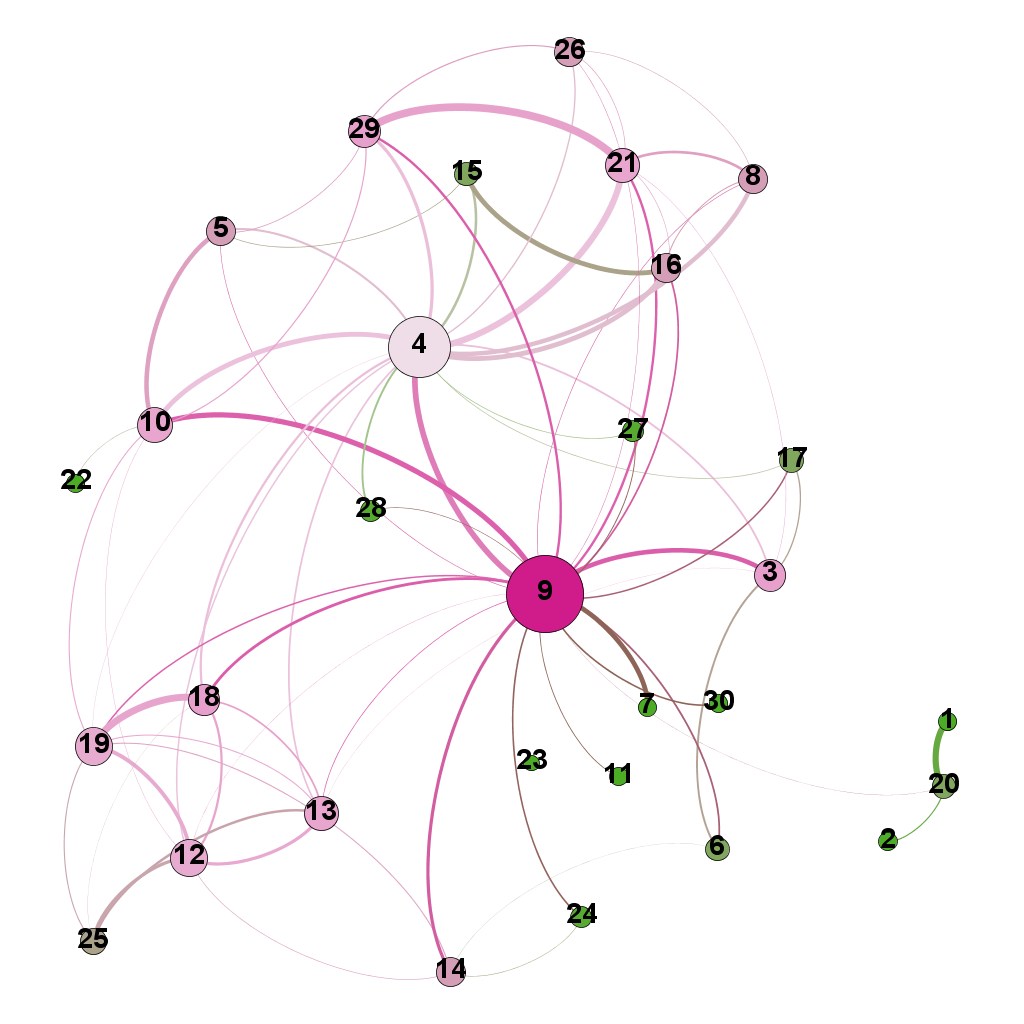
Figure 12: Gephi network graph of document corpus
…which brings us to the end of this journey.
Wrapping up
The techniques of text analysis enable us to quantify relationships between documents. Document similarity is one such relationship. Numerical measures are good, but the comprehensibility of these can be further enhanced through meaningful visualisations. Indeed, although my stated objective in this article was to provide an introduction to creating network graphs using Gephi and R (which I hope I’ve succeeded in doing), a secondary aim was to show how document similarity can be quantified and visualised. I sincerely hope you’ve found the discussion interesting and useful.
Many thanks for reading! As always, your feedback would be greatly appreciated.
A gentle introduction to Naïve Bayes classification using R
Preamble
One of the key problems of predictive analytics is to classify entities or events based on a knowledge of their attributes. An example: one might want to classify customers into two categories, say, ‘High Value’ or ‘Low Value,’ based on a knowledge of their buying patterns. Another example: to figure out the party allegiances of representatives based on their voting records. And yet another: to predict the species a particular plant or animal specimen based on a list of its characteristics. Incidentally, if you haven’t been there already, it is worth having a look at Kaggle to get an idea of some of the real world classification problems that people tackle using techniques of predictive analytics.
Given the importance of classification-related problems, it is no surprise that analytics tools offer a range of options. My favourite (free!) tool, R, is no exception: it has a plethora of state of the art packages designed to handle a wide range of problems. One of the problems with this diversity of choice is that it is often confusing for beginners to figure out which one to use in a particular situation. Over the next several months, I intend to write up tutorial articles covering many of the common algorithms, with a particular focus on their strengths and weaknesses; explaining where they work well and where they don’t. I’ll kick-off this undertaking with a simple yet surprisingly effective algorithm – the Naïve Bayes classifier.
Just enough theory
I’m going to assume you have R and RStudio installed on your computer. If you need help with this, please follow the instructions here.
To introduce the Naive Bayes algorithm, I will use the HouseVotes84 dataset, which contains US congressional voting records for 1984. The data set is in the mlbench package which is not part of the base R installation. You will therefore need to install it if you don’t have it already. Package installation is a breeze in RStudio – just go to Tools > Install Packages and follow the prompts.
The HouseVotes84 dataset describes how 435 representatives voted – yes (y), no (n) or unknown (NA) – on 16 key issues presented to Congress. The dataset also provides the party affiliation of each representative – democrat or republican.
Let’s begin by exploring the dataset. To do this, we load mlbench, fetch the dataset and get some summary stats on it. (Note: a complete listing of the code in this article can be found here)
It is good to begin by exploring the data visually. To this end, let’s do some bar plots using the basic graphic capabilities of R:
The plots are shown in Figures 1 through 3.

Fig 1: y and n votes for issue 1

Fig 2: Republican votes for issue 1.
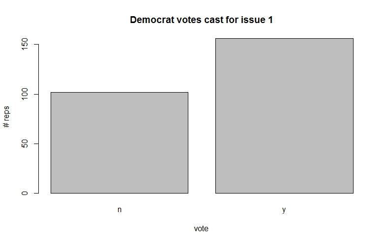
Fig 3: Democrat votes for issue 1.
Among other things, such plots give us a feel for the probabilities associated with how representatives from parties tend to vote on specific issues.
The classification problem at hand is to figure out the party affiliation from a knowledge of voting patterns. For simplicity let us assume that there are only 3 issues voted on instead of the 16 in the actual dataset. In concrete terms we wish to answer the question, “what is the probability that a representative is, say, a democrat (D) given that he or she has voted, say, 
In the notation of conditional probability this can be written as,

(Note: If you need a refresher on conditional probability, check out this post for a simple explanation.)
By Bayes theorem, which I’ve explained at length in this post, this can be recast as,

We’re interested only in relative probabilities of the representative being a democrat or republican because the predicted party affiliation depends only on which of the two probabilities is larger (the actual value of the probability is not important). This being the case, we can factor out any terms that are constant. As it happens, the denominator of the above equation – the probability of a particular voting pattern – is a constant because it depends on the total number of representatives (from both parties) who voted a particular way.
Now, using the chain rule of conditional probability, we can rewrite the numerator as:


Basically, the second term on the left hand side, 
Another application of the chain rule gives:

Where we have now factored out the n vote on the second issue.
The key assumption of Naïve Bayes is that the conditional probability of each feature given the class is independent of all other features. In mathematical terms this means that,

and

The quantity of interest, the numerator of equation (1) can then be written as:

The assumption of independent conditional probabilities is a drastic one. What it is saying is that the features are completely independent of each other. This is clearly not the case in the situation above: how representatives vote on a particular issue is coloured by their beliefs and values. For example, the conditional probability of voting patterns on socially progressive issues are definitely not independent of each other. However, as we shall see in the next section, the Naïve Bayes assumption works well for this problem as it does in many other situations where we know upfront that it is grossly incorrect.
Another good example of the unreasonable efficacy of Naive Bayes is in spam filtering. In the case of spam, the features are individual words in an email. It is clear that certain word combinations tend to show up consistently in spam – for example, “online”, “meds”, “Viagra” and “pharmacy.” In other words, we know upfront that their occurrences are definitely not independent of each other. Nevertheless, Naïve Bayes based spam detectors which assume mutual independence of features do remarkably well in distinguishing spam from ham.
Why is this so?
To explain why, I return to a point I mentioned earlier: to figure out the affiliation associated with a particular voting pattern (say, v1=y, v2=n,v3=y) one only needs to know which of the two probabilities 

This hints as to why the independence assumption might not be so quite so idiotic. Since the prediction depends only the on the maximum, the algorithm will get it right even if there are dependencies between feature providing the dependencies do not change which class has the maximum probability (once again, note that only the maximal class is important here, not the value of the maximum).
Yet another reason for the surprising success of Naïve Bayes is that dependencies often cancel out across a large set of features. But, of course, there is no guarantee that this will always happen.
In general, Naïve Bayes algorithms work better for problems in which the dependent (predicted) variable is discrete, even when there are dependencies between features (spam detection is a good example). They work less well for regression problems – i.e those in which predicted variables are continuous.
I hope the above has given you an intuitive feel for how Naïve Bayes algorithms work. I don’t know about you, but my head’s definitely spinning after writing out all that mathematical notation.
It’s time to clear our heads by doing some computation.
Naïve Bayes in action
There are a couple of well-known implementations of Naïve Bayes in R. One of them is the naiveBayes method in the e1071 package and the other is NaiveBayes method in the klaR package. I’ll use the former for no other reason than it seems to be more popular. That said, I have used the latter too and can confirm that it works just as well.
We’ve already loaded and explored the HouseVotes84 dataset. One of the things you may have noticed when summarising the data is that there are a fair number of NA values. Naïve Bayes algorithms typically handle NA values either by ignoring records that contain any NA values or by ignoring just the NA values. These choices are indicated by the value of the variable na.action in the naiveBayes algorithm, which is set to na.omit (to ignore the record) or na.pass (to ignore the value).
Just for fun, we’ll take a different approach. We’ll impute NA values for a given issue and party by looking at how other representatives from the same party voted on the issue. This is very much in keeping with the Bayesian spirit: we infer unknowns based on a justifiable belief – that is, belief based on the evidence.
To do this I write two functions: one to compute the number of NA values for a given issue (vote) and class (party affiliation), and the other to calculate the fraction of yes votes for a given issue (column) and class (party affiliation).
sum_y<-sum(HouseVotes84[,col]==’y’ & HouseVotes84$Class==cls,na.rm = TRUE)
sum_n<-sum(HouseVotes84[,col]==’n’ & HouseVotes84$Class==cls,na.rm = TRUE)
return(sum_y/(sum_y+sum_n))}
Before proceeding, you might want to go back to the data and convince yourself that these values are sensible.
We can now impute the NA values based on the above. We do this by randomly assigning values ( y or n) to NAs, based on the proportion of members of a party who have voted y or n. In practice, we do this by invoking the uniform distribution and setting an NA value to y if the random number returned is less than the probability of a yes vote and to n otherwise. This is not as complicated as it sounds; you should be able to figure the logic out from the code below.
if(sum(is.na(HouseVotes84[,i])>0)) {
c1 <- which(is.na(HouseVotes84[,i])& HouseVotes84$Class==’democrat’,arr.ind = TRUE)
c2 <- which(is.na(HouseVotes84[,i])& HouseVotes84$Class==’republican’,arr.ind = TRUE)
HouseVotes84[c1,i] <-
ifelse(runif(na_by_col_class(i,’democrat’))<p_y_col_class(i,’democrat’),’y’,’n’)
HouseVotes84[c2,i] <-
ifelse(runif(na_by_col_class(i,’republican’))<p_y_col_class(i,’republican’),’y’,’n’)}
Note that the which function filters indices by the criteria specified in the arguments and ifelse is a vectorised conditional function which enables us to apply logical criteria to multiple elements of a vector.
At this point it is a good idea to check that the NAs in each column have been set according to the voting patterns of non-NAs for a given party. You can use the p_y_col_class() function to check that the new probabilities are close to the old ones. You might want to do this before you proceed any further.
The next step is to divide the available data into training and test datasets. The former will be used to train the algorithm and produce a predictive model. The effectiveness of the model will then be tested using the test dataset. There is a great deal of science and art behind the creation of training and testing datasets. An important consideration is that both sets must contain records that are representative of the entire dataset. This can be difficult to do, especially when data is scarce and there are predictors that do not vary too much…or vary wildly for that matter. On the other hand, problems can also arise when there are redundant predictors. Indeed, the much of the art of successful prediction lies in figuring out which predictors are likely to lead to better predictions, an area known as feature selection. However, that’s a topic for another time. Our current dataset does not suffer from any of these complications so we’ll simply divide the it in an 80/20 proportion, assigning the larger number of records to the training set.
Now we’re finally good to build our Naive Bayes model (machine learning folks call this model training rather than model building – and I have to admit, it does sound a lot cooler).
The code to train the model is anticlimactically simple:
Here we’ve invokedthe naiveBayes method from the e1071 package. The first argument uses R’s formula notation.In this notation, the dependent variable (to be predicted) appears on the left hand side of the ~ and the independent variables (predictors or features) are on the right hand side. The dot (.) is simply shorthand for “all variable other than the dependent one.” The second argument is the dataframe that contains the training data. Check out the documentation for the other arguments of naiveBayes; it will take me too far afield to cover them here. Incidentally, you can take a look at the model using the summary() or str() functions, or even just entering the model name in the R console:
Note that I’ve suppressed the output above.
Now that we have a model, we can do some predicting. We do this by feeding our test data into our model and comparing the predicted party affiliations with the known ones. The latter is done via the wonderfully named confusion matrix – a table in which true and predicted values for each of the predicted classes are displayed in a matrix format. This again is just a couple of lines of code:
| pred true | democrat | republican |
| democrat | 38 | 3 |
| republican | 5 | 22 |
The numbers you get will be different because your training/test sets are almost certainly different from mine.
In the confusion matrix (as defined above), the true values are in columns and the predicted values in rows. So, the algorithm has correctly classified 38 out of 43 (i.e. 38+5) Democrats and 22 out of 25 Republicans (i.e. 22+3). That’s pretty decent. However, we need to keep in mind that this could well be quirk of the choice of dataset. To address this, we should get a numerical measure of the efficacy of the algorithm and for different training and testing datasets. A simple measure of efficacy would be the fraction of predictions that the algorithm gets right. For the training/testing set above, this is simply 60/68 (see the confusion matrix above). The simplest way to calculate this in R is:
A natural question to ask at this point is: how good is this prediction. This question cannot be answered with only a single run of the model; we need to do many runs and look at the spread of the results. To do this, we’ll create a function which takes the number of times the model should be run and the training fraction as inputs and spits out a vector containing the proportion of correct predictions for each run. Here’s the function
I’ve not commented the above code as it is essentially a repeat of the steps described earlier. Also, note that I have not made any effort to make the code generic or efficient.
Let’s do 20 runs with the same training fraction (0.8) as before:
[9] 0.9102564 0.9080460 0.9139785 0.9200000 0.9090909 0.9239130 0.9605263 0.9333333
[17] 0.9052632 0.8977273 0.9642857 0.8518519
0.8519 0.9074 0.9170 0.9177 0.9310 0.9643
We see that the outcome of the runs are quite close together, in the 0.85 to 0.95 range with a standard deviation of 0.025. This tells us that Naive Bayes does a pretty decent job with this data.
Wrapping up
I originally intended to cover a few more case studies in this post, a couple of which highlight the shortcomings of the Naive Bayes algorithm. However, I realize that doing so would make this post unreasonably long, so I’ll stop here with a few closing remarks, and a promise to write up the rest of the story in a subsequent post.
To sum up: I have illustrated the use of a popular Naive Bayes implementation in R and attempted to convey an intuition for how the algorithm works. As we have seen, the algorithm works quite well in the example case, despite the violation of the assumption of independent conditional probabilities.
The reason for the unreasonable effectiveness of the algorithm is two-fold. Firstly, the algorithm picks the predicted class based on the largest predicted probability, so ordering is more important than the actual value of the probability. Secondly, in many cases, a bias one way for a particular vote may well be counteracted by a bias the other way for another vote. That is, biases tend to cancel out, particularly if there are a large number of features.
That said, there are many cases in which the algorithm fails miserably – and we’ll look at some of these in a future post. However, despite its well known shortcomings, Naive Bayes is often the first port of call in prediction problems simply because it is easy to set up and is fast compared to many of the iterative algorithms we will explore later in this series of articles.
Endnote
Thanks for reading! If you liked this piece, you might enjoy the other articles in my “Gentle introduction to analytics using R” series. Here are the links:
A gentle introduction to text mining using R


