The map and the territory – a project manager’s reflections on the Seven Bridges Walk
Korzybski’s aphorism about the gap between the map and the territory tells a truth that is best understood by walking the territory.
The map
Some weeks ago my friend John and I did the Seven Bridges Walk, a 28 km affair organised annually by the NSW Cancer Council. The route loops around a section of the Sydney shoreline, taking in north shore and city vistas, traversing seven bridges along the way. I’d been thinking about doing the walk for some years but couldn’t find anyone interested enough to commit a Sunday. A serendipitous conversation with John a few months ago changed that.
John and I are both in reasonable shape as we are keen bushwalkers. However, the ones we do are typically in the 10 – 15 km range. Seven Bridges, being about double that, presented a higher order challenge. The best way to allay our concerns was to plan. We duly got hold of a map and worked out a schedule based on an average pace of 5 km per hour (including breaks), a figure that seemed reasonable at the time (Figure 1 – click on images to see full sized versions).

Figure 1:The map, the plan
Some key points:
- We planned to start around 7:45 am at Hunters Hill Village and have our first break at Lane Cove Village, around the 5 to 6 km from the starting point. Our estimated time for this section was about an hour.
- The plan was to take the longer, more interesting route (marked in green). This covered bushland and parks rather than roads. The detours begin at sections of the walk marked as “Decision Points” in the map, and add at a couple of kilometers to the walk, making it a round 30 km overall.
- If needed, we would stop at the 9 or 11 km mark (Wollstonecraft or Milson’s Point) for another break before heading on towards the city.
- We figured it would take us 4 to 5 hours (including breaks) to do the 18 km from Hunters Hill to Pyrmont Village in the heart of the city, so lunch would be between noon and 1 pm.
- The backend of the walk, the ~ 10 km from Pyrmont to Hunters Hill, would be covered at an easier pace in the afternoon. We thought this section would take us 2.5 to 3 hours giving us a finish time of around 4 pm.
A planned finish time of 4 pm meant we had enough extra time in hand if we needed it. We were very comfortable with what we’d charted out on the map.
The territory
We started on time and made our first crossing at around 8am: Fig Tree Bridge, about a kilometer from the starting point. John took this beautiful shot from one end, the yellow paintwork and purple Jacaranda set against the diffuse light off the Lane Cove River.
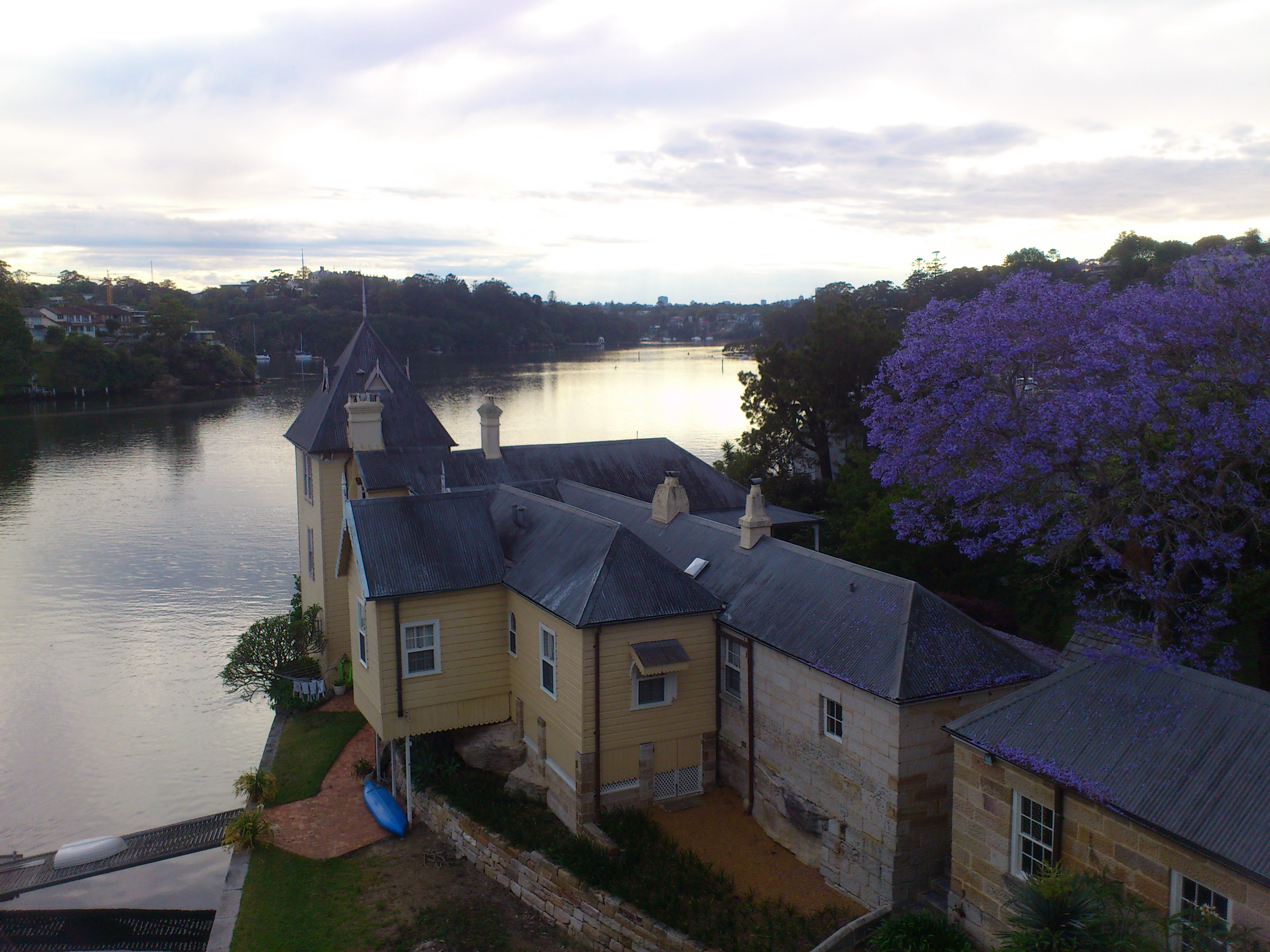
Figure 2: Lane Cove River from Fig Tree Bridge
Looking city-wards from the middle of the bridge, I got this one of a couple of morning kayakers.
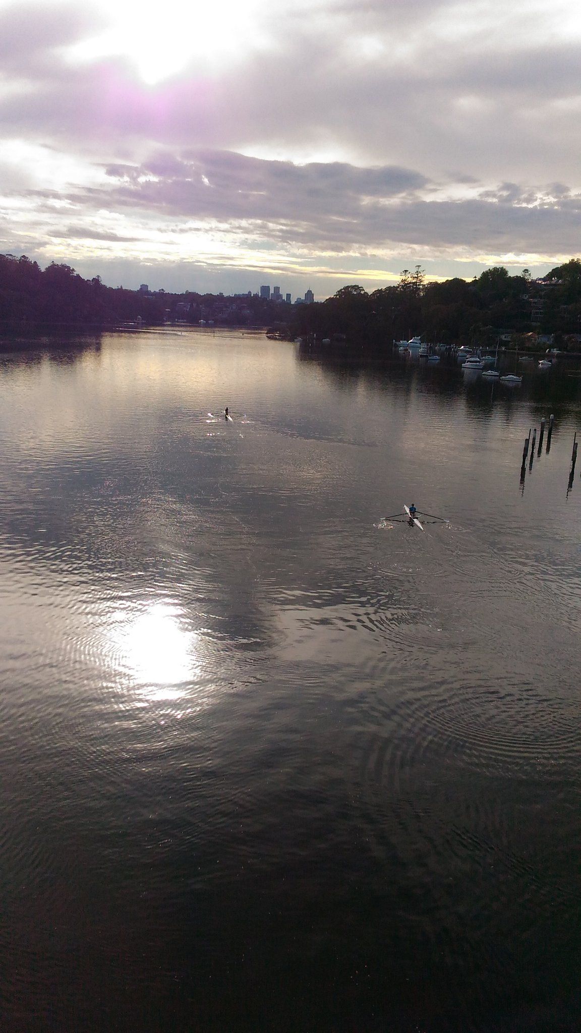
Figure 3: Morning kayakers on the river
Scenes such as these convey a sense of what it was like to experience the territory, something a map cannot do. The gap between the map and the territory is akin to the one between a plan and a project; the lived experience of a project is very different from the plan, and is also unique to each individual. Jon Whitty and Bronte van der Hoorn explore this at length in a fascinating paper that relates the experience of managing a project to the philosophy of Martin Heidegger.
The route then took us through a number of steep (but mercifully short) sections in the Lane Cove and Wollstonecraft area. On researching these later, I was gratified to find that three are featured in the Top 10 Hill runs in Lane Cove. Here’s a Google Street View shot of the top ranked one. Though it doesn’t look like much, it’s not the kind of gradient you want to encounter in a long walk.

Figure 4: A bit of a climb
As we negotiated these sections, it occurred to me that part of the fun lay in not knowing they were coming up. It’s often better not to anticipate challenges that are an unavoidable feature of the territory and deal with them as they arise. Just to be clear, I’m talking about routine challenges that are part of the territory, not those that are avoidable or have the potential to derail a project altogether.
It was getting to be time for that planned first coffee break. When drawing up our plan, we had assumed that all seven starting points (marked in blue in the map in Figure 1) would have cafes. Bad assumption: the starting points were set off from the main commercial areas. In retrospect, this makes good sense: you don’t want to have thousands of walkers traipsing through a small commercial area, disturbing the peace of locals enjoying a Sunday morning coffee. Whatever the reason, the point is that a taken-for-granted assumption turned out to be wrong; we finally got our first coffee well past the 10 km mark.
Post coffee, as we continued city-wards through Lavender Street we got this unexpected view:
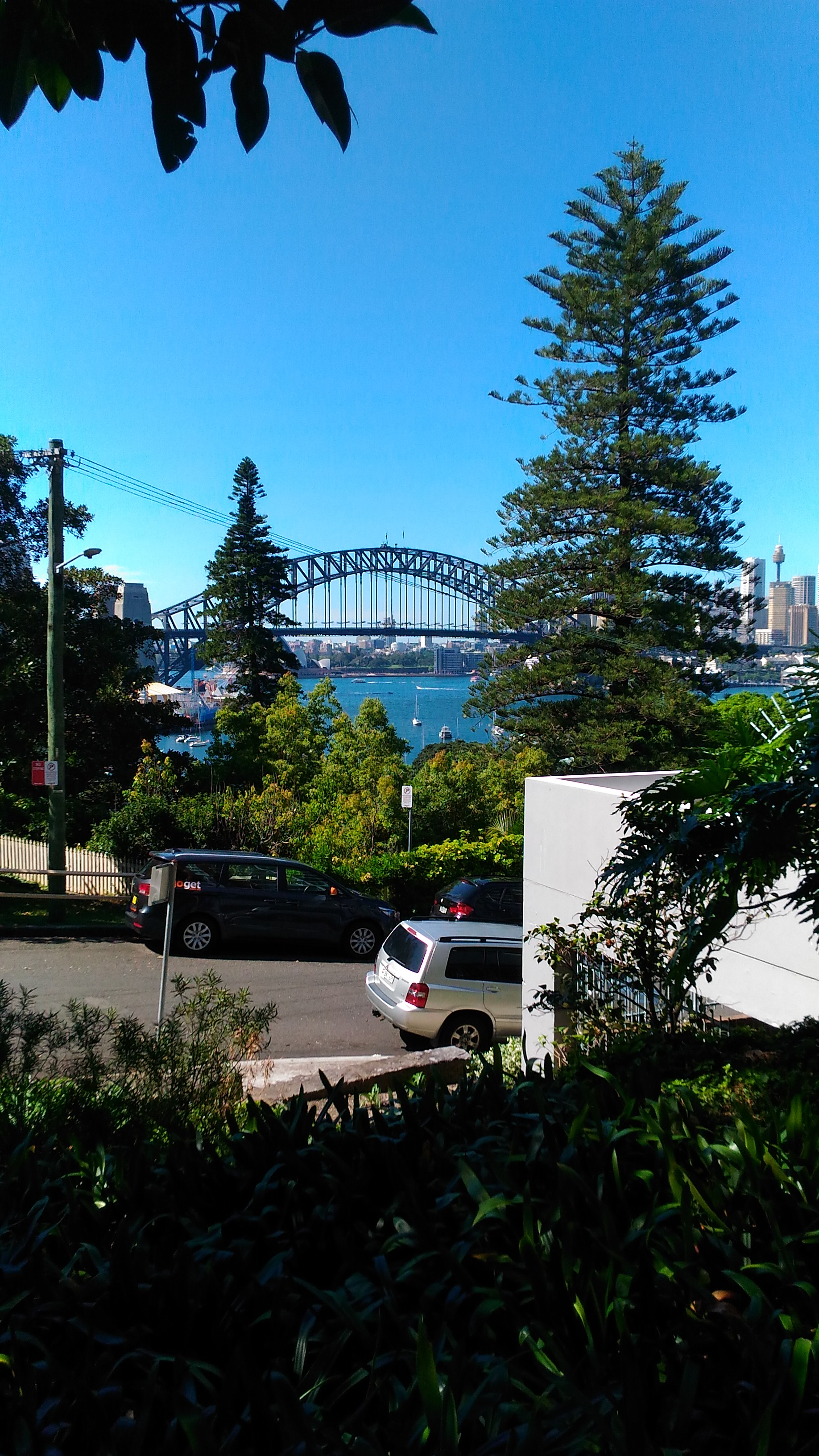
Figure 5: Harbour Bridge from Lavender St.
The view was all the sweeter because we realised we were close to the Harbour, well ahead of schedule (it was a little after 10 am).
The Harbour Bridge is arguably the most recognisable Sydney landmark. So instead of yet another stereotypical shot of it, I took one that shows a walker’s perspective while crossing it:

Figure 6: A pedestrian’s view of The Bridge
The barbed wire and mesh fencing detract from what would be an absolutely breathtaking view. According to this report, the fence has been in place for safety reasons since 1934! And yes, as one might expect, it is a sore point with tourists who come from far and wide to see the bridge.
Descriptions of things – which are but maps of a kind – often omit details that are significant. Sometimes this is done to downplay negative aspects of the object or event in question. How often have you, as a project manager, “dressed-up” reports to your stakeholders? Not outright lies, but stretching the truth. I’ve done it often enough.
The section south of The Bridge took us through parks surrounding the newly developed Barangaroo precinct which hugs the northern shoreline of the Sydney central business district. Another kilometer, and we were at crossing # 3, the Pyrmont Bridge in Darling Harbour:
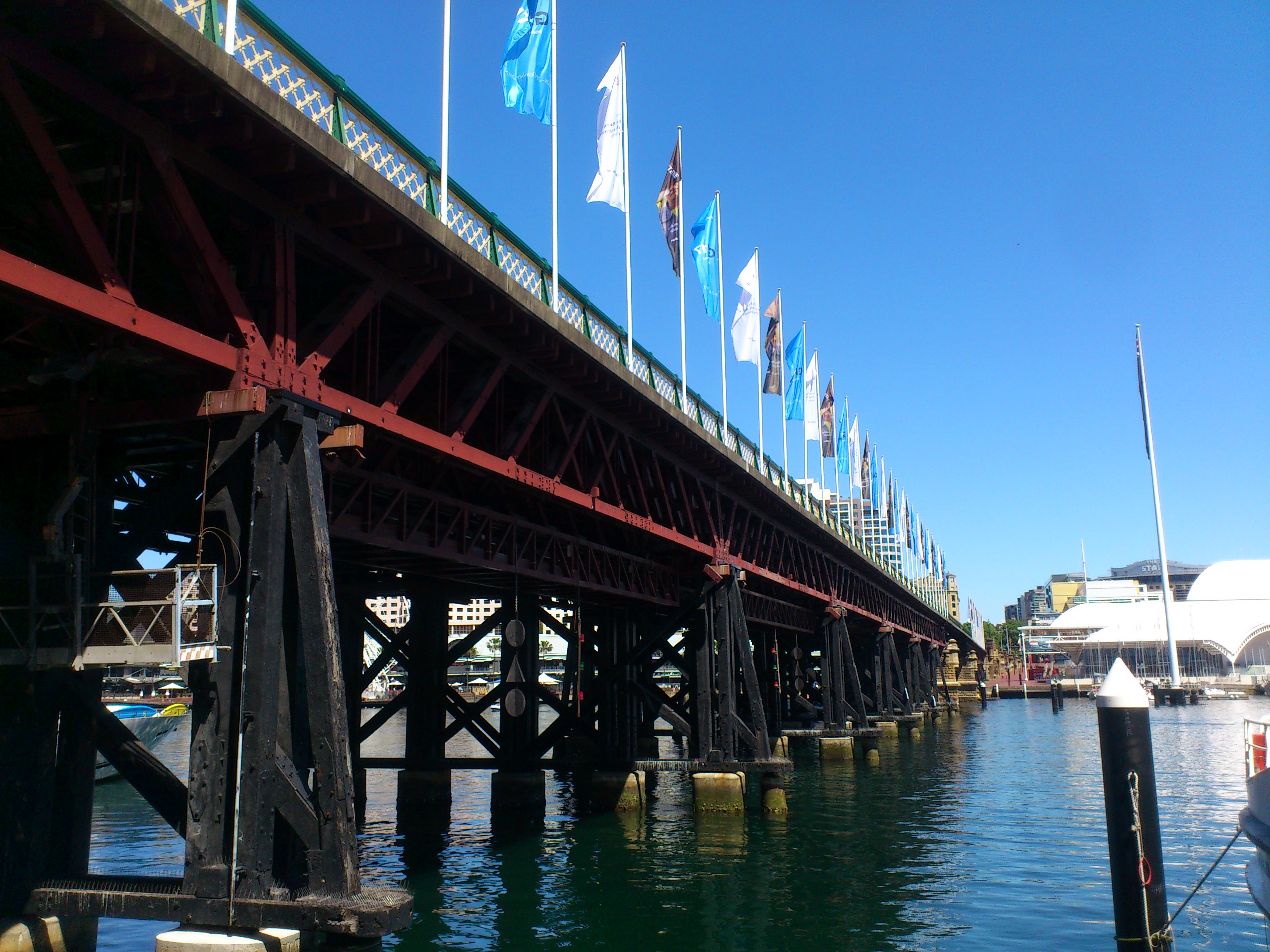
Figure 7: Pyrmont Bridge
Though almost an hour and half ahead of schedule, we took a short break for lunch at Darling Harbour before pressing on to Balmain and Anzac Bridge. John took this shot looking upward from Anzac Bridge:
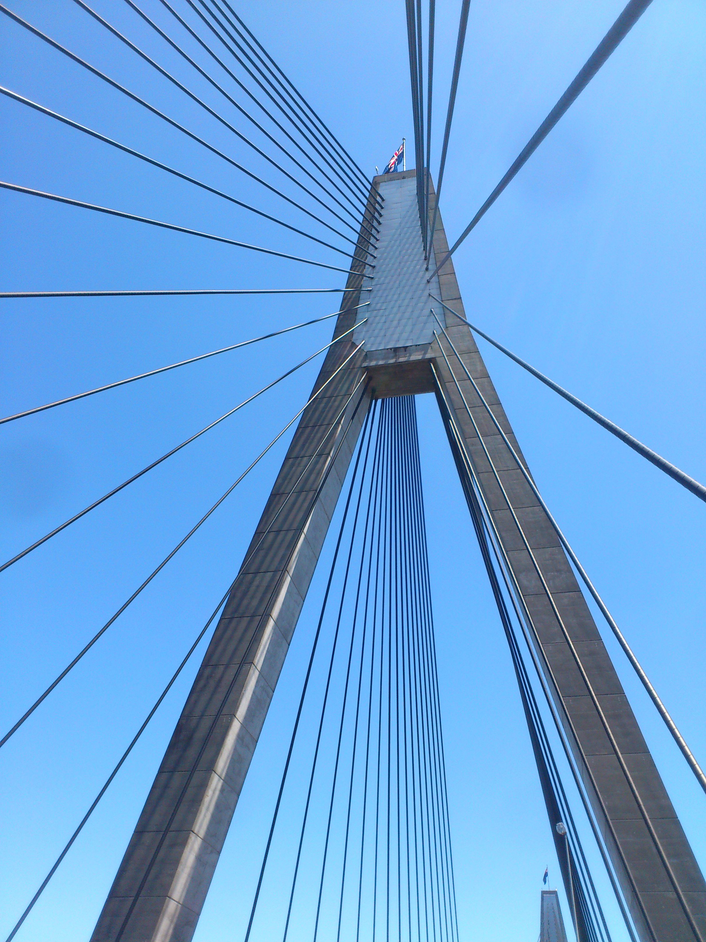
Figure: View looking up from Anzac Bridge
Commissioned in 1995, it replaced the Glebe Island Bridge, an electrically operated swing bridge constructed in 1903, which remained the main route from the city out to the western suburbs for over 90 years! As one might imagine, as the number of vehicles in the city increased many-fold from the 60s onwards, the old bridge became a major point of congestion. The Glebe Island Bridge, now retired, is a listed heritage site.
Incidentally, this little nugget of history was related to me by John as we walked this section of the route. It’s something I would almost certainly have missed had he not been with me that day. Journeys, real and metaphoric, are often enriched by travelling companions who point out things or fill in context that would otherwise be passed over.
Once past Anzac Bridge, the route took us off the main thoroughfare through the side streets of Rozelle. Many of these are lined by heritage buildings. Rozelle is in the throes of change as it is going to be impacted by a major motorway project.
The project reflects a wider problem in Australia: the relative neglect of public transport compared to road infrastructure. The counter-argument is that the relatively small population of the country makes the capital investments and running costs of public transport prohibitive. A wicked problem with no easy answers, but I do believe that the more sustainable option, though more expensive initially, will prove to be the better one in the long run.
Wicked problems are expected in large infrastructure projects that affect thousands of stakeholders, many of whom will have diametrically opposing views. What is less well appreciated is that even much smaller projects – say IT initiatives within a large organisation – can have elements of wickedness that can trip up the unwary. This is often magnified by management decisions made on the basis of short-term expediency.
From the side streets of Rozelle, the walk took us through Callan Park, which was the site of a psychiatric hospital from 1878 to 1994 (see this article for a horrifying history of asylums in Sydney). Some of the asylum buildings are now part of the Sydney College of The Arts. Pending the establishment of a trust to manage ongoing use of the site, the park is currently managed by the NSW Government in consultation with the local municipality.
Our fifth crossing of the day was Iron Cove Bridge. The cursory shot I took while crossing it does not do justice to the view; the early afternoon sun was starting to take its toll.

Figure 9: View from Iron Cove Bridge
The route then took us about a kilometer and half through the backstreets of Drummoyne to the penultimate crossing: Gladesville Bridge whose claim to fame is that it was for many years the longest single span concrete arch bridge in the world (another historical vignette that came to me via John). It has since been superseded by the Qinglong Railway Bridge in China.
By this time I was feeling quite perky, cheered perhaps by the realisation that we were almost done. I took time to compose perhaps my best shot of the day as we crossed Gladesville Bridge.

Figure 10: View from Gladesville Bridge
…and here’s one of the aforementioned arch, taken from below the bridge:
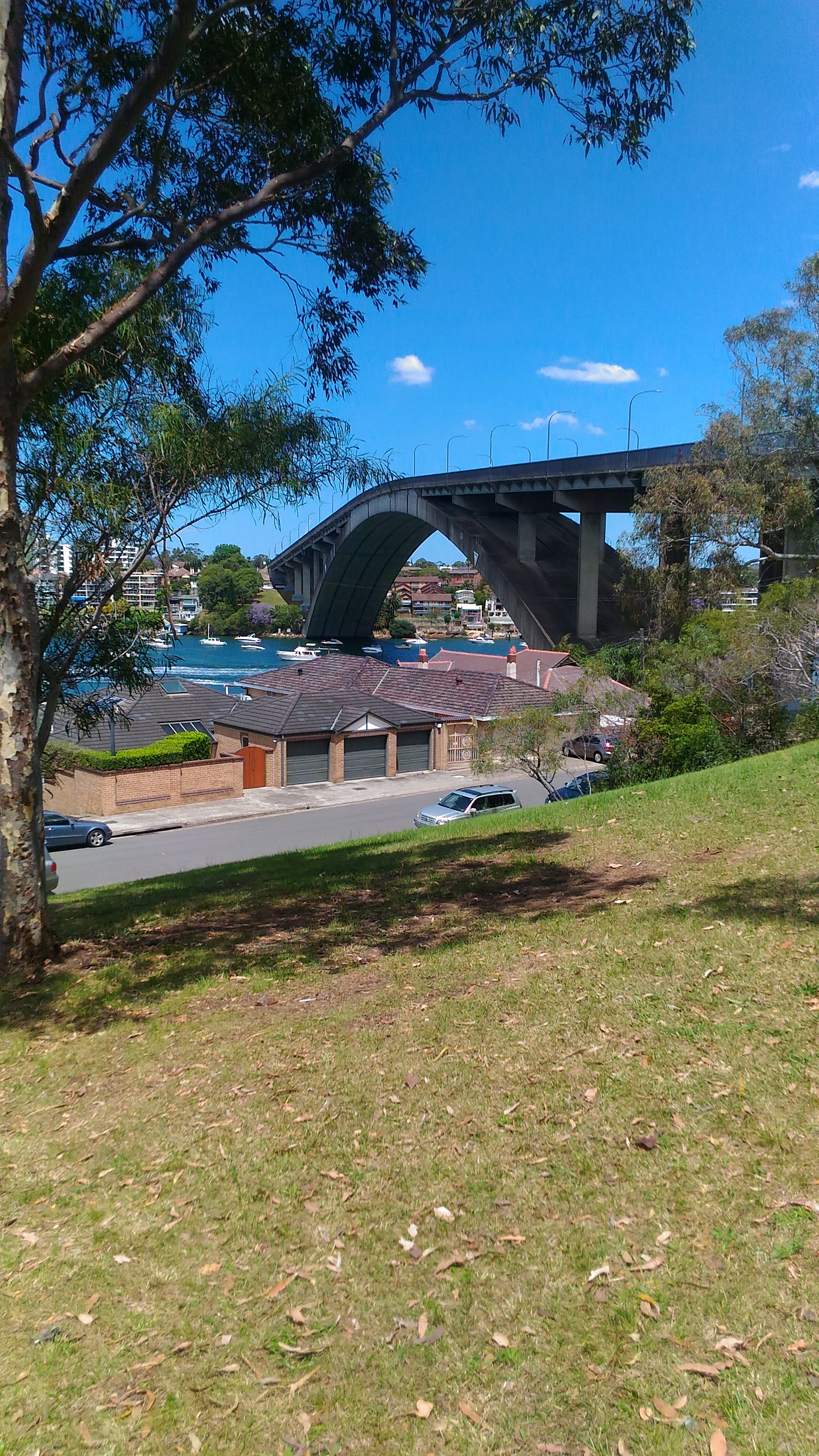
Figure 11: A side view of Gladesville Bridge
The final crossing, Tarban Creek Bridge was a short 100 metre walk from the Gladesville Bridge. We lingered mid-bridge to take a few shots as we realised the walk was coming to an end; the finish point was a few hundred metres away.
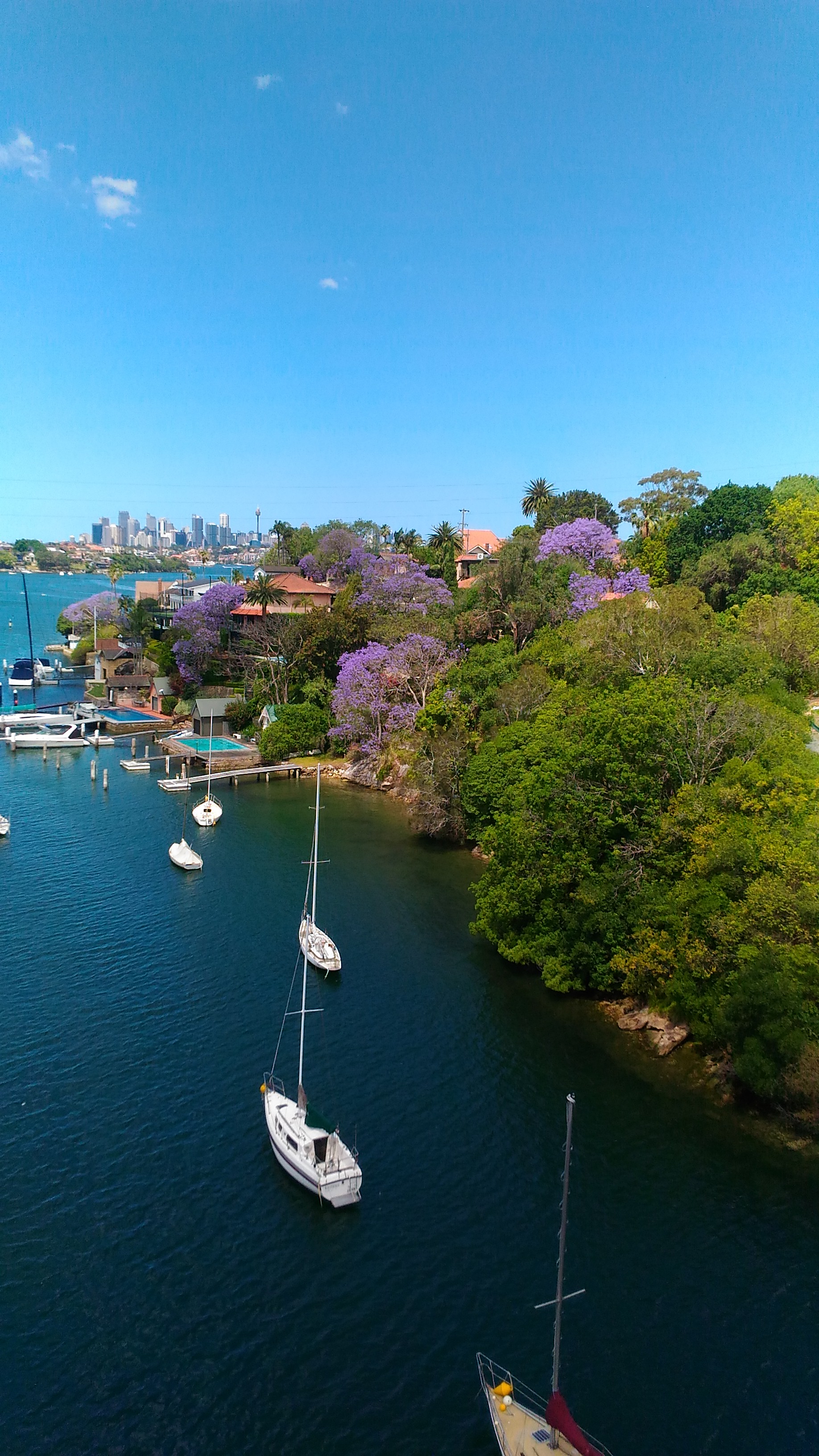
Figure 12: View from Tarban Creek Bridge
We duly collected our “Seven Bridges Completed” stamp at around 2:30 pm and headed to the local pub for a celebratory pint.

Figure 13: A well-deserved pint
Wrapping up
Gregory Bateson once wrote:
“We say the map is different from the territory. But what is the territory? Operationally, somebody went out with a retina or a measuring stick and made representations which were then put upon paper. What is on the paper map is a representation of what was in the retinal representation of the [person] who made the map; and as you push the question back, what you find is an infinite regress, an infinite series of maps. The territory never gets in at all. The territory is [the thing in itself] and you can’t do anything with it. Always the process of representation will filter it out so that the mental world is only maps of maps of maps, ad infinitum.”
One might think that a solution lies in making ever more accurate representations, but that is an exercise in futility. Indeed, as Borges pointed out in a short story:
“… In that Empire, the Art of Cartography attained such Perfection that the map of a single Province occupied the entirety of a City, and the map of the Empire, the entirety of a Province. In time, those Unconscionable Maps no longer satisfied, and the Cartographers Guilds struck a Map of the Empire whose size was that of the Empire, and which coincided point for point with it. The following Generations, who were not so fond of the Study of Cartography as their Forebears had been, saw that that vast map was Useless…”
Apart from being impossibly cumbersome, a complete map of a territory is impossible because a representation can never be the real thing. The territory remains forever ineffable; every encounter with it is unique and has the potential to reveal new perspectives.
This is as true for a project as it is for a walk or any other experience.
A gentle introduction to data visualisation using R
Data science students often focus on machine learning algorithms, overlooking some of the more routine but important skills of the profession. I’ve lost count of the number of times I have advised students working on projects for industry clients to curb their keenness to code and work on understanding the data first. This is important because, as people (ought to) know, data doesn’t speak for itself, it has to be given a voice; and as data-scarred professionals know from hard-earned experience, one of the best ways to do this is through visualisation.
Data visualisation is sometimes (often?) approached as a bag of tricks to be learnt individually, with no little or no reference to any underlying principles. Reading Hadley Wickham’s paper on the grammar of graphics was an epiphany; it showed me how different types of graphics can be constructed in a consistent way using common elements. Among other things, the grammar makes visualisation a logical affair rather than a set of tricks. This post is a brief – and hopefully logical – introduction to visualisation using ggplot2, Wickham’s implementation of a grammar of graphics.
In keeping with the practical bent of this series we’ll focus on worked examples, illustrating elements of the grammar as we go along. We’ll first briefly describe the elements of the grammar and then show how these are used to build different types of visualisations.
A grammar of graphics
Most visualisations are constructed from common elements that are pieced together in prescribed ways. The elements can be grouped into the following categories:
- Data – this is obvious, without data there is no story to tell and definitely no plot!
- Mappings – these are correspondences between data and display elements such as spatial location, shape or colour. Mappings are referred to as aesthetics in Wickham’s grammar.
- Scales – these are transformations (conversions) of data values to numbers that can be displayed on-screen. There should be one scale per mapping. ggplot typically does the scaling transparently, without users having to worry about it. One situation in which you might need to mess with default scales is when you want to zoom in on a particular range of values. We’ll see an example or two of this later in this article.
- Geometric objects – these specify the geometry of the visualisation. For example, in ggplot2 a scatter plot is specified via a point geometry whereas a fitting curve is represented by a smooth geometry. ggplot2 has a range of geometries available of which we will illustrate just a few.
- Coordinate system – this specifies the system used to position data points on the graphic. Examples of coordinate systems are Cartesian and polar. We’ll deal with Cartesian systems in this tutorial. See this post for a nice illustration of how one can use polar plots creatively.
- Facets – a facet specifies how data can be split over multiple plots to improve clarity. We’ll look at this briefly towards the end of this article.
The basic idea of a layered grammar of graphics is that each of these elements can be combined – literally added layer by layer – to achieve a desired visual result. Exactly how this is done will become clear as we work through some examples. So without further ado, let’s get to it.
Hatching (gg)plots
In what follows we’ll use the NSW Government Schools dataset, made available via the state government’s open data initiative. The data is in csv format. If you cannot access the original dataset from the aforementioned link, you can download an Excel file with the data here (remember to save it as a csv before running the code!).
The first task – assuming that you have a working R/RStudio environment – is to load the data into R. To keep things simple we’ll delete a number of columns (as shown in the code) and keep only rows that are complete, i.e. those that have no missing values. Here’s the code:
A note regarding the last line of code above, a couple of schools have “np” entered for the student_number variable. These are coerced to NA in the numeric conversion. The last line removes these two schools from the dataset.
Apart from student numbers and location data, we have retained level of schooling (primary, secondary etc.) and ICSEA ranking. The location information includes attributes such as suburb, postcode, region, remoteness as well as latitude and longitude. We’ll use only remoteness in this post.
The first thing that caught my eye in the data was was the ICSEA ranking. Before going any further, I should mention that the Australian Curriculum Assessment and Reporting Authority (the organisation responsible for developing the ICSEA system) emphasises that the score is not a school ranking, but a measure of socio-educational advantage of the student population in a school. Among other things, this is related to family background and geographic location. The average ICSEA score is set at an average of 1000, which can be used as a reference level.
I thought a natural first step would be to see how ICSEA varies as a function of the other variables in the dataset such as student numbers and location (remoteness, for example). To begin with, let’s plot ICSEA rank as a function of student number. As it is our first plot, let’s take it step by step to understand how the layered grammar works. Here we go:
This displays a blank plot because we have not specified a mapping and geometry to go with the data. To get a plot we need to specify both. Let’s start with a scatterplot, which is specified via a point geometry. Within the geometry function, variables are mapped to visual properties of the using aesthetic mappings. Here’s the code:
The resulting plot is shown in Figure 1.
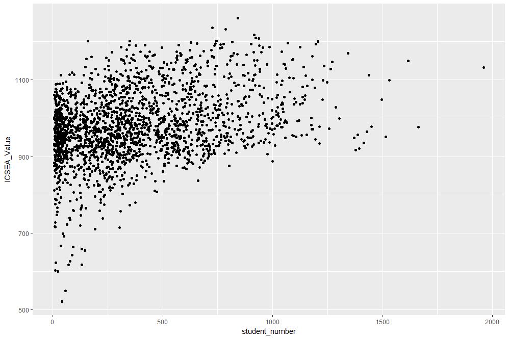
Figure 1: Scatterplot of ICSEA score versus student numbers
At first sight there are two points that stand out: 1) there are fewer number of large schools, which we’ll look into in more detail later and 2) larger schools seem to have a higher ICSEA score on average. To dig a little deeper into the latter, let’s add a linear trend line. We do that by adding another layer (geometry) to the scatterplot like so:
The result is shown in Figure 2.
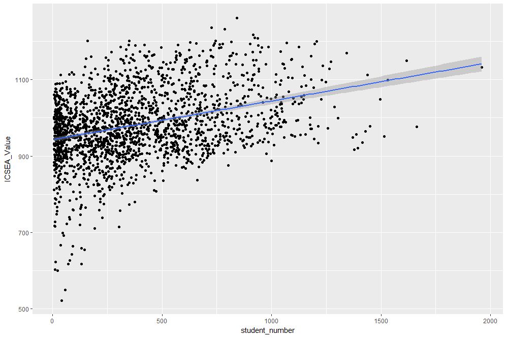
Figure 2: scatterplot of ICSEA vs student number with linear trendline
The lm method does a linear regression on the data. The shaded area around the line is the 95% confidence level of the regression line (i.e that it is 95% certain that the true regression line lies in the shaded region). Note that geom_smooth provides a range of smoothing functions including generalised linear and local regression (loess) models.
You may have noted that we’ve specified the aesthetic mappings in both geom_point and geom_smooth. To avoid this duplication, we can simply specify the mapping, once in the top level ggplot call (the first layer) like so:
geom_point()+
geom_smooth(method=”lm”)
From Figure 2, one can see a clear positive correlation between student numbers and ICSEA scores, let’s zoom in around the average value (1000) to see this more clearly…
The coord_cartesian function is used to zoom the plot to without changing any other settings. The result is shown in Figure 3.

Figure 3: Zoomed view of Figure 2 for 900 < ICSEA <1100
To make things clearer, let’s add a reference line at the average:
The result, shown in Figure 4, indicates quite clearly that larger schools tend to have higher ICSEA scores. That said, there is a twist in the tale which we’ll come to a bit later.
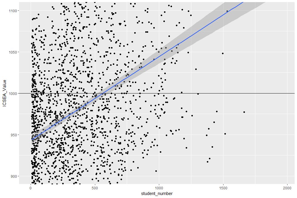
Figure 4: Zoomed view with reference line at average value of ICSEA
As a side note, you would use geom_vline to zoom in on a specific range of x values and geom_abline to add a reference line with a specified slope and intercept. See this article on ggplot reference lines for more.
OK, now that we have seen how ICSEA scores vary with student numbers let’s switch tack and incorporate another variable in the mix. An obvious one is remoteness. Let’s do a scatterplot as in Figure 1, but now colouring each point according to its remoteness value. This is done using the colour aesthetic as shown below:
geom_point()
The resulting plot is shown in Figure 5.

Figure 5: ICSEA score as a function of student number and remoteness category
Aha, a couple of things become apparent. First up, large schools tend to be in metro areas, which makes good sense. Secondly, it appears that metro area schools have a distinct socio-educational advantage over regional and remote area schools. Let’s add trendlines by remoteness category as well to confirm that this is indeed so:
The plot, which is shown in Figure 6, indicates clearly that ICSEA scores decrease on the average as we move away from metro areas.
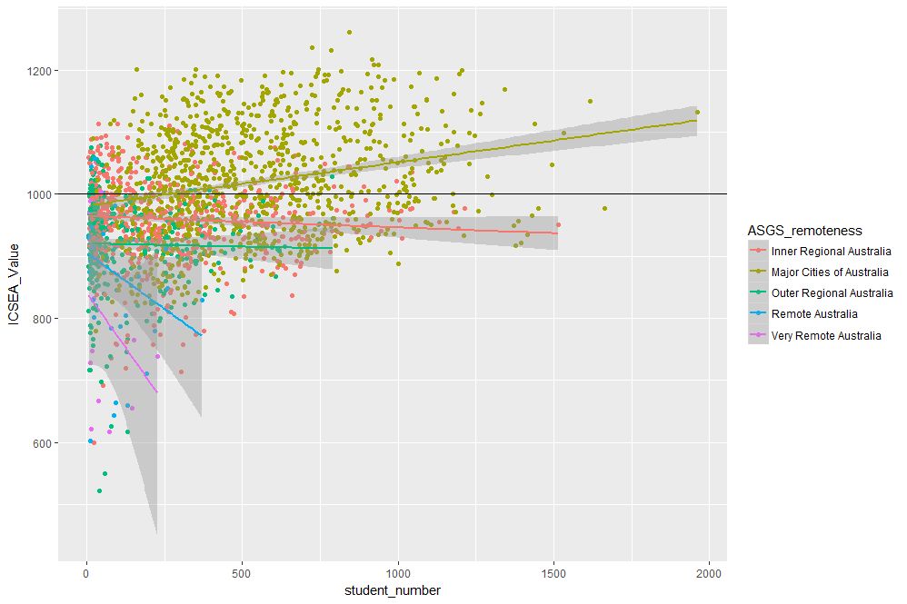
Figure 6: ICSEA scores vs student numbers and remoteness, with trendlines for each remoteness category
Moreover, larger schools metropolitan areas tend to have higher than average scores (above 1000), regional areas tend to have lower than average scores overall, with remote areas being markedly more disadvantaged than both metro and regional areas. This is no surprise, but the visualisations show just how stark the differences are.
It is also interesting that, in contrast to metro and (to some extent) regional areas, there negative correlation between student numbers and scores for remote schools. One can also use local regression to get a better picture of how ICSEA varies with student numbers and remoteness. To do this, we simply use the loess method instead of lm:
geom_point() + geom_hline(yintercept=1000) + geom_smooth(method=”loess”)
The result, shown in Figure 7, has a number of interesting features that would have been worth pursuing further were we analysing this dataset in a real life project. For example, why do small schools tend to have lower than benchmark scores?

Figure 7: ICSEA scores vs student numbers and remoteness with loess regression curves.
From even a casual look at figures 6 and 7, it is clear that the confidence intervals for remote areas are huge. This suggests that the number of datapoints for these regions are a) small and b) very scattered. Let’s quantify the number by getting counts using the table function (I know, we could plot this too…and we will do so a little later). We’ll also transpose the results using data.frame to make them more readable:
The number of datapoints for remote regions is much less than those for metro and regional areas. Let’s repeat the loess plot with only the two remote regions. Here’s the code:
geom_point() + geom_hline(yintercept=1000) + geom_smooth(method=”loess”)
The plot, shown in Figure 8, shows that there is indeed a huge variation in the (small number) of datapoints, and the confidence intervals reflect that. An interesting feature is that some small remote schools have above average scores. If we were doing a project on this data, this would be a feature worth pursuing further as it would likely be of interest to education policymakers.

Figure 8: Loess plots as in Figure 7 for remote region schools
Note that there is a difference in the x axis scale between Figures 7 and 8 – the former goes from 0 to 2000 whereas the latter goes up to 400 only. So for a fair comparison, between remote and other areas, you may want to re-plot Figure 7, zooming in on student numbers between 0 and 400 (or even less). This will also enable you to see the complicated dependence of scores on student numbers more clearly across all regions.
We’ll leave the scores vs student numbers story there and move on to another geometry – the well-loved bar chart. The first one is a visualisation of the remoteness category count that we did earlier. The relevant geometry function is geom_bar, and the code is as easy as:
The plot is shown in Figure 9.
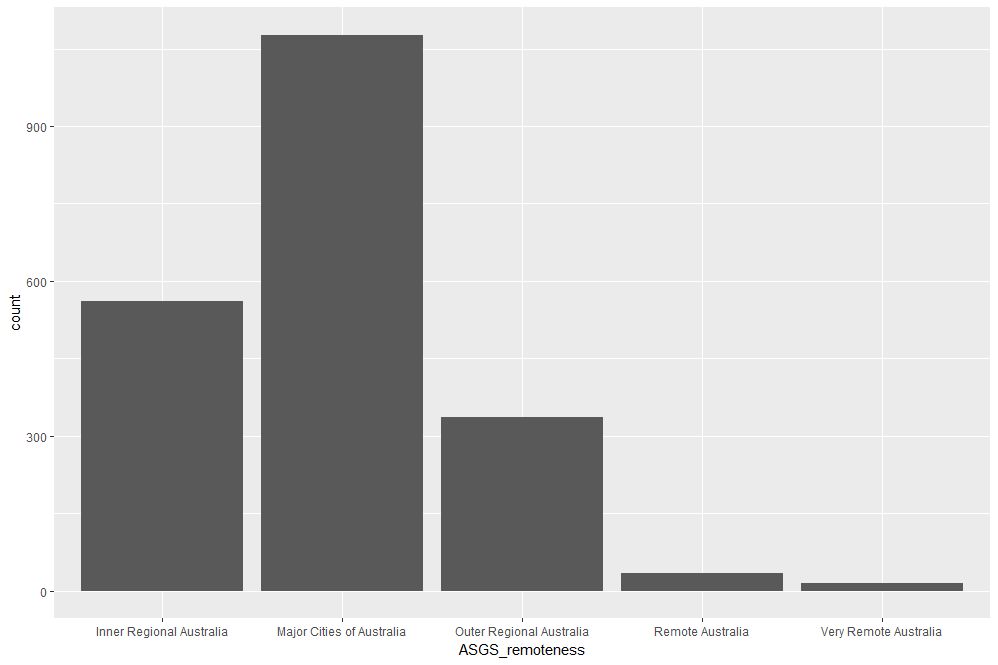
Figure 9: School count by remoteness categories
The category labels on the x axis are too long and look messy. This can be fixed by tilting them to a 45 degree angle so that they don’t run into each other as they most likely did when you ran the code on your computer. This is done by modifying the axis.text element of the plot theme. Additionally, it would be nice to get counts on top of each category bar. The way to do that is using another geometry function, geom_text. Here’s the code incorporating the two modifications:
theme(axis.text.x=element_text(angle=45, hjust=1))
The result is shown in Figure 10.

Figure 10: Bar plot of remoteness with counts and angled x labels
Some things to note: : stat=count tells ggplot to compute counts by category and the aesthetic label = ..count.. tells ggplot to access the internal variable that stores those counts. The the vertical justification setting, vjust=-1, tells ggplot to display the counts on top of the bars. Play around with different values of vjust to see how it works. The code to adjust label angles is self explanatory.
It would be nice to reorder the bars by frequency. This is easily done via fct_infreq function in the forcats package like so:
geom_bar(mapping = aes(x=fct_infreq(ASGS_remoteness)))+
theme(axis.text.x=element_text(angle=45, hjust=1))
The result is shown in Figure 11.

Figure 11: Barplot of Figure 10 sorted by descending count
To reverse the order, invoke fct_rev, which reverses the sort order:
geom_bar(mapping = aes(x=fct_rev(fct_infreq(ASGS_remoteness))))+
theme(axis.text.x=element_text(angle=45, hjust=1))
The resulting plot is shown in Figure 12.
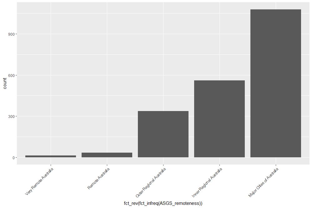
Figure 12: Bar plot of Figure 10 sorted by ascending count
If this is all too grey for us, we can always add some colour. This is done using the fill aesthetic as follows:
geom_bar(mapping = aes(x=ASGS_remoteness, fill=ASGS_remoteness))+
theme(axis.text.x=element_text(angle=45, hjust=1))
The resulting plot is shown in Figure 13.

Figure 13: Coloured bar plot of school count by remoteness
Note that, in the above, that we have mapped fill and x to the same variable, remoteness which makes the legend superfluous. I will leave it to you to figure out how to suppress the legend – Google is your friend.
We could also map fill to another variable, which effectively adds another dimension to the plot. Here’s how:
geom_bar(mapping = aes(x=ASGS_remoteness, fill=level_of_schooling))+
theme(axis.text.x=element_text(angle=45, hjust=1))
The plot is shown in Figure 14. The new variable, level of schooling, is displayed via proportionate coloured segments stacked up in each bar. The default stacking is one on top of the other.

Figure 14: Bar plot of school counts as a function of remoteness and school level
Alternately, one can stack them up side by side by setting the position argument to dodge as follows:
geom_bar(mapping = aes(x=ASGS_remoteness,fill=level_of_schooling),position =”dodge”)+
theme(axis.text.x=element_text(angle=45, hjust=1))
The plot is shown in Figure 15.

Figure 15: Same data as in Figure 14 stacked side-by-side
Finally, setting the position argument to fill normalises the bar heights and gives us the proportions of level of schooling for each remoteness category. That sentence will make more sense when you see Figure 16 below. Here’s the code, followed by the figure:
geom_bar(mapping = aes(x=ASGS_remoteness,fill=level_of_schooling),position = “fill”)+
theme(axis.text.x=element_text(angle=45, hjust=1))
Obviously, we lose frequency information since the bar heights are normalised.
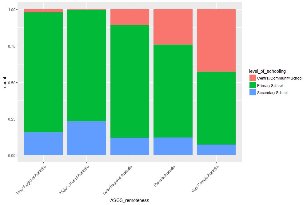
Figure 16: Proportions of school levels for remoteness categories
An interesting feature here is that the proportion of central and community schools increases with remoteness. Unlike primary and secondary schools, central / community schools provide education from Kindergarten through Year 12. As remote areas have smaller numbers of students, it makes sense to consolidate educational resources in institutions that provide schooling at all levels .
Finally, to close the loop so to speak, let’s revisit our very first plot in Figure 1 and try to simplify it in another way. We’ll use faceting to split it out into separate plots, one per remoteness category. First, we’ll organise the subplots horizontally using facet_grid:
facet_grid(~ASGS_remoteness)
The plot is shown in Figure 17 in which the different remoteness categories are presented in separate plots (facets) against a common y axis. It shows, the sharp differences between student numbers between remote and other regions.
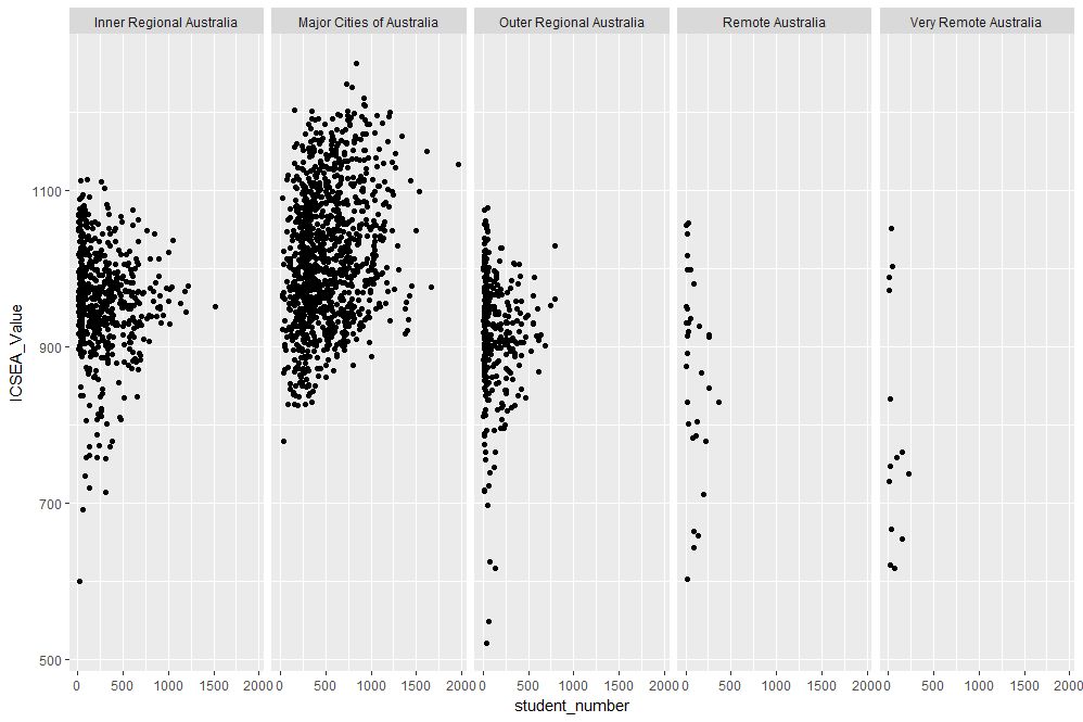
Figure 17: Horizontally laid out facet plots of ICSEA scores for different remoteness categories
To get a vertically laid out plot, switch the faceted variable to other side of the formula (left as an exercise for you).
If one has too many categories to fit into a single row, one can wrap the facets using facet_wrap like so:
geom_point(mapping = aes(x=student_number,y=ICSEA_Value))+
facet_wrap(~ASGS_remoteness, ncol= 2)
The resulting plot is shown in Figure 18.

Figure 18: Same data as in Figure 17, with facets wrapped in a 2 column format
One can specify the number of rows instead of columns. I won’t illustrate that as the change in syntax is quite obvious.
…and I think that’s a good place to stop.
Wrapping up
Data visualisation has a reputation of being a dark art, masterable only by the visually gifted. This may have been partially true some years ago, but in this day and age it definitely isn’t. Versatile packages such as ggplot, that use a consistent syntax have made the art much more accessible to visually ungifted folks like myself. In this post I have attempted to provide a brief and (hopefully) logical introduction to ggplot. In closing I note that although some of the illustrative examples violate the principles of good data visualisation, I hope this article will serve its primary purpose which is pedagogic rather than artistic.
Further reading:
Where to go for more? Two of the best known references are Hadley Wickham’s books:
I highly recommend his R for Data Science , available online here. Apart from providing a good overview of ggplot, it is an excellent introduction to R for data scientists. If you haven’t read it, do yourself a favour and buy it now.
People tell me his ggplot book is an excellent book for those wanting to learn the ins and outs of ggplot . I have not read it myself, but if his other book is anything to go by, it should be pretty damn good.
The two tributaries of time
How time flies. Ten years ago this month, I wrote my first post on Eight to Late. The anniversary gives me an excuse to post something a little different. When rummaging around in my drafts folder for something suitable, I came across this piece that I wrote some years ago (2013) but didn’t publish. It’s about our strange relationship with time, which I thought makes it a perfect piece to mark the occasion.
Introduction
The metaphor of time as a river resonates well with our subjective experiences of time. Everyday phrases that evoke this metaphor include the flow of time and time going by, or the somewhat more poetic currents of time. As Heraclitus said, no [person] can step into the same river twice – and so it is that a particular instant in time …like right now…is ephemeral, receding into the past as we become aware of it.
On the other hand, organisations have to capture and quantify time because things have to get done within fixed periods, the financial year being a common example. Hence, key organisational activities such as projects, strategies and budgets are invariably time-bound affairs. This can be problematic because there is a mismatch between the ways in which organisations view time and individuals experience it.
Organisational time
The idea that time is an objective entity is most clearly embodied in the notion of a timeline: a graphical representation of a time period, punctuated by events. The best known of these is perhaps the ubiquitous Gantt Chart, loved (and perhaps equally, reviled) by managers the world over.
Timelines are interesting because, as Elaine Yakura states in this paper, “they seem to render time, the ultimate abstraction, visible and concrete.” As a result, they can serve as boundary objects that make it possible to negotiate and communicate what is to be accomplished in the specified time period. They make this possible because they tell a story with a clear beginning, middle and end, a narrative of what is to come and when.
For the reasons mentioned in the previous paragraph, timelines are often used to manage time-bound organisational initiatives. Through their use in scheduling and allocation, timelines serve to objectify time in such a way that it becomes a resource that can be measured and rationed, much like other resources such as money, labour etc.
At our workplaces we are governed by many overlapping timelines – workdays, budgeting cycles and project schedules being examples. From an individual perspective, each of these timelines are different representations of how one’s time is to be utilised, when an activity should be started and when it must be finished. Moreover, since we are generally committed to multiple timelines, we often find ourselves switching between them. They serve to remind us what we should be doing and when.
But there’s more: one of the key aims of developing a timeline is to enable all stakeholders to have a shared understanding of time as it pertains to the initiative. In this view, a timeline is a consensus representation of how a particular aspect of the future will unfold. Timelines thus serve as coordinating mechanisms.
In terms of the metaphor, a timeline is akin to a map of the river of time. Along the map we can measure out and apportion it; we can even agree about way-stops at various points in time. However, we should always be aware that it remains a representation of time, for although we might treat a timeline as real, the fact is no one actually experiences time as it is depicted in a timeline. Mistaking one for the other is akin to confusing the map with the territory.
This may sound a little strange so I’ll try to clarify. I’ll start with the observation that we experience time through events and processes – for example the successive chimes of a clock, the movement of the second hand of a watch (or the oscillations of a crystal), the passing of seasons or even the greying of one’s hair. Moreover, since these events and processes can be objectively agreed on by different observers, they can also be marked out on a timeline. Yet the actual experience of living these events is unique to each individual.
Individual perception of time
As we have seen, organisations treat time as an objective commodity that can be represented, allocated and used much like any tangible resource. On the other hand our experience of time is intensely personal. For example, I’m sitting in a cafe as I write these lines. My perception of the flow of time depends rather crucially on my level of engagement in writing: slow when I’m struggling for words but zipping by when I’m deeply involved. This is familiar to us all: when we are deeply engaged in an activity, we lose all sense of time but when our involvement is superficial we are acutely aware of the clock.
This is true at work as well. When I’m engaged in any kind of activity at work, be it a group activity such as a meeting, or even an individual one such as developing a business case, my perception of time has little to do with the actual passage of seconds, minutes and hours on a clock. Sure, there are things that I will do habitually at a particular time – going to lunch, for example – but my perception of how fast the day goes is governed not by the clock but by the degree of engagement with my work.
I can only speak for myself, but I suspect that this is the case with most people. Though our work lives are supposedly governed by “objective” timelines, the way we actually live out our workdays depends on a host of things that have more to do with our inner lives than visible outer ones. Specifically, they depend on things such as feelings, emotions, moods and motivations.
Flow and engagement
OK, so you may be wondering where I’m going with this. Surely, my subjective perception of my workday should not matter as long as I do what I’m required to do and meet my deadlines, right?
As a matter of fact, I think the answer to the above question is a qualified, “No”. The quality of the work we do depends on our level of commitment and engagement. Moreover, since a person’s perception of the passage of time depends rather sensitively on the degree of their involvement in a task, their subjective sense of time is a good indicator of their engagement in work.
In his book, Finding Flow, Mihalyi Csikszentmihalyi describes such engagement as an optimal experience in which a person is completely focused on the task at hand. Most people would have experienced flow when engaged in activities that they really enjoy. As Anthony Reading states in his book, Hope and Despair: How Perceptions of the Future Shape Human Behaviour, “…most of what troubles us resides in our concerns about the past and our apprehensions about the future.” People in flow are entirely focused on the present and are thus (temporarily) free from troubling thoughts. As Csikszentmihalyi puts it, for such people, “the sense of time is distorted; hours seem to pass by in minutes.”
All this may seem far removed from organisational concerns, but it is easy to see that it isn’t: a Google search on the phrase “increase employee engagement” will throw up many articles along the lines of “N ways to increase employee engagement.” The sense in which the term is used in these articles is essentially the same as the one Csikszentmihalyi talks about: deep involvement in work.
So, the advice of management gurus and business school professors notwithstanding, the issue is less about employee engagement or motivation than about creating conditions that are conducive to flow. All that is needed for the latter is a deep understanding how the particular organisation functions, the task at hand and (most importantly) the people who will be doing it. The best managers I’ve worked with have grokked this, and were able to create the right conditions in a seemingly effortless and unobtrusive way. It is a skill that cannot be taught, but can be learnt by observing how such managers do what they do.
Time regained
Organisations tend to treat their employees’ time as though it were a commodity or resource that can be apportioned and allocated for various tasks. This view of time is epitomised by the timeline as depicted in a Gantt Chart or a resource-loaded project schedule.
In contrast, at an individual level, the perception of time depends rather critically on the level of engagement that a person feels with the task he or she is performing. Ideally organisations would (or ought to!) want their employees to be in that optimal zone of engagement that Csikszentmihalyi calls flow, at least when they are involved in creative work. However, like spontaneity, flow is a state that cannot be achieved by corporate decree; the best an organisation can do is to create the conditions that encourage it.
The organisational focus on timelines ought to be balanced by actions that are aimed at creating the conditions that are conducive to employee engagement and flow. It may then be possible for those who work in organisation-land to experience, if only fleetingly, that Blakean state in which eternity is held in an hour.


