A prelude to machine learning
What is machine learning?
The term machine learning gets a lot of airtime in the popular and trade press these days. As I started writing this article, I did a quick search for recent news headlines that contained this term. Here are the top three results with datelines within three days of the search:
The truth about hype usually tends to be quite prosaic and so it is in this case. Machine learning, as Professor Yaser Abu-Mostafa puts it, is simply about “learning from data.” And although the professor is referring to computers, this is so for humans too – we learn through patterns discerned from sensory data. As he states in the first few lines of his wonderful (but mathematically demanding!) book entitled, Learning From Data:
If you show a picture to a three-year-old and ask if there’s a tree in it, you will likely get a correct answer. If you ask a thirty year old what the definition of a tree is, you will likely get an inconclusive answer. We didn’t learn what a tree is by studying a [model] of what trees [are]. We learned by looking at trees. In other words, we learned from data.
In other words, the three year old forms a model of what constitutes a tree through a process of discerning a common pattern between all objects that grown-ups around her label “trees.” (the data). She can then “predict” that something is (or is not) a tree by applying this model to new instances presented to her.
This is exactly what happens in machine learning: the computer (or more correctly, the algorithm) builds a predictive model of a variable (like “treeness”) based on patterns it discerns in data. The model can then be applied to predict the value of the variable (e.g. is it a tree or not) in new instances.
With that said for an introduction, it is worth contrasting this machine-driven process of model building with the traditional approach of building mathematical models to predict phenomena as in, say, physics and engineering.
What are models good for?
Physicists and engineers model phenomena using physical laws and mathematics. The aim of such modelling is both to understand and predict natural phenomena. For example, a physical law such as Newton’s Law of Gravitation is itself a model – it helps us understand how gravity works and make predictions about (say) where Mars is going to be six months from now. Indeed, all theories and laws of physics are but models that have wide applicability.
(Aside: Models are typically expressed via differential equations. Most differential equations are hard to solve analytically (or exactly), so scientists use computers to solve them numerically. It is important to note that in this case computers are used as calculation tools, they play no role in model-building.)
As mentioned earlier, the role of models in the sciences is twofold – understanding and prediction. In contrast, in machine learning the focus is usually on prediction rather than understanding. The predictive successes of machine learning have led certain commentators to claim that scientific theory building is obsolete and science can advance by crunching data alone. Such claims are overblown, not to mention, hubristic, for although a data scientist may be able to predict with accuracy, he or she may not be able to tell you why a particular prediction is obtained. This lack of understanding can mislead and can even have harmful consequences, a point that’s worth unpacking in some detail…
Assumptions, assumptions
A model of a real world process or phenomenon is necessarily a simplification. This is essentially because it is impossible to isolate a process or phenomenon from the rest of the world. As a consequence it is impossible to know for certain that the model one has built has incorporated all the interactions that influence the process / phenomenon of interest. It is quite possible that potentially important variables have been overlooked.
The selection of variables that go into a model is based on assumptions. In the case of model building in physics, these assumptions are made upfront and are thus clear to anybody who takes the trouble to read the underlying theory. In machine learning, however, the assumptions are harder to see because they are implicit in the data and the algorithm. This can be a problem when data is biased or an algorithm opaque.
Problem of bias and opacity become more acute as datasets increase in size and algorithms become more complex, especially when applied to social issues that have serious human consequences. I won’t go into this here, but for examples the interested reader may want to have a look at Cathy O’Neil’s book, Weapons of Math Destruction, or my article on the dark side of data science.
As an aside, I should point out that although assumptions are usually obvious in traditional modelling, they are often overlooked out of sheer laziness or, more charitably, lack of awareness. This can have disastrous consequences. The global financial crisis of 2008 can – to some extent – be blamed on the failure of trading professionals to understand assumptions behind the model that was used to calculate the value of collateralised debt obligations.
It all starts with a straight line….
Now that we’ve taken a tour of some of the key differences between model building in the old and new worlds, we are all set to start talking about machine learning proper.
I should begin by admitting that I overstated the point about opacity: there are some machine learning algorithms that are transparent as can possibly be. Indeed, chances are you know the algorithm I’m going to discuss next, either from an introductory statistics course in university or from plotting relationships between two variables in your favourite spreadsheet. Yea, you may have guessed that I’m referring to linear regression.
In its simplest avatar, linear regression attempts to fit a straight line to a set of data points in two dimensions. The two dimensions correspond to a dependent variable (traditionally denoted by 


Figure 1: Linear Regression
Figure 1 also serves to illustrate that linear models are going to be inappropriate in most real world situations (the straight line does not fit the data well). But it is not so hard to devise methods to fit more complicated functions.
The important point here is that since machine learning is about finding functions that accurately predict dependent variables for as yet unknown values of the independent variables, most algorithms make explicit or implicit choices about the form of these functions.
Complexity versus simplicity
At first sight it seems a no-brainer that complicated functions will work better than simple ones. After all, if we choose a nonlinear function with lots of parameters, we should be able to fit a complex data set better than a linear function can (See Figure 2 – the complicated function fits the datapoints better than the straight line). But there’s catch: although the ability to fit a dataset increases with the flexibility of the fitting function, increasing complexity beyond a point will invariably reduce predictive power. Put another way, a complex enough function may fit the known data points perfectly but, as a consequence, will inevitably perform poorly on unknown data. This is an important point so let’s look at it in greater detail.

Figure 2: Simple and complex fitting function (courtesy: Wikimedia)
Recall that the aim of machine learning is to predict values of the dependent variable for as yet unknown values of the independent variable(s). Given a finite (and usually, very limited) dataset, how do we build a model that we can have some confidence in? The usual strategy is to partition the dataset into two subsets, one containing 60 to 80% of the data (called the training set) and the other containing the remainder (called the test set). The model is then built – i.e. an appropriate function fitted – using the training data and verified against the test data. The verification process consists of comparing the predicted values of the dependent variable with the known values for the test set.
Now, it should be intuitively clear that the more complicated the function, the better it will fit the training data.
Question: Why?
Answer: Because complicated functions have more free parameters – for example, linear functions of a single (dependent) variable have two parameters (slope and intercept), quadratics have three, cubics four and so on. The mathematician, John von Neumann is believed to have said, “With four parameters I can fit an elephant, and with five I can make him wiggle his trunk.” See this post for a nice demonstration of the literal truth of his words.
Put another way, complex functions are wrigglier than simple ones, and – by suitable adjustment of parameters – their “wriggliness” can be adjusted to fit the training data better than functions that are less wriggly. Figure 2 illustrates this point well.
This may sound like you can have your cake and eat it too: choose a complicated enough function and you can fit both the training and test data well. Not so! Keep in mind that the resulting model (fitted function) is built using the training set alone, so a good fit to the test data is not guaranteed. In fact, it is intuitively clear that a function that fits the training data perfectly (as in Figure 2) is likely to do a terrible job on the test data.
Question: Why?
Answer: Remember, as far as the model is concerned, the test data is unknown. Hence, the greater the wriggliness in the trained model, the less likely it is to fit the test data well. Remember, once the model is fitted to the training data, you have no freedom to tweak parameters any further.
This tension between simplicity and complexity of models is one of the key principles of machine learning and is called the bias-variance tradeoff. Bias here refers to lack of flexibility and variance, the reducible error. In general simpler functions have greater bias and lower variance and complex functions, the opposite. Much of the subtlety of machine learning lies in developing an understanding of how to arrive at the right level of complexity for the problem at hand – that is, how to tweak parameters so that the resulting function fits the training data just well enough so as to generalise well to unknown data.
Note: those who are curious to learn more about the bias-variance tradeoff may want to have a look at this piece. For details on how to achieve an optimal tradeoff, search for articles on regularization in machine learning.
Unlocking unstructured data
The discussion thus far has focused primarily on quantitative or enumerable data (numbers and categories) that’s stored in a structured format – i.e. as columns and rows in a spreadsheet or database table). This is fine as it goes, but the fact is that much of the data in organisations is unstructured, the most common examples being text documents and audio-visual media. This data is virtually impossible to analyse computationally using relational database technologies (such as SQL) that are commonly used by organisations.
The situation has changed dramatically in the last decade or so. Text analysis techniques that once required expensive software and high-end computers have now been implemented in open source languages such as Python and R, and can be run on personal computers. For problems that require computing power and memory beyond that, cloud technologies make it possible to do so cheaply. In my opinion, the ability to analyse textual data is the most important advance in data technologies in the last decade or so. It unlocks a world of possibilities for the curious data analyst. Just think, all those comment fields in your survey data can now be analysed in a way that was never possible in the relational world!
There is a general impression that text analysis is hard. Although some of the advanced techniques can take a little time to wrap one’s head around, the basics are simple enough. Yea, I really mean that – for proof, check out my tutorial on the topic.
Wrapping up
I could go on for a while. Indeed, I was planning to delve into a few algorithms of increasing complexity (from regression to trees and forests to neural nets) and then close with a brief peek at some of the more recent headline-grabbing developments like deep learning. However, I realised that such an exploration would be too long and (perhaps more importantly) defeat the main intent of this piece which is to give starting students an idea of what machine learning is about, and how it differs from preexisting techniques of data analysis. I hope I have succeeded, at least partially, in achieving that aim.
For those who are interested in learning more about machine learning algorithms, I can suggest having a look at my “Gentle Introduction to Data Science using R” series of articles. Start with the one on text analysis (link in last line of previous section) and then move on to clustering, topic modelling, naive Bayes, decision trees, random forests and support vector machines. I’m slowly adding to the list as I find the time, so please do check back again from time to time.
Note: This post is written as an introduction to the Data, Algorithms and Meaning subject that is part of the core curriculum of the Master of Data Science and Innovation program at UTS. I’m co-teaching the subject in Autumn 2018 with Alex Scriven and Rory Angus.
A gentle introduction to support vector machines using R
Introduction
Most machine learning algorithms involve minimising an error measure of some kind (this measure is often called an objective function or loss function). For example, the error measure in linear regression problems is the famous mean squared error – i.e. the averaged sum of the squared differences between the predicted and actual values. Like the mean squared error, most objective functions depend on all points in the training dataset. In this post, I describe the support vector machine (SVM) approach which focuses instead on finding the optimal separation boundary between datapoints that have different classifications. I’ll elaborate on what this means in the next section.
Here’s the plan in brief. I’ll begin with the rationale behind SVMs using a simple case of a binary (two class) dataset with a simple separation boundary (I’ll clarify what “simple” means in a minute). Following that, I’ll describe how this can be generalised to datasets with more complex boundaries. Finally, I’ll work through a couple of examples in R, illustrating the principles behind SVMs. In line with the general philosophy of my “Gentle Introduction to Data Science Using R” series, the focus is on developing an intuitive understanding of the algorithm along with a practical demonstration of its use through a toy example.
The rationale
The basic idea behind SVMs is best illustrated by considering a simple case: a set of data points that belong to one of two classes, red and blue, as illustrated in figure 1 below. To make things simpler still, I have assumed that the boundary separating the two classes is a straight line, represented by the solid green line in the diagram. In the technical literature, such datasets are called linearly separable.

Figure 1: Linearly separable data
In the linearly separable case, there is usually a fair amount of freedom in the way a separating line can be drawn. Figure 2 illustrates this point: the two broken green lines are also valid separation boundaries. Indeed, because there is a non-zero distance between the two closest points between categories, there are an infinite number of possible separation lines. This, quite naturally, raises the question as to whether it is possible to choose a separation boundary that is optimal.

Figure 2: Illustrating multiple separation boundaries
The short answer is, yes there is. One way to do this is to select a boundary line that maximises the margin, i.e. the distance between the separation boundary and the points that are closest to it. Such an optimal boundary is illustrated by the black brace in Figure 3. The really cool thing about this criterion is that the location of the separation boundary depends only on the points that are closest to it. This means, unlike other classification methods, the classifier does not depend on any other points in dataset. The directed lines between the boundary and the closest points on either side are called support vectors (these are the solid black lines in figure 3). A direct implication of this is that the fewer the support vectors, the better the generalizability of the boundary.

Figure 3: Optimal separation boundary in linearly separable case
Although the above sounds great, it is of limited practical value because real data sets are seldom (if ever) linearly separable.
So, what can we do when dealing with real (i.e. non linearly separable) data sets?
A simple approach to tackle small deviations from linear separability is to allow a small number of points (those that are close to the boundary) to be misclassified. The number of possible misclassifications is governed by a free parameter C, which is called the cost. The cost is essentially the penalty associated with making an error: the higher the value of C, the less likely it is that the algorithm will misclassify a point.
This approach – which is called soft margin classification – is illustrated in Figure 4. Note the points on the wrong side of the separation boundary. We will demonstrate soft margin SVMs in the next section. (Note: At the risk of belabouring the obvious, the purely linearly separable case discussed in the previous para is simply is a special case of the soft margin classifier.)

Figure 4: Soft margin classifier (linearly separable data)
Real life situations are much more complex and cannot be dealt with using soft margin classifiers. For example, as shown in Figure 5, one could have widely separated clusters of points that belong to the same classes. Such situations, which require the use of multiple (and nonlinear) boundaries, can sometimes be dealt with using a clever approach called the kernel trick.

Figure 5: Non-linearly separable data
The kernel trick
Recall that in the linearly separable (or soft margin) case, the SVM algorithm works by finding a separation boundary that maximises the margin, which is the distance between the boundary and the points closest to it. The distance here is the usual straight line distance between the boundary and the closest point(s). This is called the Euclidean distance in honour of the great geometer of antiquity. The point to note is that this process results in a separation boundary that is a straight line, which as Figure 5 illustrates, does not always work. In fact in most cases it won’t.
So what can we do? To answer this question, we have to take a bit of a detour…
What if we were able to generalize the notion of distance in a way that generates nonlinear separation boundaries? It turns out that this is possible. To see how, one has to first understand how the notion of distance can be generalized.
The key properties that any measure of distance must satisfy are:
- Non-negativity – a distance cannot be negative, a point that needs no further explanation I reckon 🙂
- Symmetry – that is, the distance between point A and point B is the same as the distance between point B and point A.
- Identity– the distance between a point and itself is zero.
- Triangle inequality – that is the sum of distances between point A and B and points B and C must be less than or equal to the distance between A and C (equality holds only if all three points lie along the same line).
Any mathematical object that displays the above properties is akin to a distance. Such generalized distances are called metrics and the mathematical space in which they live is called a metric space. Metrics are defined using special mathematical functions designed to satisfy the above conditions. These functions are known as kernels.
The essence of the kernel trick lies in mapping the classification problem to a metric space in which the problem is rendered separable via a separation boundary that is simple in the new space, but complex – as it has to be – in the original one. Generally, the transformed space has a higher dimensionality, with each of the dimensions being (possibly complex) combinations of the original problem variables. However, this is not necessarily a problem because in practice one doesn’t actually mess around with transformations, one just tries different kernels (the transformation being implicit in the kernel) and sees which one does the job. The check is simple: we simply test the predictions resulting from using different kernels against a held out subset of the data (as one would for any machine learning algorithm).
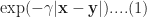
It turns out that a particular function – called the radial basis function kernel (RBF kernel) – is very effective in many cases. The RBF kernel is essentially a Gaussian (or Normal) function with the Euclidean distance between pairs of points as the variable (see equation 1 below). The basic rationale behind the RBF kernel is that it creates separation boundaries that it tends to classify points close together (in the Euclidean sense) in the original space in the same way. This is reflected in the fact that the kernel decays (i.e. drops off to zero) as the Euclidean distance between points increases.
The rate at which a kernel decays is governed by the parameter 
Finally, though it is probably obvious, it is worth mentioning that the separation boundaries for arbitrary kernels are also defined through support vectors as in Figure 3. To reiterate a point made earlier, this means that a solution that has fewer support vectors is likely to be more robust than one with many. Why? Because the data points defining support vectors are ones that are most sensitive to noise- therefore the fewer, the better.
There are many other types of kernels, each with their own pros and cons. However, I’ll leave these for adventurous readers to explore by themselves. Finally, for a much more detailed….and dare I say, better… explanation of the kernel trick, I highly recommend this article by Eric Kim.
Support vector machines in R
In this demo we’ll use the svm interface that is implemented in the e1071 R package. This interface provides R programmers access to the comprehensive libsvm library written by Chang and Lin. I’ll use two toy datasets: the famous iris dataset available with the base R package and the sonar dataset from the mlbench package. I won’t describe details of the datasets as they are discussed at length in the documentation that I have linked to. However, it is worth mentioning the reasons why I chose these datasets:
- As mentioned earlier, no real life dataset is linearly separable, but the iris dataset is almost so. Consequently, it is a good illustration of using linear SVMs. Although one almost never uses these in practice, I have illustrated their use primarily for pedagogical reasons.
- The sonar dataset is a good illustration of the benefits of using RBF kernels in cases where the dataset is hard to visualise (60 variables in this case!). In general, one would almost always use RBF (or other nonlinear) kernels in practice.
With that said, let’s get right to it. I assume you have R and RStudio installed. For instructions on how to do this, have a look at the first article in this series. The processing preliminaries – loading libraries, data and creating training and test datasets are much the same as in my previous articles so I won’t dwell on these here. For completeness, however, I’ll list all the code so you can run it directly in R or R studio (a complete listing of the code can be found here):
The output from the SVM model show that there are 24 support vectors. If desired, these can be examined using the SV variable in the model – i.e via svm_model$SV.
The test prediction accuracy indicates that the linear performs quite well on this dataset, confirming that it is indeed near linearly separable. To check performance by class, one can create a confusion matrix as described in my post on random forests. I’ll leave this as an exercise for you. Another point is that we have used a soft-margin classification scheme with a cost C=1. You can experiment with this by explicitly changing the value of C. Again, I’ll leave this for you an exercise.
Before proceeding to the RBF kernel, I should mention a point that an alert reader may have noticed. The predicted variable, Species, can take on 3 values (setosa, versicolor and virginica). However, our discussion above dealt with a binary (2 valued) classification problem. This brings up the question as to how the algorithm deals multiclass classification problems – i.e those involving datasets with more than two classes. The libsvm algorithm (which svm uses) does this using a one-against-one classification strategy. Here’s how it works:
- Divide the dataset (assumed to have N classes) into N(N-1)/2 datasets that have two classes each.
- Solve the binary classification problem for each of these subsets
- Use a simple voting mechanism to assign a class to each data point.
Basically, each data point is assigned the most frequent classification it receives from all the binary classification problems it figures in.
With that said for the unrealistic linear classifier, let’s move to the real world. In the code below, I build SVM models using three different kernels
- Linear kernel (this is for comparison with the following 2 kernels).
- RBF kernel with default values for the parameters
and
- RBF kernel with optimal values for
OK, lets go:
I’ll leave you to examine the contents of the model. The important point to note here is that the performance of the model with the test set is quite dismal compared to the previous case. This simply indicates that the linear kernel is not appropriate here. Let’s take a look at what happens if we use the RBF kernel with default values for the parameters:
That’s a pretty decent improvement from the linear kernel. Let’s see if we can do better by doing some parameter tuning. To do this we first invoke tune.svm and use the parameters it gives us in the call to svm:
Which is fairly decent improvement on the un-optimised case.
Wrapping up
This bring us to the end of this introductory exploration of SVMs in R. To recap, the distinguishing feature of SVMs in contrast to most other techniques is that they attempt to construct optimal separation boundaries between different categories.
SVMs are quite versatile and have been applied to a wide variety of domains ranging from chemistry to pattern recognition. They are best used in binary classification scenarios. This brings up a question as to where SVMs are to be preferred to other binary classification techniques such as logistic regression. The honest response is, “it depends” – but here are some points to keep in mind when choosing between the two. A general point to keep in mind is that SVM algorithms tend to be expensive both in terms of memory and computation, issues that can start to hurt as the size of the dataset increases.
Given all the above caveats and considerations, the best way to figure out whether an SVM approach will work for your problem may be to do what most machine learning practitioners do: try it out!
The dark side of data science
Data scientists are sometimes blind to the possibility that the predictions of their algorithms can have unforeseen negative effects on people. Ethical or social implications are easy to overlook when one finds interesting new patterns in data, especially if they promise significant financial gains. The Centrelink debt recovery debacle, recently reported in the Australian media, is a case in point.
Here is the story in brief:
Centrelink is an Australian Government organisation responsible for administering welfare services and payments to those in need. A major challenge such organisations face is ensuring that their clients are paid no less and no more than what is due to them. This is difficult because it involves crosschecking client income details across multiple systems owned by different government departments, a process that necessarily involves many assumptions. In July 2016, Centrelink unveiled an automated compliance system that compares income self-reported by clients to information held by the taxation office.
The problem is that the algorithm is flawed: it makes strong (and incorrect!) assumptions regarding the distribution of income across a financial year and, as a consequence, unfairly penalizes a number of legitimate benefit recipients. It is very likely that the designers and implementers of the algorithm did not fully understand the implications of their assumptions. Worse, from the errors made by the system, it appears they may not have adequately tested it either. But this did not stop them (or, quite possibly, their managers) from unleashing their algorithm on an unsuspecting public, causing widespread stress and distress. More on this a bit later.
Algorithms like the one described above are the subject of Cathy O’Neil’s aptly titled book, Weapons of Math Destruction. In the remainder of this article I discuss the main themes of the book. Just to be clear, this post is more riff than review. However, for those seeking an opinion, here’s my one-line version: I think the book should be read not only by data science practitioners, but also by those who use or are affected by their algorithms (which means pretty much everyone!).
Abstractions and assumptions
‘O Neil begins with the observation that data algorithms are mathematical models of reality, and are necessarily incomplete because several simplifying assumptions are invariably baked into them. This point is important and often overlooked so it is worth illustrating via an example.
When assessing a person’s suitability for a loan, a bank will want to know whether the person is a good risk. It is impossible to model creditworthiness completely because we do not know all the relevant variables and those that are known may be hard to measure. To make up for their ignorance, data scientists typically use proxy variables, i.e. variables that are believed to be correlated with the variable of interest and are also easily measurable. In the case of creditworthiness, proxy variables might be things like gender, age, employment status, residential postcode etc. Unfortunately many of these can be misleading, discriminatory or worse, both.
The Centrelink algorithm provides a good example of such a “double-whammy” proxy. The key variable it uses is the difference between the client’s annual income reported by the taxation office and self-reported annual income stated by the client. A large difference is taken to be an indicative of an incorrect payment and hence an outstanding debt. This simplistic assumption overlooks the fact that most affected people are not in steady jobs and therefore do not earn regular incomes over the course of a financial year (see this article by Michael Griffin, for a detailed example). Worse, this crude proxy places an unfair burden on vulnerable individuals for whom casual and part time work is a fact of life.
Worse still, for those wrongly targeted with a recovery notice, getting the errors sorted out is not a straightforward process. This is typical of a WMD. As ‘O Neil states in her book, “The human victims of WMDs…are held to a far higher standard of evidence than the algorithms themselves.” Perhaps this is because the algorithms are often opaque. But that’s a poor excuse. This is the only technical field where practitioners are held to a lower standard of accountability than those affected by their products.
‘O Neil’s sums it up rather nicely when she calls algorithms like the Centrelink one weapons of math destruction (WMD).
Self-fulfilling prophecies and feedback loops
A characteristic of WMD is that their predictions often become self-fulfilling prophecies. For example a person denied a loan by a faulty risk model is more likely to be denied again when he or she applies elsewhere, simply because it is on their record that they have been refused credit before. This kind of destructive feedback loop is typical of a WMD.
An example that ‘O Neil dwells on at length is a popular predictive policing program. Designed for efficiency rather than nuanced judgment, such algorithms measure what can easily be measured and act by it, ignoring the subtle contextual factors that inform the actions of experienced officers on the beat. Worse, they can lead to actions that can exacerbate the problem. For example, targeting young people of a certain demographic for stop and frisk actions can alienate them to a point where they might well turn to crime out of anger and exasperation.
As Goldratt famously said, “Tell me how you measure me and I’ll tell you how I’ll behave.”
This is not news: savvy managers have known about the dangers of managing by metrics for years. The problem is now exacerbated manyfold by our ability to implement and act on such metrics on an industrial scale, a trend that leads to a dangerous devaluation of human judgement in areas where it is most needed.
A related problem – briefly mentioned earlier – is that some of the important variables are known but hard to quantify in algorithmic terms. For example, it is known that community-oriented policing, where officers on the beat develop relationships with people in the community, leads to greater trust. The degree of trust is hard to quantify, but it is known that communities that have strong relationships with their police departments tend to have lower crime rates than similar communities that do not. Such important but hard-to-quantify factors are typically missed by predictive policing programs.
Blackballed!
Ironically, although WMDs can cause destructive feedback loops, they are often not subjected to feedback themselves. O’Neil gives the example of algorithms that gauge the suitability of potential hires. These programs often use proxy variables such as IQ test results, personality tests etc. to predict employability. Candidates who are rejected often do not realise that they have been screened out by an algorithm. Further, it often happens that candidates who are thus rejected go on to successful careers elsewhere. However, this post-rejection information is never fed back to the algorithm because it impossible to do so.
In such cases, the only way to avoid being blackballed is to understand the rules set by the algorithm and play according to them. As ‘O Neil so poignantly puts it, “our lives increasingly depend on our ability to make our case to machines.” However, this can be difficult because it assumes that a) people know they are being assessed by an algorithm and 2) they have knowledge of how the algorithm works. In most hiring scenarios neither of these hold.
Just to be clear, not all data science models ignore feedback. For example, sabermetric algorithms used to assess player performance in Major League Baseball are continually revised based on latest player stats, thereby taking into account changes in performance.
Driven by data
In recent years, many workplaces have gradually seen the introduction to data-driven efficiency initiatives. Automated rostering, based on scheduling algorithms is an example. These algorithms are based on operations research techniques that were developed for scheduling complex manufacturing processes. Although appropriate for driving efficiency in manufacturing, these techniques are inappropriate for optimising shift work because of the effect they have on people. As O’ Neil states:
Scheduling software can be seen as an extension of just-in-time economy. But instead of lawn mower blades or cell phone screens showing up right on cue, it’s people, usually people who badly need money. And because they need money so desperately, the companies can bend their lives to the dictates of a mathematical model.
She correctly observes that an, “oversupply of low wage labour is the problem.” Employers know they can get away with treating people like machine parts because they have a large captive workforce. What makes this seriously scary is that vested interests can make it difficult to outlaw such exploitative practices. As ‘O Neil mentions:
Following [a] New York Times report on Starbucks’ scheduling practices, Democrats in Congress promptly drew up bills to rein in scheduling software. But facing a Republican majority fiercely opposed to government regulations, the chances that their bill would become law were nil. The legislation died.
Commercial interests invariably trump social and ethical issues, so it is highly unlikely that industry or government will take steps to curb the worst excesses of such algorithms without significant pressure from the general public. A first step towards this is to educate ourselves on how these algorithms work and the downstream social effects of their predictions.
Messing with your mind
There is an even more insidious way that algorithms mess with us. Hot on the heels of the recent US presidential election, there were suggestions that fake news items on Facebook may have influenced the results. Mark Zuckerberg denied this, but as this Casey Newton noted in this trenchant tweet, the denial leaves Facebook in “the awkward position of having to explain why they think they drive purchase decisions but not voting decisions.”
Be that as it may, the fact is Facebook’s own researchers have been conducting experiments to fine tune a tool they call the “voter megaphone”. Here’s what ‘O Neil says about it:
The idea was to encourage people to spread the word that they had voted. This seemed reasonable enough. By sprinkling people’s news feeds with “I voted” updates, Facebook was encouraging Americans – more that sixty-one million of them – to carry out their civic duty….by posting about people’s voting behaviour, the site was stoking peer pressure to vote. Studies have shown that the quiet satisfaction of carrying out a civic duty is less likely to move people than the possible judgement of friends and neighbours…The Facebook started out with a constructive and seemingly innocent goal to encourage people to vote. And it succeeded…researchers estimated that their campaign had increased turnout by 340,000 people. That’s a big enough crowd to swing entire states, and even national elections.
And if that’s not scary enough, try this:
For three months leading up to the election between President Obama and Mitt Romney, a researcher at the company….altered the news feed algorithm for about two million people, all of them politically engaged. The people got a higher proportion of hard news, as opposed to the usual cat videos, graduation announcements, or photos from Disney world….[the researcher] wanted to see if getting more [political] news from friends changed people’s political behaviour. Following the election [he] sent out surveys. The self-reported results that voter participation in this group inched up from 64 to 67 percent.
This might not sound like much, but considering the thin margins of recent presidential elections, it could be enough to change a result.
But it’s even more insidious. In a paper published in 2014, Facebook researchers showed that users’ moods can be influenced by the emotional content of their newsfeeds. Here’s a snippet from the abstract of the paper:
In an experiment with people who use Facebook, we test whether emotional contagion occurs outside of in-person interaction between individuals by reducing the amount of emotional content in the News Feed. When positive expressions were reduced, people produced fewer positive posts and more negative posts; when negative expressions were reduced, the opposite pattern occurred. These results indicate that emotions expressed by others on Facebook influence our own emotions, constituting experimental evidence for massive-scale contagion via social networks.
As you might imagine, there was a media uproar following which the lead researcher issued a clarification and Facebook officials duly expressed regret (but, as far as I know, not an apology). To be sure, advertisers have been exploiting this kind of “mind control” for years, but a public social media platform should (expect to) be held to a higher standard of ethics. Facebook has since reviewed its internal research practices, but the recent fake news affair shows that the story is to be continued.
Disarming weapons of math destruction
The Centrelink debt debacle, Facebook mood contagion experiments and the other case studies mentioned in the book illusrate the myriad ways in which Big Data algorithms have a pernicious effect on our day-to-day lives. Quite often people remain unaware of their influence, wondering why a loan was denied or a job application didn’t go their way. Just as often, they are aware of what is happening, but are powerless to change it – shift scheduling algorithms being a case in point.
This is not how it was meant to be. Technology was supposed to make life better for all, not just the few who wield it.
So what can be done? Here are some suggestions:
- To begin with, education is the key. We must work to demystify data science, create a general awareness of data science algorithms and how they work. O’ Neil’s book is an excellent first step in this direction (although it is very thin on details of how the algorithms work)
- Develop a code of ethics for data science practitioners. It is heartening to see that IEEE has recently come up with a discussion paper on ethical considerations for artificial intelligence and autonomous systems and ACM has proposed a set of principles for algorithmic transparency and accountability. However, I should also tag this suggestion with the warning that codes of ethics are not very effective as they can be easily violated. One has to – somehow – embed ethics in the DNA of data scientists. I believe, one way to do this is through practice-oriented education in which data scientists-in-training grapple with ethical issues through data challenges and hackathons. It is as Wittgenstein famously said, “it is clear that ethics cannot be articulated.” Ethics must be practiced.
- Put in place a system of reliable algorithmic audits within data science departments, particularly those that do work with significant social impact.
- Increase transparency a) by publishing information on how algorithms predict what they predict and b) by making it possible for those affected by the algorithm to access the data used to classify them as well as their classification, how it will be used and by whom.
- Encourage the development of algorithms that detect bias in other algorithms and correct it.
- Inspire aspiring data scientists to build models for the good.
It is only right that the last word in this long riff should go to ‘O Neil whose work inspired it. Towards the end of her book she writes:
Big Data processes codify the past. They do not invent the future. Doing that requires moral imagination, and that’s something that only humans can provide. We have to explicitly embed better values into our algorithms, creating Big Data models that follow our ethical lead. Sometimes that will mean putting fairness ahead of profit.
Excellent words for data scientists to live by.


