Posts Tagged ‘Network Graphs’
A gentle introduction to network graphs using R and Gephi
Introduction
Graph theory is the an area of mathematics that analyses relationships between pairs of objects. Typically graphs consist of nodes (points representing objects) and edges (lines depicting relationships between objects). As one might imagine, graphs are extremely useful in visualizing relationships between objects. In this post, I provide a detailed introduction to network graphs using R, the premier open source tool statistics package for calculations and the excellent Gephi software for visualization.
The article is organised as follows: I begin by defining the problem and then spend some time developing the concepts used in constructing the graph Following this, I do the data preparation in R and then finally build the network graph using Gephi.
The problem
In an introductory article on cluster analysis, I provided an in-depth introduction to a couple of algorithms that can be used to categorise documents automatically. Although these techniques are useful, they do not provide a feel for the relationships between different documents in the collection of interest. In the present piece I show network graphs can be used to to visualise similarity-based relationships within a corpus.
Document similarity
There are many ways to quantify similarity between documents. A popular method is to use the notion of distance between documents. The basic idea is simple: documents that have many words in common are “closer” to each other than those that share fewer words. The problem with distance, however, is that it can be skewed by word count: documents that have an unusually high word count will show up as outliers even though they may be similar (in terms of words used) to other documents in the corpus. For this reason, we will use another related measure of similarity that does not suffer from this problem – more about this in a minute.
Representing documents mathematically
As I explained in my article on cluster analysis, a document can be represented as a point in a conceptual space that has dimensionality equal to the number of distinct words in the collection of documents. I revisit and build on that explanation below.
Say one has a simple document consisting of the words “five plus six”, one can represent it mathematically in a 3 dimensional space in which the individual words are represented by the three axis (See Figure 1). Here each word is a coordinate axis (or dimension). Now, if one connects the point representing the document (point A in the figure) to the origin of the word-space, one has a vector, which in this case is a directed line connecting the point in question to the origin. Specifically, the point A can be represented by the coordinates 

Figure 1
As another example consider document, B, which consists of only two words: “five plus” (see Fig 2). Clearly this document shares some similarity with document but it is not identical. Indeed, this becomes evident when we note that document (or point) B is simply the point $latex(1, 1, 0)$ in this space, which tells us that it has two coordinates (words/frequencies) in common with document (or point) A.

Figure 2
To be sure, in a realistic collection of documents we would have a large number of distinct words, so we’d have to work in a very high dimensional space. Nevertheless, the same principle holds: every document in the corpus can be represented as a vector consisting of a directed line from the origin to the point to which the document corresponds.
Cosine similarity
Now it is easy to see that two documents are identical if they correspond to the same point. In other words, if their vectors coincide. On the other hand, if they are completely dissimilar (no words in common), their vectors will be at right angles to each other. What we need, therefore, is a quantity that varies from 0 to 1 depending on whether two documents (vectors) are dissimilar(at right angles to each other) or similar (coincide, or are parallel to each other).
Now here’s the ultra-cool thing, from your high school maths class, you know there is a trigonometric ratio which has exactly this property – the cosine!
What’s even cooler is that the cosine of the angle between two vectors is simply the dot product of the two vectors, which is sum of the products of the individual elements of the vector, divided by the product of the lengths of the two vectors. In three dimensions this can be expressed mathematically as:

where the two vectors are 


The upshot of the above is that the cosine of the angle between the vector representation of two documents is a reasonable measure of similarity between them. This quantity, sometimes referred to as cosine similarity, is what we’ll take as our similarity measure in the rest of this article.
The adjacency matrix
If we have a collection of 

Since every document is identical to itself, the diagonal elements of the matrix will all be 1. These similarities are trivial (we know that every document is identical to itself!) so we’ll set the diagonal elements to zero.
Another important practical point is that visualizing every relationship is going to make a very messy graph. There would be 
Building the adjacency matrix using R
We now have enough background to get down to the main point of this article – visualizing relationships between documents.
The first step is to build the adjacency matrix. In order to do this, we have to build the document term matrix (DTM) for the collection of documents, a process which I have dealt with at length in my introductory pieces on text mining and topic modeling. In fact, the steps are actually identical to those detailed in the second piece. I will therefore avoid lengthy explanations here. However, I’ve listed all the code below with brief comments (for those who are interested in trying this out, the document corpus can be downloaded here and a pdf listing of the R code can be obtained here.)
OK, so here’s the code listing:
docs <- tm_map(docs, toSpace, “-“)
docs <- tm_map(docs, toSpace, “’”)
docs <- tm_map(docs, toSpace, “‘”)
docs <- tm_map(docs, toSpace, “•”)
docs <- tm_map(docs, toSpace, “””)
docs <- tm_map(docs, toSpace, ““”)
pattern = “organiz”, replacement = “organ”)
docs <- tm_map(docs, content_transformer(gsub),
pattern = “organis”, replacement = “organ”)
docs <- tm_map(docs, content_transformer(gsub),
pattern = “andgovern”, replacement = “govern”)
docs <- tm_map(docs, content_transformer(gsub),
pattern = “inenterpris”, replacement = “enterpris”)
docs <- tm_map(docs, content_transformer(gsub),
pattern = “team-“, replacement = “team”)
“also”,”howev”,”tell”,”will”,
“much”,”need”,”take”,”tend”,”even”,
“like”,”particular”,”rather”,”said”,
“get”,”well”,”make”,”ask”,”come”,”end”,
“first”,”two”,”help”,”often”,”may”,
“might”,”see”,”someth”,”thing”,”point”,
“post”,”look”,”right”,”now”,”think”,”‘ve “,
“‘re “,”anoth”,”put”,”set”,”new”,”good”,
“want”,”sure”,”kind”,”larg”,”yes,”,”day”,”etc”,
“quit”,”sinc”,”attempt”,”lack”,”seen”,”awar”,
“littl”,”ever”,”moreov”,”though”,”found”,”abl”,
“enough”,”far”,”earli”,”away”,”achiev”,”draw”,
“last”,”never”,”brief”,”bit”,”entir”,”brief”,
“great”,”lot”)
The rows of a DTM are document vectors akin to the vector representations of documents A and B discussed earlier. The DTM therefore contains all the information we need to calculate the cosine similarity between every pair of documents in the corpus (via equation 1). The R code below implements this, after taking care of a few preliminaries.
A few lines need a brief explanation:
First up, although the DTM is a matrix, it is internally stored in a special form suitable for sparse matrices. We therefore have to explicitly convert it into a proper matrix before using it to calculate similarity.
Second, the names I have given the documents are way too long to use as labels in the network diagram. I have therefore mapped the document names to the row numbers which we’ll use in our network graph later. The mapping back to the original document names is stored in filekey.csv. For future reference, the mapping is shown in Table 1 below.
| File number | Name |
| 1 | BeyondEntitiesAndRelationships.txt |
| 2 | bigdata.txt |
| 3 | ConditionsOverCauses.txt |
| 4 | EmergentDesignInEnterpriseIT.txt |
| 5 | FromInformationToKnowledge.txt |
| 6 | FromTheCoalface.txt |
| 7 | HeraclitusAndParmenides.txt |
| 8 | IroniesOfEnterpriseIT.txt |
| 9 | MakingSenseOfOrganizationalChange.txt |
| 10 | MakingSenseOfSensemaking.txt |
| 11 | ObjectivityAndTheEthicalDimensionOfDecisionMaking.txt |
| 12 | OnTheInherentAmbiguitiesOfManagingProjects.txt |
| 13 | OrganisationalSurprise.txt |
| 14 | ProfessionalsOrPoliticians.txt |
| 15 | RitualsInInformationSystemDesign.txt |
| 16 | RoutinesAndReality.txt |
| 17 | ScapegoatsAndSystems.txt |
| 18 | SherlockHolmesFailedProjects.txt |
| 19 | sherlockHolmesMgmtFetis.txt |
| 20 | SixHeresiesForBI.txt |
| 21 | SixHeresiesForEnterpriseArchitecture.txt |
| 22 | TheArchitectAndTheApparition.txt |
| 23 | TheCloudAndTheGrass.txt |
| 24 | TheConsultantsDilemma.txt |
| 25 | TheDangerWithin.txt |
| 26 | TheDilemmasOfEnterpriseIT.txt |
| 27 | TheEssenceOfEntrepreneurship.txt |
| 28 | ThreeTypesOfUncertainty.txt |
| 29 | TOGAFOrNotTOGAF.txt |
| 30 | UnderstandingFlexibility.txt |
Table 1: File mappings
Finally, the distance function (as.dist) in the cosine similarity function sets the diagonal elements to zero because the distance between a document and itself is zero…which is just a complicated way of saying that a document is identical to itself 🙂
The last three lines of code above simply implement the cutoff that I mentioned in the previous section. The comments explain the details so I need say no more about it.
…which finally brings us to Gephi.
Visualizing document similarity using Gephi
Gephi is an open source, Java based network analysis and visualisation tool. Before going any further, you may want to download and install it. While you’re at it you may also want to download this excellent quick start tutorial.
Go on, I’ll wait for you…
To begin with, there’s a little formatting quirk that we need to deal with. Gephi expects separators in csv files to be semicolons (;) . So, your first step is to open up the adjacency matrix that you created in the previous section (AdjacencyMatrix.csv) in a text editor and replace commas with semicolons.
Once you’ve done that, fire up Gephi, go to File > Open, navigate to where your Adjacency matrix is stored and load the file. If it loads successfully, you should see a feedback panel as shown in Figure 3. By default Gephi creates a directed graph (i.e one in which the edges have arrows pointing from one node to another). Change this to undirected and click OK.
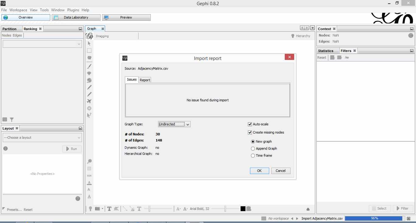
Figure 3: Gephi import feedback
Once that is done, click on overview (top left of the screen). You should end up with something like Figure 4.
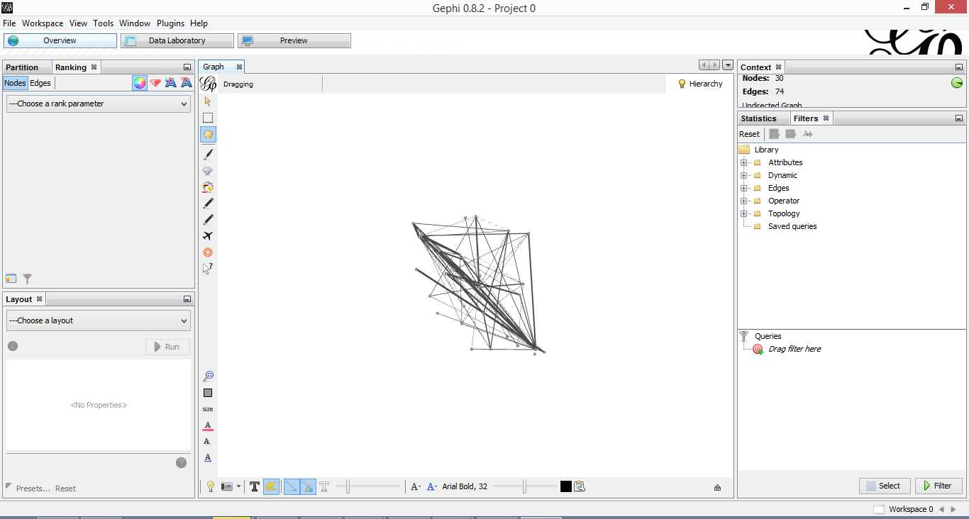
Figure 4: Initial overview after loading adjacency matrix
Gephi has sketched out an initial network diagram which depicts the relationships between documents…but it needs a bit of work to make it look nicer and more informative. The quickstart tutorial mentioned earlier describes various features that can be used to manipulate and prettify the graph. In the remainder of this section, I list some that I found useful. Gephi offers many more. Do explore, there’s much more than I can cover in an introductory post.
First some basics. You can:
- Zoom and pan using mouse wheel and right button.
- Adjust edge thicknesses using the slider next to text formatting options on bottom left of main panel.
- Re-center graph via the magnifying glass icon on left of display panel (just above size adjuster).
- Toggle node labels on/off by clicking on grey T symbol on bottom left panel.
Figure 5 shows the state of the diagram after labels have been added and edge thickness adjusted (note that your graph may vary in appearance).

Figure 5: graph with node labels and adjusted edge thicknesses
The default layout of the graph is ugly and hard to interpret. Let’s work on fixing it up. To do this, go over to the layout panel on the left. Experiment with different layouts to see what they do. After some messing around, I found the Fruchtermann-Reingold and Force Atlas options to be good for this graph. In the end I used Force Atlas with a Repulsion Strength of 2000 (up from the default of 200) and an Attraction Strength of 1 (down from the default of 10). I also adjusted the figure size and node label font size from the graph panel in the center. The result is shown in Figure 6.

Figure 6: Graph after using Force Atlas layout
This is much better. For example, it is now evident that document 9 is the most connected one (which table 9 tells us is a transcript of a conversation with Neil Preston on organisational change).
It would be nice if we could colour code edges/nodes and size nodes by their degree of connectivity. This can be done via the ranking panel above the layout area where you’ve just been working.
In the Nodes tab select Degree as the rank parameter (this is the degree of connectivity of the node) and hit apply. Select your preferred colours via the small icon just above the colour slider. Use the colour slider to adjust the degree of connectivity at which colour transitions occur.
Do the same for edges, selecting weight as the rank parameter(this is the degree of similarity between the two douments connected by the edge). With a bit of playing around, I got the graph shown in the screenshot below (Figure 7).

Figure 5: Connectivity-based colouring of edges and nodes.
If you want to see numerical values for the rankings, hit the results list icon on the bottom left of the ranking panel. You can see numerical ranking values for both nodes and edges as shown in Figures 8 and 9.

Figure 8: Node ranking (see left of figure)

Figure 9: Edge ranking
It is easy to see from the figure that documents 21 and 29 are the most similar in terms of cosine ranking. This makes sense, they are pieces in which I have ranted about the current state of enterprise architecture – the first article is about EA in general and the other about the TOGAF framework. If you have a quick skim through, you’ll see that they have a fair bit in common.
Finally, it would be nice if we could adjust node size to reflect the connectedness of the associated document. You can do this via the “gem” symbol on the top right of the ranking panel. Select appropriate min and max sizes (I chose defaults) and hit apply. The node size is now reflective of the connectivity of the node – i.e. the number of other documents to which it is cosine similar to varying degrees. The thickness of the edges reflect the degree of similarity. See Figure 10.

Figure 10: Node sizes reflecting connectedness
Now that looks good enough to export. To do this, hit the preview tab on main panel and make following adjustments to the default settings:
Under Node Labels:
1. Check Show Labels
2. Uncheck proportional size
3. Adjust font to required size
Under Edges:
1. Change thickness to 10
2. Check rescale weight
Hit refresh after making the above adjustments. You should get something like Fig 11.

Figure 11: Export preview
All that remains now is to do the deed: hit export SVG/PDF/PNG to export the diagram. My output is displayed in Figure 12. It clearly shows the relationships between the different documents (nodes) in the corpus. The nodes with the highest connectivity are indicated via node size and colour (purple for high, green for low) and strength of similarity is indicated by edge thickness.
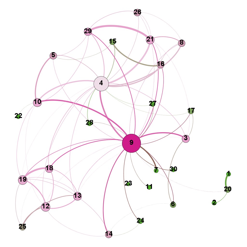
Figure 12: Gephi network graph of document corpus
…which brings us to the end of this journey.
Wrapping up
The techniques of text analysis enable us to quantify relationships between documents. Document similarity is one such relationship. Numerical measures are good, but the comprehensibility of these can be further enhanced through meaningful visualisations. Indeed, although my stated objective in this article was to provide an introduction to creating network graphs using Gephi and R (which I hope I’ve succeeded in doing), a secondary aim was to show how document similarity can be quantified and visualised. I sincerely hope you’ve found the discussion interesting and useful.
Many thanks for reading! As always, your feedback would be greatly appreciated.


